A brochure can be a powerful marketing tool, but only if it’s designed correctly from the start. Many businesses pour time into creating eye-catching graphics, only to receive prints with cut-off text, blurry images, or colours that look nothing like the screen preview. Understanding how to design a brochure for printing means knowing the technical requirements that separate amateur results from professional output.
This guide walks you through each step of the design process, from choosing the right dimensions and fold types to setting up bleeds, margins, and colour profiles. Whether you’re creating a tri-fold for a trade show or a bi-fold for your services menu, you’ll learn exactly what your file needs to be print-ready.
At Apex Workwear, we print brochures for Canadian businesses every day, and we’ve seen the common mistakes that cause delays and reprints. This article shares the practical knowledge our team uses to help customers get it right the first time, so your brochure arrives looking exactly as intended.
What you need before you start
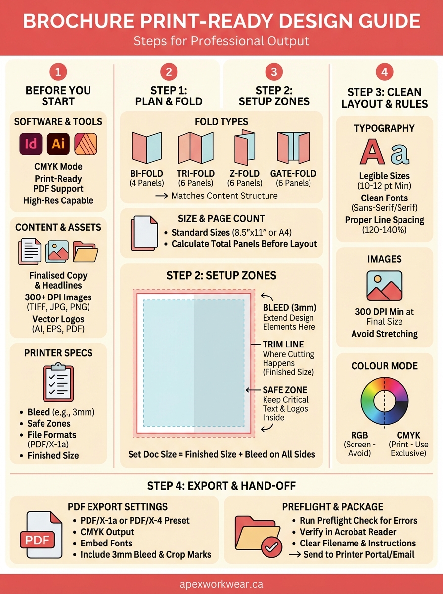
Before you dive into learning how to design a brochure for printing, you need to gather your tools and materials. Starting with the right setup prevents wasted time and ensures your design software can produce files that printers accept. You’ll also need content ready and specifications confirmed so you’re not guessing at technical requirements halfway through the project.
Software and design tools
You need professional design software that can export print-ready PDFs with proper colour profiles and bleeds. Adobe InDesign is the industry standard for multi-page layouts, while Adobe Illustrator works well for simpler brochures. Affinity Publisher offers a budget-friendly alternative with full print capabilities, and even Canva Pro now supports bleed and CMYK exports if you’re working with basic designs.
Your software must support CMYK colour mode rather than RGB, since monitors display colours differently than printed ink. It also needs to handle high-resolution images at 300 DPI minimum and export PDFs with embedded fonts. If your current tool can’t do these things, you’ll face problems when the printer reviews your file.
Software that works for social media graphics often lacks the print-specific features you need for professional brochure production.
Content and visual assets ready
Gather all your written content before you start designing, including headlines, body copy, contact information, and calls to action. Writing as you design slows the process and often results in awkward layouts where text doesn’t fit properly. Proofread everything before placing it in your design, since catching typos in the layout stage is harder than reviewing a plain document.
Your images need to be high resolution, meaning at least 300 DPI at the size they’ll appear in print. A photo that looks sharp on your website at 72 DPI will print blurry and pixelated. Logos should be vector files (AI, EPS, or PDF format) whenever possible, as these scale to any size without losing quality. If you only have PNG or JPG logos, make sure they’re large enough to print clearly.
Collect these assets into a dedicated folder on your computer:
- Final text documents with approved copy
- High-resolution photos (TIFF, PNG, or JPG at 300+ DPI)
- Vector logos and graphics (AI, EPS, PDF, or SVG)
- Brand colour codes in CMYK values
- Font files if using custom typefaces
Print specifications from your printer
Contact your printing company before designing to get their exact specifications. Different printers have different requirements for bleed amounts, colour profiles, and file formats. Apex Workwear provides a specifications sheet that tells you exactly what your files need, eliminating guesswork about margins or trim sizes.
Ask for these details specifically:
- Required bleed amount (typically 3mm but can vary)
- Safe zone or margin requirements
- Accepted file formats (usually PDF/X-1a or PDF/X-4)
- Colour profile requirements
- Finished size options available
- Paper stock weights and finishes
Having this information upfront means you set up your document correctly from the beginning rather than reformatting everything later. Printers reject files that don’t meet their specifications, which delays your project and creates extra work.
Step 1. Plan the brochure and pick the right fold
The first step in how to design a brochure for printing involves planning your structure before you open any design software. This decision affects everything from your document setup to how readers interact with your content. You need to consider both the amount of information you’re presenting and the physical format that best displays it.
Choose your fold type based on content volume
Your brochure’s fold style determines how many panels you have available for content. A tri-fold creates six panels (three on each side), making it ideal for organizing information into clear sections like services, benefits, and contact details. Bi-fold brochures provide four larger panels that work better when you need more space for images or detailed explanations.
Common fold types include:
| Fold Type | Panels | Best For |
|---|---|---|
| Bi-fold | 4 | Product catalogues, event programmes, menus |
| Tri-fold | 6 | Service overviews, company introductions, informational guides |
| Z-fold | 6 | Step-by-step processes, timelines, maps |
| Gate-fold | 6 | Premium presentations, dramatic reveals, architectural layouts |
| Accordion | 8+ | Detailed product lines, extended timelines, technical specifications |
The fold you choose also affects how readers naturally progress through your content. Tri-folds follow a specific reading order as panels unfold, while Z-folds allow readers to see multiple panels simultaneously.
Pick your fold type based on your content structure, not just aesthetic preference, since the physical format guides how readers consume your message.
Determine finished size and page count
Standard brochure sizes make printing more affordable because they fit efficiently on press sheets. The most common finished size is 8.5" x 11" (letter size), which folds down to fit standard envelopes and display racks. A4 size (210mm x 297mm) is standard in many international markets and works identically for planning purposes.
Your page count must match your fold type. A tri-fold uses a single sheet (2 pages), while multi-page brochures require careful planning to ensure content flows correctly across spreads. Calculate the total panels you need before finalizing your fold choice to avoid cramming text or leaving panels awkwardly empty.
Step 2. Set up the document with bleed and safe zones
Setting up your document correctly from the beginning prevents costly reprints and delays. When you learn how to design a brochure for printing, this technical setup step separates amateur files from professional output. Your design software needs precise dimensions that account for how printers physically trim finished pieces.
Create your document with proper dimensions
Start by creating a new document with your finished size plus bleed. If your brochure finishes at 8.5" x 11", you need to add the bleed amount to all sides. Most printers require 3mm (0.125") of bleed, which means your document should be 8.75" x 11.25" to accommodate the extra space around all edges.
Set these specifications when creating your document:
| Setting | Value |
|---|---|
| Finished Size | 8.5" x 11" (or your chosen dimensions) |
| Bleed Amount | 3mm (0.125") on all sides |
| Document Size | 8.75" x 11.25" (finished + bleed) |
| Colour Mode | CMYK |
| Resolution | 300 DPI minimum |
Your software should allow you to enter bleed values during document setup. In Adobe InDesign, this appears in the "New Document" dialogue under "Bleed and Slug." Affinity Publisher places these controls in the same initial setup window.
Add bleed margins to your artboard
The bleed area is where you extend design elements beyond the finished edge to prevent white gaps if trimming shifts slightly. Any background colour, image, or design element that touches the edge must extend fully into the bleed zone. Stopping your background exactly at the trim line risks visible white slivers after cutting.
Extend all edge-touching elements at least 3mm beyond the trim line to ensure clean edges after cutting.
Activate bleed guides in your software to see exactly where elements need to reach. These appear as red lines outside your main document area in most programmes, showing you the absolute edge of your printable space.
Define safe zones for critical content
Keep all important content at least 3mm inside the trim line to prevent accidental cropping. This safe zone protects your text, logos, and essential graphics from getting cut during the trimming process. Printers have slight variations in where blades cut, and the safe zone accounts for this tolerance.
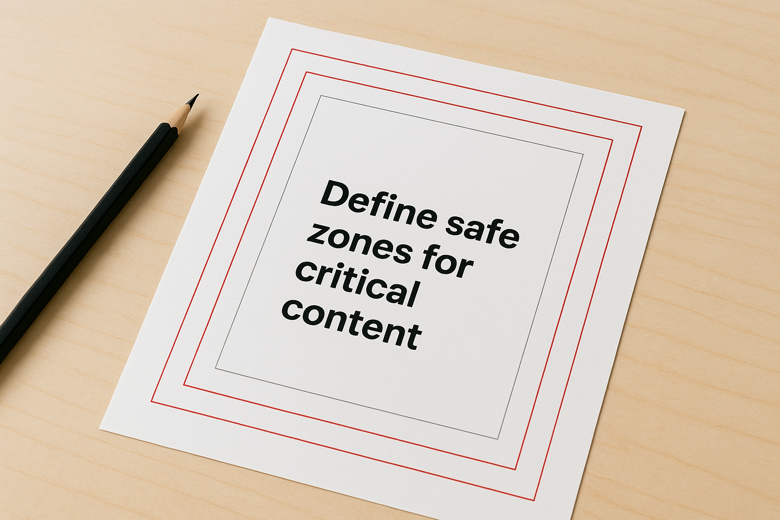
Your layout should now show three distinct zones: the bleed area (outermost), the trim line (where cutting happens), and the safe zone (innermost margin). Position text and logos within the safe zone, while backgrounds and decorative elements extend into the bleed.
Step 3. Build a clean layout with print-safe design rules
Once you’ve set up your document correctly, you need to build your layout using design principles that work specifically for print production. Learning how to design a brochure for printing means understanding that what looks good on screen doesn’t always translate well to physical paper. Your design choices directly affect readability and professional appearance in the finished piece.
Choose print-friendly typography
Select fonts that remain legible at small sizes and reproduce cleanly when printed. Avoid decorative script fonts for body text, as these often blur when printed at typical reading sizes. Sans-serif fonts like Helvetica or Arial work well for headlines, while serif fonts like Garamond or Times New Roman improve readability for longer text blocks.
Keep your body text at 10-12 points minimum to ensure comfortable reading without strain. Smaller text becomes difficult to read on printed brochures, especially for older audiences. Line spacing should be set to 120-140% of your font size to prevent lines from appearing cramped or running together.
Use a maximum of three font families throughout your brochure to maintain visual consistency. Mixing too many typefaces creates a cluttered appearance that undermines your professional message.
Ensure images meet print resolution standards
Place images at 300 DPI or higher at their final printed size to guarantee sharp, clear reproduction. Your design software should display image resolution when you select placed graphics. Any image below 250 DPI will print visibly pixelated and degrade your brochure’s quality.
Scale images down rather than up in your layout, as enlarging low-resolution files makes pixelation worse and cannot recover lost detail.
Avoid stretching or distorting images by maintaining aspect ratios when resizing. Most design software locks proportions by default, but accidentally unlocking this creates stretched photos that look unprofessional.
Work exclusively in CMYK colour mode
Convert all colour elements to CMYK before placing them in your design, including imported graphics and photos. RGB colours display on screens but translate unpredictably to print, often resulting in duller or shifted hues that don’t match your expectations. Your design software should show CMYK values in the colour picker.
Test your colour choices by printing a proof on your office printer, understanding that final results will still vary based on paper stock and printing method.
Step 4. Export a print-ready PDF and hand it off
The final step in how to design a brochure for printing involves exporting your file correctly and providing everything your printer needs for production. Your design work means nothing if the export settings create a file that printers reject or that produces unexpected results. This stage requires careful attention to technical specifications that ensure your digital design translates accurately to physical paper.
Configure PDF export settings correctly
Open your software’s export or save dialogue and select PDF as your output format, then choose the specific preset that matches print requirements. In Adobe InDesign, select "PDF/X-1a:2001" or "PDF/X-4" from the preset dropdown, as these standards embed fonts, flatten transparency, and convert colours automatically. Affinity Publisher offers similar presets under "Print (PDF/X-1a)" that handle these requirements.
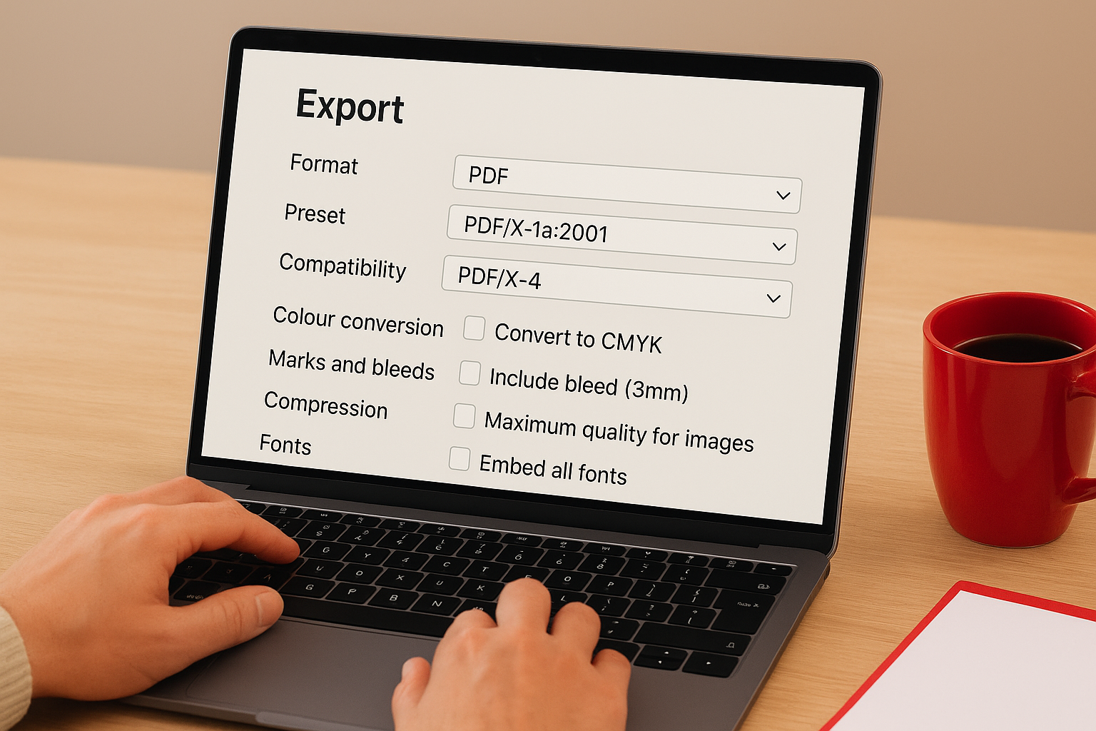
Verify these critical settings before exporting:
| Setting | Required Value |
|---|---|
| Colour Conversion | Convert to CMYK |
| Marks and Bleeds | Include bleed (3mm) |
| Compression | Maximum quality for images |
| Fonts | Embed all fonts |
| Compatibility | PDF/X-1a or PDF/X-4 |
Enable crop marks and registration marks if your printer requests them, though many modern printers prefer files without marks. Check your printer’s specifications document to confirm their preference before finalizing your export.
Run a preflight check before sending
Use your software’s preflight tool to scan for errors that prevent proper printing. This automated check identifies missing fonts, low-resolution images, RGB colours, and other issues that cause production problems. InDesign’s preflight panel shows live errors as you work, while Affinity Publisher includes a preflight report in the export process.
Run preflight checks before exporting your final PDF, as catching errors at this stage saves time and prevents costly reprints.
Open your exported PDF in Adobe Acrobat Reader or a similar viewer to verify that all elements appear correctly, fonts display properly, and colours look appropriate for print.
Package your files for delivery
Create a folder containing your final PDF along with any supporting materials your printer might need. Include a text file with contact information, special instructions about paper stock or finishing, and confirmation of your order details. Name your PDF file clearly using your business name and brochure purpose, such as "ApexWorkwear-ServicesGuide-2026.pdf" rather than generic names like "brochure-final.pdf".
Send files through your printer’s preferred delivery method, whether that involves uploading through their website portal, email attachment, or file transfer service for larger files.
Ready to send it to print
You’ve now completed every technical step for how to design a brochure for printing, from planning your fold type to exporting a print-ready PDF. Your file includes proper bleed and safe zones, uses CMYK colours exclusively, and contains images at the correct resolution for professional reproduction. The preflight check confirmed that your fonts are embedded and no technical errors exist that could delay production.
When you hand off your file to a printer, you’re providing work that meets industry standards and produces the results you expect. No more surprises about cut-off text or colours that don’t match your screen. Your brochure will arrive looking exactly as you designed it.
Apex Workwear prints brochures for Canadian businesses with the same attention to print-ready specifications covered in this guide. Upload your file through our website portal to receive a quote within 24 hours, and we’ll review your design to ensure it meets all production requirements before printing begins.