You’ve got a few seconds, maybe less, to grab someone’s attention as they drive or walk past your yard sign. That’s it. So knowing how to design yard signs for visibility isn’t just a nice skill to have; it’s the difference between a sign that works and one that blends into the background. Colour choices, font sizes, layout, every detail matters when your message needs to land at a glance.
This guide breaks down the practical design principles that make yard signs readable from a distance and effective on the street. We’ll cover high-contrast colour pairings, font legibility, layout strategies, and common mistakes that kill visibility. Whether you’re promoting an event, advertising a service, or directing foot traffic, these tips will help you get it right before you print.
At Apex Workwear, we print custom coroplast and yard signs right here in Canada, with expert design review on every order. We see what works, and what doesn’t, across hundreds of signs, so we’ve built this guide from real production experience to help you make the most of yours.
What "visibility" means for yard signs
Visibility isn’t just about being seen. It splits into two distinct challenges: capturing attention at a distance, and delivering your message before the viewer moves on. A sign can be large and bright but still fail if the text is cluttered or the contrast is weak. When you think about how to design yard signs for visibility, you need to account for both the physical environment where the sign sits and the cognitive limits of someone reading it on the move. The right sign doesn’t need someone to stop; it works in motion, in varying light, and from metres away. Getting this right is the foundation of everything else in this guide.
The three distances that matter
Most yard signs need to work across three viewing zones. Far distance (10 metres or more) is where colour and shape register first, before any words are legible. Mid distance (5 to 10 metres) is where your headline becomes readable for the first time. Close distance (under 5 metres) is where secondary details like a phone number or website URL come into focus. Designing for all three means layering your information deliberately, not stacking everything onto one visual plane at the same size.
| Viewing Distance | What the viewer registers | What to prioritise |
|---|---|---|
| 10+ metres | Colour, shape, contrast | High contrast, bold background |
| 5-10 metres | Main headline | Large, clean font with 1-3 words |
| Under 5 metres | Contact details, secondary copy | Smaller supporting text |
What actually kills visibility
The most common visibility problem isn’t a bad colour choice; it’s information overload. When a sign tries to say everything, it communicates nothing. A viewer moving past at 40 km/h has roughly 1.5 to 2 seconds to process what they see, and if your sign demands more time than that, you’ve already lost them. Crowded layouts, low contrast, and small fonts are the three fastest ways to make an expensive sign invisible, even in broad daylight. Think of your sign budget not just in dollars, but in terms of the attention it either earns or wastes with every person who passes.
A yard sign is not a brochure. Treat every element you add as a trade-off against clarity.
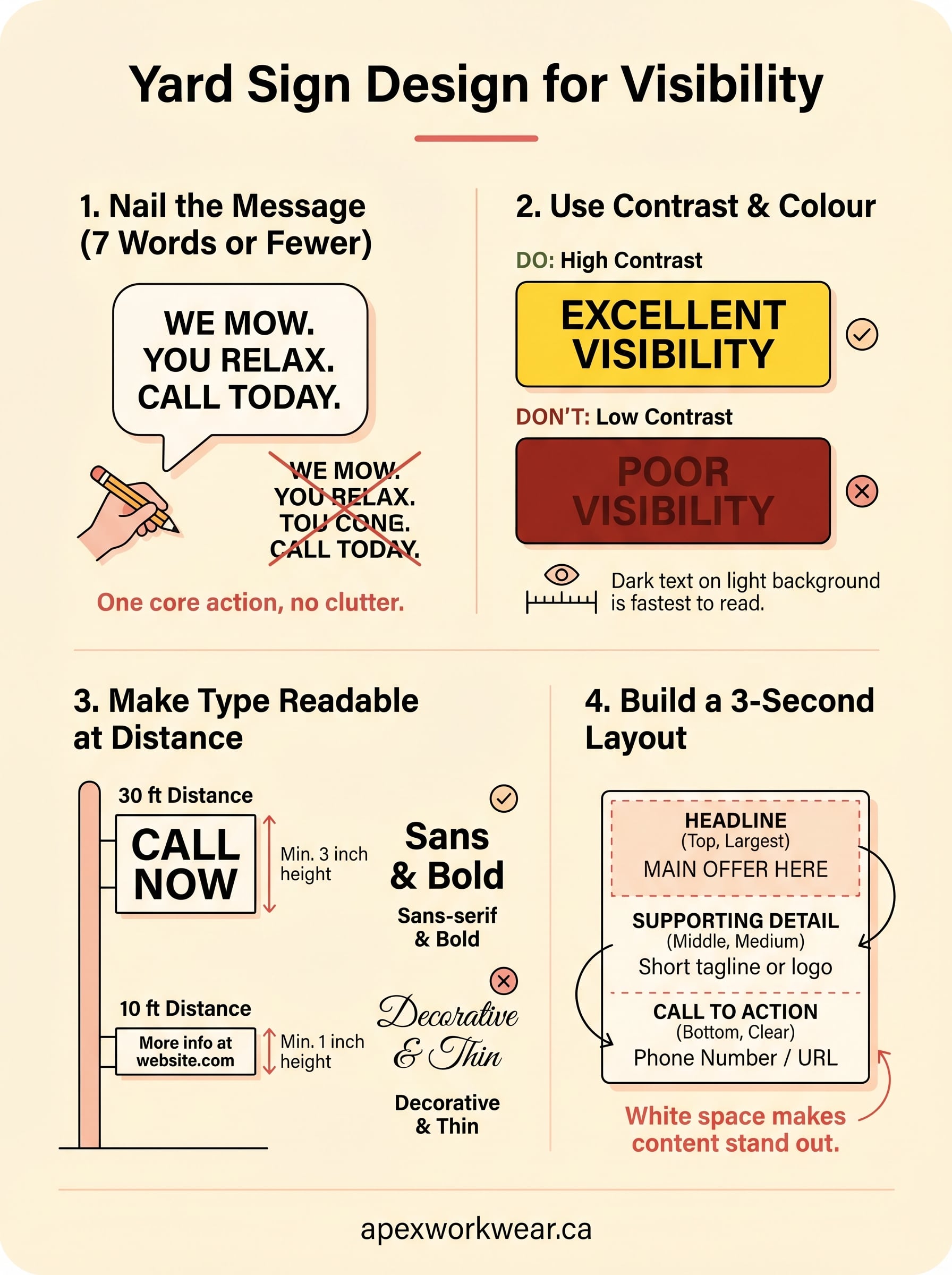
Step 1. Nail the message in seven words
Your sign’s message is the foundation of everything. If you can’t strip your message down to seven words or fewer, it won’t land at driving distance. This is the hardest part of how to design yard signs for visibility, and also the most important. Every word you remove makes the words that remain more powerful.
If you need more than seven words to explain what you do, your message isn’t clear yet.
How to cut your copy down
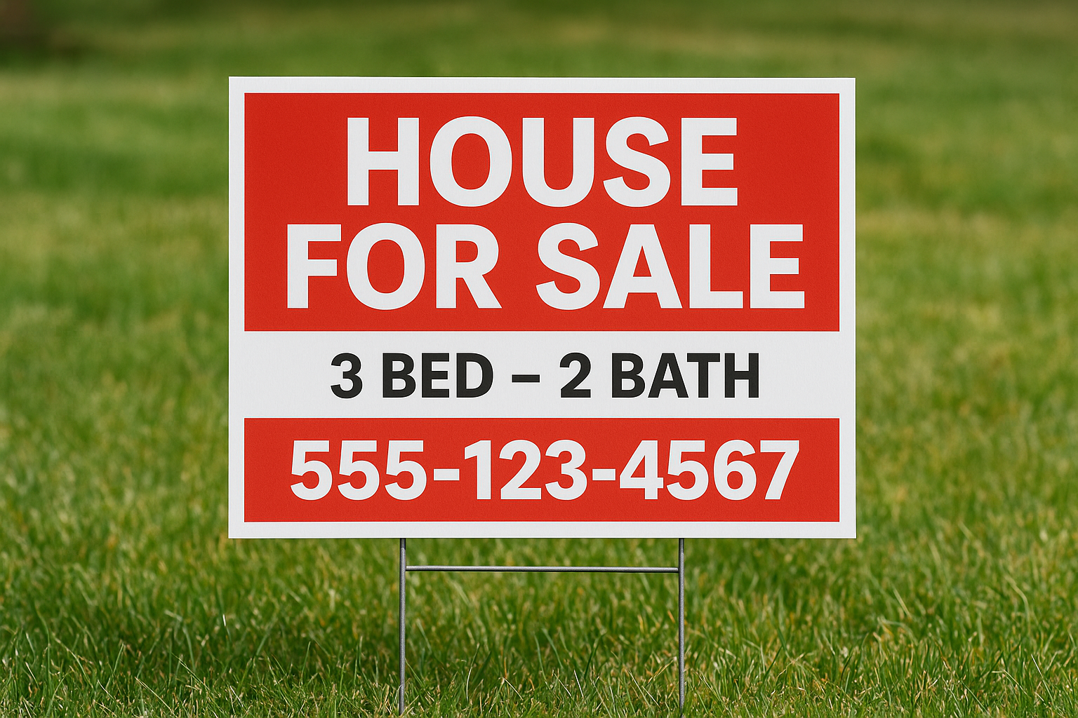
Start by writing out your full message in plain language, then cut ruthlessly. Focus on one core action or benefit, not a list of everything you offer. A landscaping company doesn’t need "Professional lawn care, garden design, and seasonal maintenance services available." It needs: "We Mow. You Relax. Call Today." That’s seven words, one idea, and a clear call to action.
Use this template to structure your headline:
| Element | Example |
|---|---|
| What you do | Roofing repairs |
| Who it’s for or where | GTA homes |
| Call to action | Free quote: 647-XXX-XXXX |
What to leave off
Secondary information like website URLs, social handles, and taglines should only appear if space allows after your headline is set. Most yard signs fail because designers treat every detail as equally important. Pick your one non-negotiable message, lock it in, then add supporting details around it sparingly. A phone number is worth including; a full address usually isn’t.
Step 2. Use contrast and colour on purpose
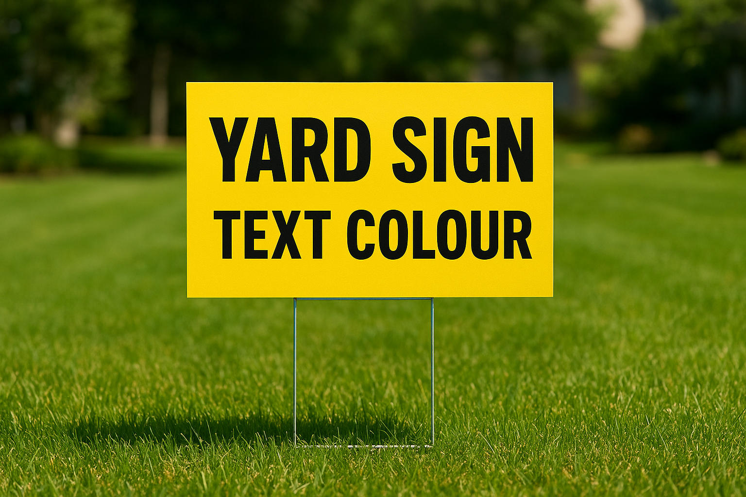
Colour is your first communication tool, even before someone reads a single word. When thinking about how to design yard signs for visibility, contrast between your background and text is what makes the difference between a sign that jumps out and one that gets ignored. High contrast doesn’t mean loud colours; it means choosing combinations where light and dark values are far apart on the scale.
The human eye reads dark text on a light background faster than any other combination, especially at a distance.
Pick a colour pair that works at distance
Your background and text colour need to work together, not just look good on a screen. The combinations below are proven performers in outdoor conditions across different lighting:
| Background | Text Colour | Visibility Rating |
|---|---|---|
| Yellow | Black | Excellent |
| White | Dark navy or black | Excellent |
| Dark green | White | Good |
| Red | White | Good |
| Orange | Black | Good |
| Light grey | Black | Moderate |
Avoid pairing colours that are similar in brightness, like red on dark brown or blue on black. These collapse into each other at even short distances.
Avoid colours that shift in sunlight
Outdoor lighting changes everything. A colour combination that looks sharp on your monitor can lose contrast in direct afternoon sun or heavy overcast. Yellows and whites can wash out against each other, and dark backgrounds collect heat that causes coroplast to warp over time. Stick to tested outdoor pairings rather than chasing brand colours that haven’t been tested at scale.
Step 3. Make type readable at driving distance
Font size and style decisions are where many yard sign designs go wrong. When you’re figuring out how to design yard signs for visibility, the rule is simple: if you have to squint to read it in the design file, it will be completely unreadable on the street. Typography isn’t about personal preference here; it’s about engineering your text to communicate under real-world conditions.
Match font size to viewing distance
A general rule used in sign printing is the 1-inch-per-10-feet standard: for every 10 feet of viewing distance, your text height should be at least 1 inch. On a standard 18×24 inch yard sign, your headline should never drop below 3 inches in height to stay legible at 30 feet.
Bigger is almost always better when it comes to yard sign type; you can rarely make the headline too large.
| Viewing Distance | Minimum Font Height |
|---|---|
| 10 feet | 1 inch |
| 30 feet | 3 inches |
| 50 feet | 5 inches |
Choose fonts that hold up outdoors
Sans-serif fonts like Arial, Helvetica, or Futura hold their shape at distance far better than decorative or script typefaces. Thin strokes and ornate details disappear when a sign is viewed from metres away, especially in low light. Stick to bold weight versions of clean sans-serif fonts, and avoid all-caps for longer phrases since mixed case is faster to read in motion.
Step 4. Build a layout that scans in 3 seconds
Layout is the structure that ties every other design decision together. When you think about how to design yard signs for visibility, your layout determines the order in which a viewer processes the sign. A well-structured layout guides the eye naturally from top to bottom, so your most critical information lands first and secondary details follow without competing for attention.
Lead with the most important information
Visual hierarchy is the principle that makes fast reading possible on any sign. Place your headline at the top third of the sign where the eye lands first, followed by a supporting detail in the middle, and your call to action at the bottom. Never bury your phone number or core offer in a crowded middle section where it gets lost among competing elements.
Your sign should answer "what you offer" before it answers "how to reach you."
Use this basic layout structure as your starting point:
| Zone | Content | Suggested size |
|---|---|---|
| Top third | Headline or main offer | Largest text |
| Middle | Supporting detail or logo | Medium text |
| Bottom third | Phone number or website | Clear but smaller |
Give every element room to breathe
White space is not wasted space; it is what makes each element stand out under real outdoor conditions. Crowding elements together forces the viewer’s eye to work harder, which means they stop processing before they reach your contact details. Leave generous margins on all four sides and keep at least one clear visual gap between each content zone.
Signs staked at an angle or partially blocked by grass or posts lose their edge content first, so keep all critical information well within the centre field of the sign.
Bring it all together
Knowing how to design yard signs for visibility comes down to applying a handful of principles consistently: tight messaging, strong contrast, legible type, and a layout that guides the eye without demanding extra effort. Each step in this guide builds on the last, and they work together. A well-worded headline loses its impact if the font is too small, and a bold colour choice means nothing if the layout crowds out your call to action. Every design decision either adds clarity or takes it away, so treat each one as a deliberate choice rather than an afterthought.
When you’re ready to print, work with a team that reviews your design before it goes to press. At Apex Workwear, every order includes expert design review and a digital proof, so you see exactly what you’re getting before a single sign goes into production. Get a free quote on your custom yard signs and put these principles to work.