Hand someone a glossy card, and they glance at it. Hand them a matte business card, and they actually feel it. That tactile difference matters more than most people realise, it shapes a first impression before anyone reads a single word. Matte finishes have quietly become the go-to choice for professionals who want their cards to look sharp without the glare or fingerprint smudges that come with glossy coatings.
But choosing matte isn’t just about aesthetics. The finish affects readability, durability, and even whether you can write on the card with a pen. If you’re weighing your options, you need the full picture before placing an order, not just a vibe check.
In this guide, we break down exactly what matte business cards are, where they outperform other finishes, and how to get the best results from your print run. At Apex Workwear, we print business cards right here in Canada with no minimums, free design proofs, and free local shipping across the GTA, so once you know what you want, we make it easy to get it done right.
What makes a business card matte
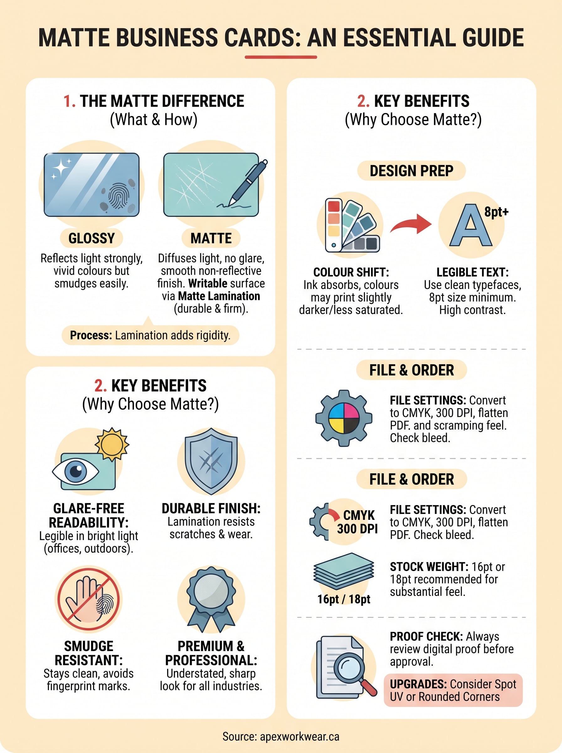
The finish on a card comes down to the coating applied after printing. A matte coating is a thin layer of lacquer or laminate that diffuses light rather than reflecting it. Instead of bouncing light back in a single direction, the surface scatters it, which is what gives matte business cards their signature flat, non-reflective look. There’s no shine, no mirror effect, just a clean, even surface that sits quietly in the hand.
The coating process
Matte finishes are applied using one of two main methods: aqueous coating (a water-based solution rolled on during or just after printing) or matte lamination (a film bonded to the card surface under heat and pressure). Lamination produces a more durable and consistent result, while aqueous coating is lighter and slightly less protective. Most professional print runs use lamination for business cards because it adds structural rigidity alongside the finish, which means your card holds its shape better over time.
Matte lamination also makes the card surface writable, so recipients can jot notes directly on your card with a ballpoint pen.
How matte differs from other finishes
Glossy cards use a high-gloss coating that reflects light sharply, making colours appear more vivid but also picking up fingerprints and smudges easily. Soft-touch matte, sometimes called suede or velvet finish, takes the effect further with a tactile, almost rubbery texture. Standard matte sits between the two, offering a smooth but non-slippery surface that reads well under most lighting and photographs cleanly without glare.
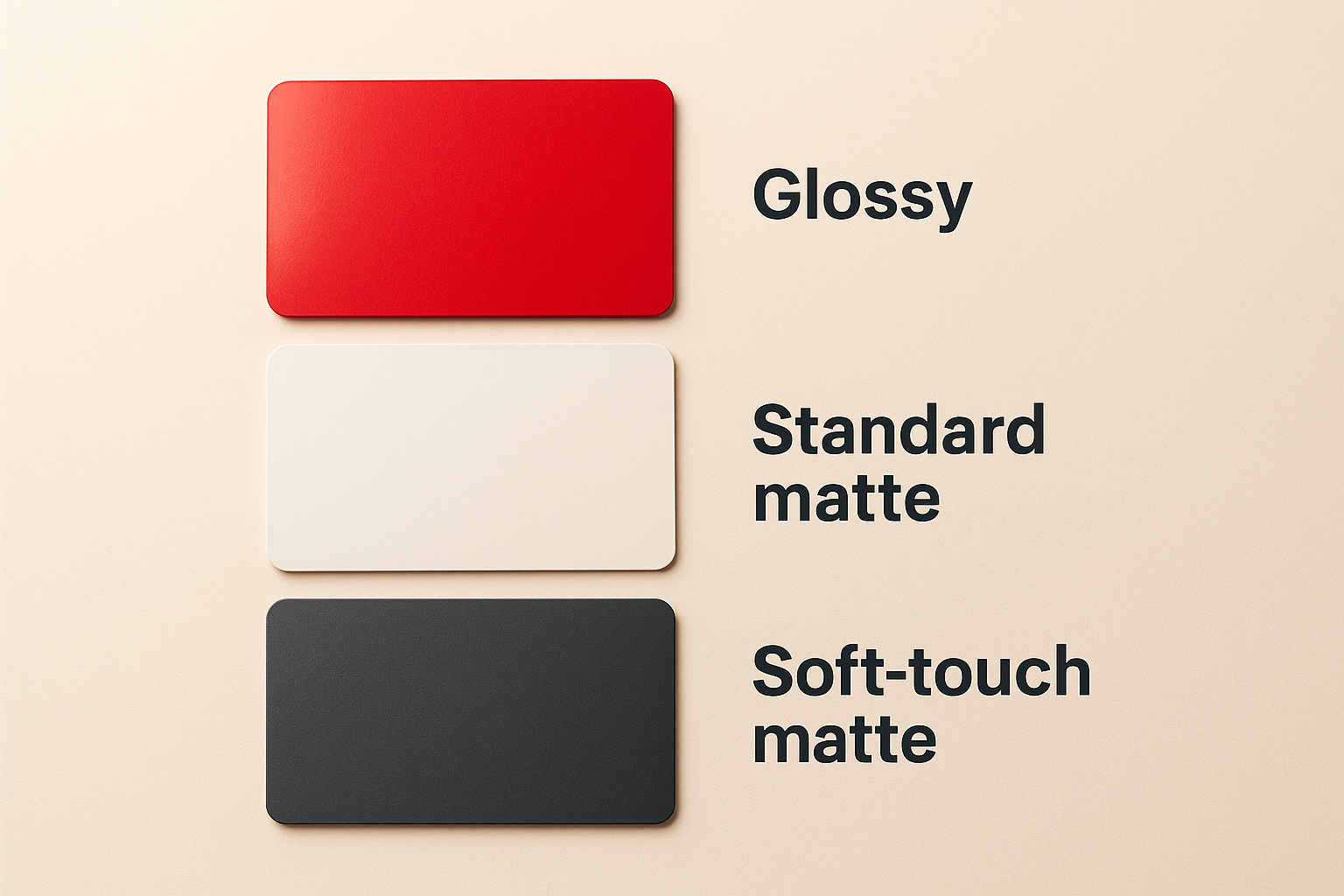
| Finish | Light reflection | Smudge resistance | Writeable |
|---|---|---|---|
| Glossy | High | Low | No |
| Standard matte | Low | High | Yes |
| Soft-touch matte | None | Very high | Yes |
Why matte business cards work for many brands
Matte business cards aren’t just a style preference; they solve real problems that other finishes create. Glare-free surfaces stay legible in bright environments like trade shows, outdoor events, or well-lit offices where glossy cards become difficult to read. Your brand’s colours and typography also print with a natural, understated richness that feels premium without looking over-designed.
They suit professional and creative industries equally
A lot of people assume matte only works for minimalist or luxury brands. That assumption is wrong. Law firms, contractors, photographers, and retail shops all use matte effectively because the non-reflective surface keeps your content as the focus rather than the coating itself.
Matte works especially well when your card carries a lot of text or fine detail, because the finish keeps everything sharp and easy to scan without visual interference.
They hold up in real-world use
Cards spend time in wallets, pockets, and desk drawers. Matte lamination resists scuffing and minor surface scratches better than uncoated stock, so your card still looks intentional weeks after you hand it out.
Soft-touch matte takes durability even further, though it adds to the unit cost. For most print runs, standard matte lamination gives you the right balance of protection and price.
How to design matte business cards that print well
Designing for a matte finish requires a few adjustments compared to designing for glossy stock. Matte business cards absorb more ink than glossy surfaces, which means colours can print slightly darker or less saturated than they appear on your screen. Accounting for this upfront saves you from a disappointing proof and avoids costly reprints.
Set your colours and resolution correctly
Convert your file to CMYK colour mode before sending it to print, as most printers work in CMYK, not RGB. Submitting an RGB file shifts your colours unpredictably once the print software converts it. Your artwork should also sit at a minimum of 300 DPI to avoid blurring or pixelation on the final card.
If your brand colours look vivid on screen, ask your printer for a physical swatch or colour proof before approving a full run.
Keep contrast high and text legible
Dark text on a light background performs well on matte stock, but very light text on a very dark background can lose definition if ink spreads slightly during printing. Use clean typefaces at 8pt or larger for contact details, and avoid placing anything critical within 3mm of the card edges.
Paper stocks, thickness, and upgrades to consider
Card stock weight affects how your matte business cards feel the moment someone picks them up. A thin card signals a rushed order; a thick one signals intention. Most professional print runs use 16pt or 18pt stock as a reliable baseline, giving you enough rigidity that the card won’t bend in a wallet but won’t feel like cardboard either.
Thicker stocks pair especially well with matte lamination because the combination produces a card that feels genuinely substantial.
Choosing the right thickness for your use case
Standard 14pt works fine for high-volume networking events where you hand out dozens of cards at once. If you want something that genuinely stands out, upgrade to 16pt or 18pt with a matte laminate on one or both sides. Double-sided lamination adds more protection and a consistent look across the whole card.
Upgrades worth the extra cost
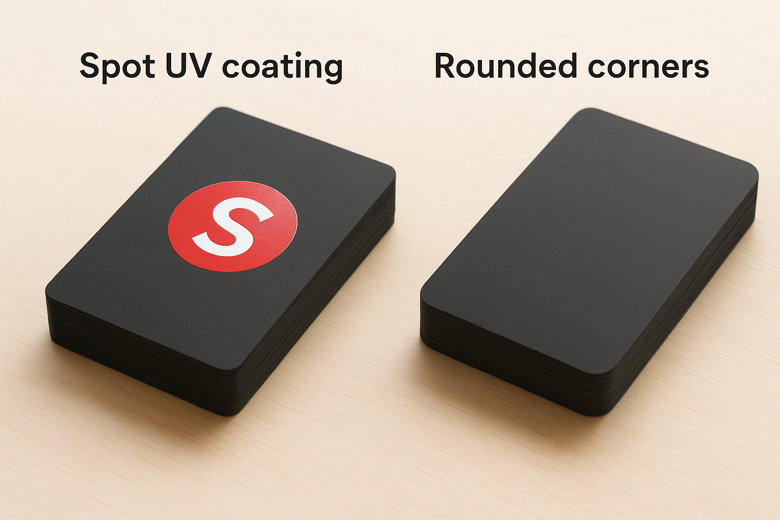
Spot UV coating lets you apply a gloss accent layer on top of a matte base, which draws attention to specific elements like your logo. Rounded corners are another low-cost upgrade that reduces edge wear and gives your card a cleaner, more finished look without changing the layout.
Ordering and print-proof tips to avoid mistakes
Before you approve a print run, request a digital proof and review it against your original file. Check that your contact details, spacing, and layout match exactly what you submitted. Small errors on matte business cards, like a transposed digit in your phone number or a logo sitting too close to a cut edge, only show up once the finished cards are in your hands if you skip this step.
What to check before you confirm your order
Your proof review should cover a few specific areas. Confirm that bleed and safe zone margins are correct, meaning your background extends at least 3mm beyond the cut line and your key content sits at least 3mm from any edge. Also verify that your file is a flattened PDF in CMYK at 300 DPI, as most professional printers need this format to reproduce colours and fine details accurately.
If anything looks wrong in the proof, raise it before approving. Fixing a layout error before print costs nothing; reprinting an entire order does.
Starting with a small test quantity is worth considering if you are trying a new stock or finish combination for the first time. It lets you assess the physical result before committing to a larger run.
Wrapping it up
Matte business cards give you a professional, readable, and durable card that holds up in everyday use without the glare or fingerprint issues that come with glossy finishes. Choosing the right stock weight, setting your files to CMYK at 300 DPI, and reviewing a proof before approving your order are the steps that separate a solid result from a frustrating one.
None of this needs to be complicated. Once you know what finish, thickness, and layout work for your brand, the rest is just execution. Upgrades like spot UV or rounded corners are worth considering when you want something that stands apart, but even a clean standard matte card on 16pt stock makes a strong impression.
If you are ready to place your order, get a free quote from Apex Workwear and have your cards printed in Canada with no minimums, free design proofs, and fast turnaround.