You designed the perfect logo, picked the right colours, and sent your files off to print, only to get back a banner or business card where the black looks washed out, patchy, or weirdly tinted. That usually comes down to one overlooked detail: rich black vs 100K. These two types of black behave very differently on press, and choosing the wrong one at the wrong time is one of the most common causes of muddy or uneven prints.
At Apex Workwear, we produce custom apparel, signage, business cards, and large-format prints for businesses across Canada, so we see this mix-up regularly. A black that works perfectly for body text can fall apart when it’s used as a full-bleed background, and vice versa. Understanding when to use each black saves you time, money, and the frustration of a reprint.
This article breaks down exactly what rich black and 100K black are, their CMYK formulas, when each one belongs in your design files, and how to avoid the printing errors that trip up even experienced designers.
Rich black vs 100K black, defined
Both terms refer to types of black in CMYK printing, the four-colour process commercial printers use to produce everything from business cards to large-format banners. CMYK stands for Cyan, Magenta, Yellow, and Key (black), and every colour in your print file is built from some combination of those four ink channels. Knowing the rich black vs 100K difference before you send your files prevents the most common colour errors that lead to costly reprints.
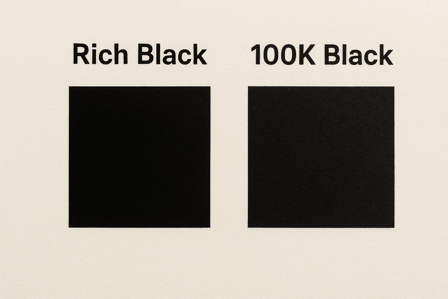
What 100K black is
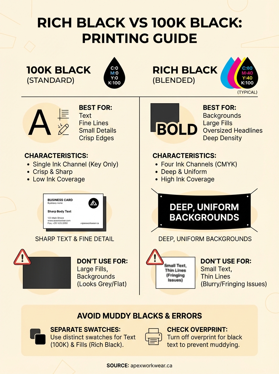
100K black uses a single ink channel: C:0 M:0 Y:0 K:100. Because only the black plate prints, there is no overlap between ink layers, which keeps edges crisp and sharp at any size. That is exactly what you need for body copy, fine lines, small logos, and any element where precise detail matters.
Most design software sets black to C:0 M:0 Y:0 K:100 by default when you pick black from the colour palette. For text and small elements, that default is correct. The problem starts when designers use that same default black for large backgrounds or oversized filled areas, where a single ink layer lacks the visual density to look fully saturated on press.
What rich black is
Rich black blends all four CMYK channels to produce a denser, more saturated black than K alone can achieve across larger surfaces. Adding cyan, magenta, and yellow on top of full black ink increases the total ink coverage, giving solid backgrounds and bold graphic panels a deeper, more uniform appearance that a single-channel black simply cannot match.
A single K channel on a large area often appears flat or slightly grey under certain lighting conditions, which is the exact visual problem rich black is designed to correct.
The table below shows how the two blacks compare at a glance:
| 100K Black | Rich Black | |
|---|---|---|
| CMYK formula | C:0 M:0 Y:0 K:100 | C:60 M:40 Y:40 K:100 (typical) |
| Ink channels used | 1 | 4 |
| Best for | Text, fine lines, small details | Backgrounds, large fills, bold panels |
Why the difference shows up in print
The gap between rich black vs 100K becomes visible because of how commercial printing lays down ink. Offset and digital presses build colour from thousands of tiny dots spread across four separate ink channels. When you use only the K channel at 100%, you get one layer of black ink, and on large surfaces, that single layer can appear slightly grey or uneven depending on paper stock, press calibration, and lighting conditions.
How ink coverage affects visual density
Your eye reads colour density based on how much ink sits on the surface. A single K channel at 100% deposits one layer of pigment, which works well for small elements like text but falls short for large fills. Adding cyan, magenta, and yellow alongside the black increases total ink coverage, making the surface appear deeper and more uniform. The overlapping dot patterns from four channels fill in gaps that a single channel leaves behind.
The more ink channels contributing to a colour, the denser and more visually consistent it appears across a large printed area.
Ink behaviour also shifts with paper absorbency. On uncoated stocks, single-channel black spreads slightly as it absorbs into the fibres, which can make large filled areas look patchy or inconsistent. Rich black compensates by building depth across multiple channels at once, evening out the final result regardless of how the stock responds.
When to use 100K and when to use rich black
The rich black vs 100K decision comes down to element size and detail level. Using the wrong black for the wrong context either creates registration problems and blurry edges or leaves large surfaces looking flat and grey. Match your black choice to what each element actually needs to look sharp and consistent on press.
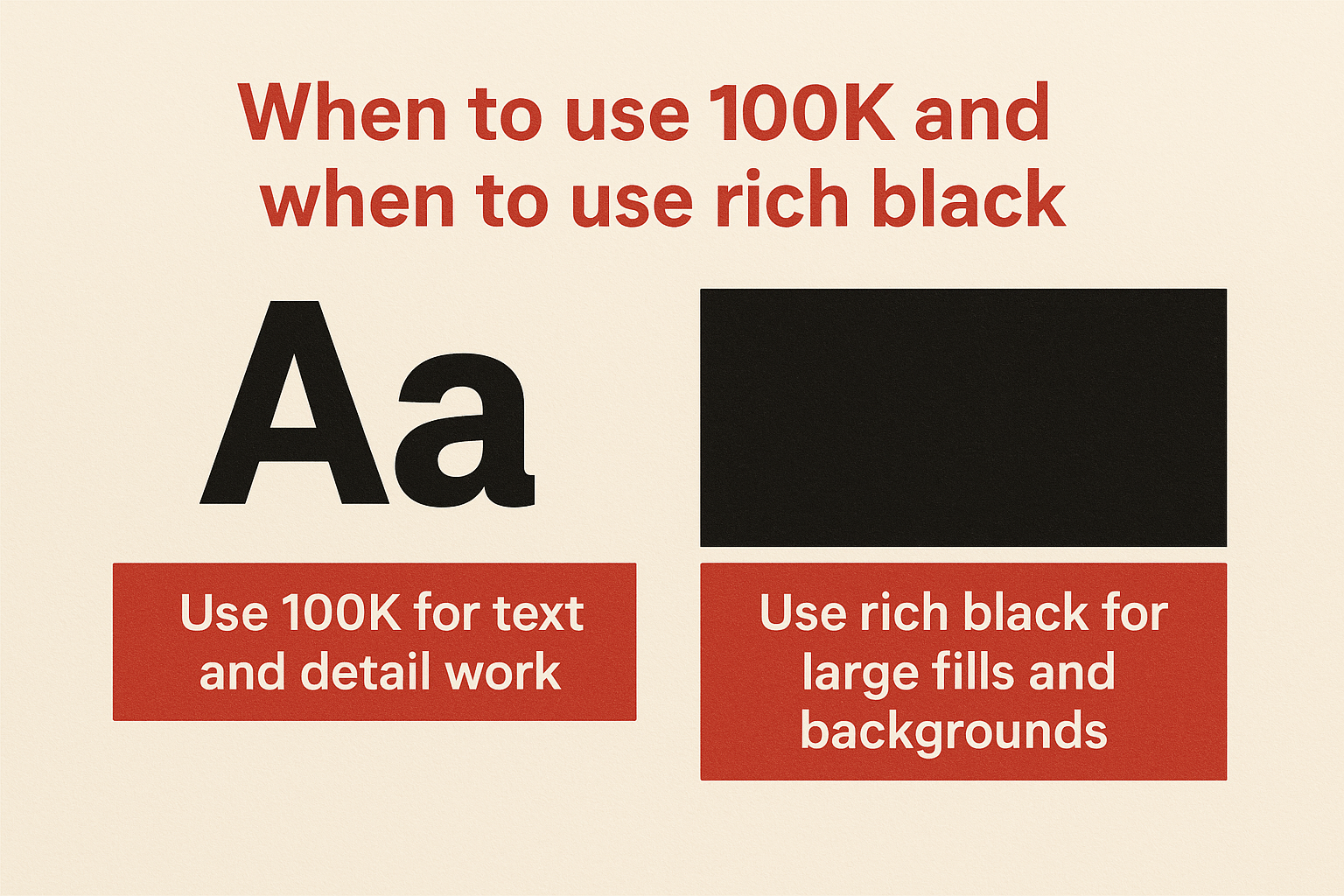
Use 100K for text and detail work
Any element that depends on sharp, clean edges should use 100K black. This includes body copy, legal text, fine lines, small icons, and logos under roughly 1 inch in size. When multiple ink channels print across that small a space, slight misregistration between plates causes visible colour fringing, turning crisp text into a blurry mess.
If your file contains small text or fine detail anywhere on the page, set those elements to C:0 M:0 Y:0 K:100 before you send the file.
Use rich black for large fills and backgrounds
Rich black belongs on solid background panels, oversized headlines, and full-bleed sections where visual depth matters. When your black area covers a significant portion of the page, a single K channel produces an uneven, slightly washed-out result. Layering all four ink channels gives large surfaces the density they need to look intentional and polished.
Common situations that call for rich black:
- Full-bleed backgrounds on flyers, posters, and banners
- Large header blocks on business cards and presentation folders
- Oversized display text above approximately 72pt
Rich black formulas that print cleanly
Not every rich black formula works equally well across all print applications. The total ink coverage in your formula directly affects whether the result looks deep and even or ends up oversaturated, causing ink to bleed and dry unevenly on press. Keeping your combined CMYK values within your printer’s recommended total ink limit is what separates a clean rich black from a problematic one.
The standard formula
The most widely used starting point in the rich black vs 100K conversation is C:60 M:40 Y:40 K:100, which gives you a neutral, deep black with a total ink coverage of 240%. Most commercial printers handle this without issue on coated stocks, and it produces a consistent result across banners, business cards, and presentation folders.
If your printer specifies a total ink limit below 300%, this formula fits comfortably within that range and remains safe for most substrates.
Adjusting for your substrate
Uncoated or absorbent stocks require a lower total ink coverage to prevent bleed and drying problems. On those materials, pull the formula back to something closer to C:40 M:30 Y:30 K:100, bringing total coverage to 200%. Always check your printer’s ink limit specification before finalising your file, since exceeding it on any stock leads to smearing, slow drying, and uneven saturation across large fills.
How to avoid muddy blacks and ghosting
Muddy blacks and ghosting are two preventable print problems, and both trace back to incorrect ink settings or mismatched formulas in your design files. Muddy black happens when total ink coverage exceeds the substrate’s limit, causing colours to bleed together and dry unevenly. Ghosting appears when heavy ink areas leave a faint impression elsewhere on the sheet due to ink starvation on the press.
Keep your black swatches separate
The single most effective step in the rich black vs 100K workflow is keeping your blacks as distinct named swatches in your design software. This prevents accidental formula swaps when you edit or reuse elements across documents.
Set your text and fine-detail elements to one swatch at C:0 M:0 Y:0 K:100, and your large fill areas to a separate rich black swatch. If both use the same unnamed black, one formula change affects every element on the page.
Never apply rich black to small text or thin lines, even if the rest of the design uses it for backgrounds.
Check overprint settings before export
Overprint tells the press to layer ink on top of whatever sits beneath it rather than knocking out a white space first. If your black text has overprint switched on unintentionally, small elements pick up colour from the layers below, producing tinted or muddy results.
Before exporting to PDF, confirm these three settings:
- Overprint: off for all black text and fine detail
- Black swatch: correct formula assigned per element type
- Total ink coverage: within your printer’s specified limit
Quick recap and what to do next
The rich black vs 100K decision is straightforward once you know the rule: use C:0 M:0 Y:0 K:100 for text, fine lines, and small detail work, and use a blended rich black formula for large fills, backgrounds, and oversized display elements. Mixing the two up is what causes flat backgrounds, blurry text, and muddy results on press.
Before you send any file to print, check that your black swatches are named and separated, your overprint settings are off for text elements, and your total ink coverage sits within your printer’s specified limit. A formula around C:60 M:40 Y:40 K:100 handles most coated-stock applications cleanly, while uncoated stocks benefit from pulling that back to around 200% total coverage.
If you want a print partner who catches these issues before they reach press, get a quote from Apex Workwear and let our team review your files before production starts.