Your business card design looks perfect on screen. The colours pop, the text reads clearly, and every element sits exactly where you want it. Then the printed cards arrive and everything feels off. The text looks fuzzy, the colours don’t match, and your logo bleeds right to the edge. You just wasted money on a batch of cards you can’t hand out, and now you need to start over. Most of these business card design tips for printing problems stem from ignoring how ink behaves on paper versus how pixels appear on your monitor.
This article walks you through five critical design decisions that separate amateur prints from professional results. You’ll learn the exact specifications printers need, how to set up your files correctly, and which common mistakes wreck otherwise good designs. Each tip breaks down into three parts: what to do, which specs to follow, and which errors to avoid. By the end, you’ll know how to prepare files that come back from the printer looking exactly as you intended.
1. Get a printer to check your design before you print
Professional printers catch design problems that ruin print jobs before you waste money on production. Your screen shows RGB colours and backlit pixels, while printed cards use CMYK ink on physical paper. These fundamental differences create gaps between what you see and what prints. A printer’s preflight check spots file errors, colour mismatches, resolution issues, and layout problems that your design software won’t flag.
What to do
Send your design file to your printer for a preflight review at least two days before you need the final cards. Most professional print shops offer this service for free and catch issues within 24 hours. Request a printed proof if your budget allows it, because a physical sample shows exactly how your colours, paper stock, and finishes will look together. Digital proofs work for checking layout and text, but they can’t replicate how ink sits on your chosen paper or how a matte finish affects contrast.
Ask specific questions when you submit your file. Confirm whether your file format works with their equipment, whether your colour profile matches their press, and whether any elements sit too close to trim edges. Printers see hundreds of files weekly and spot problems instantly that take you hours to notice.
A printer’s preflight check turns guesswork into certainty before production starts.
Print specs to follow
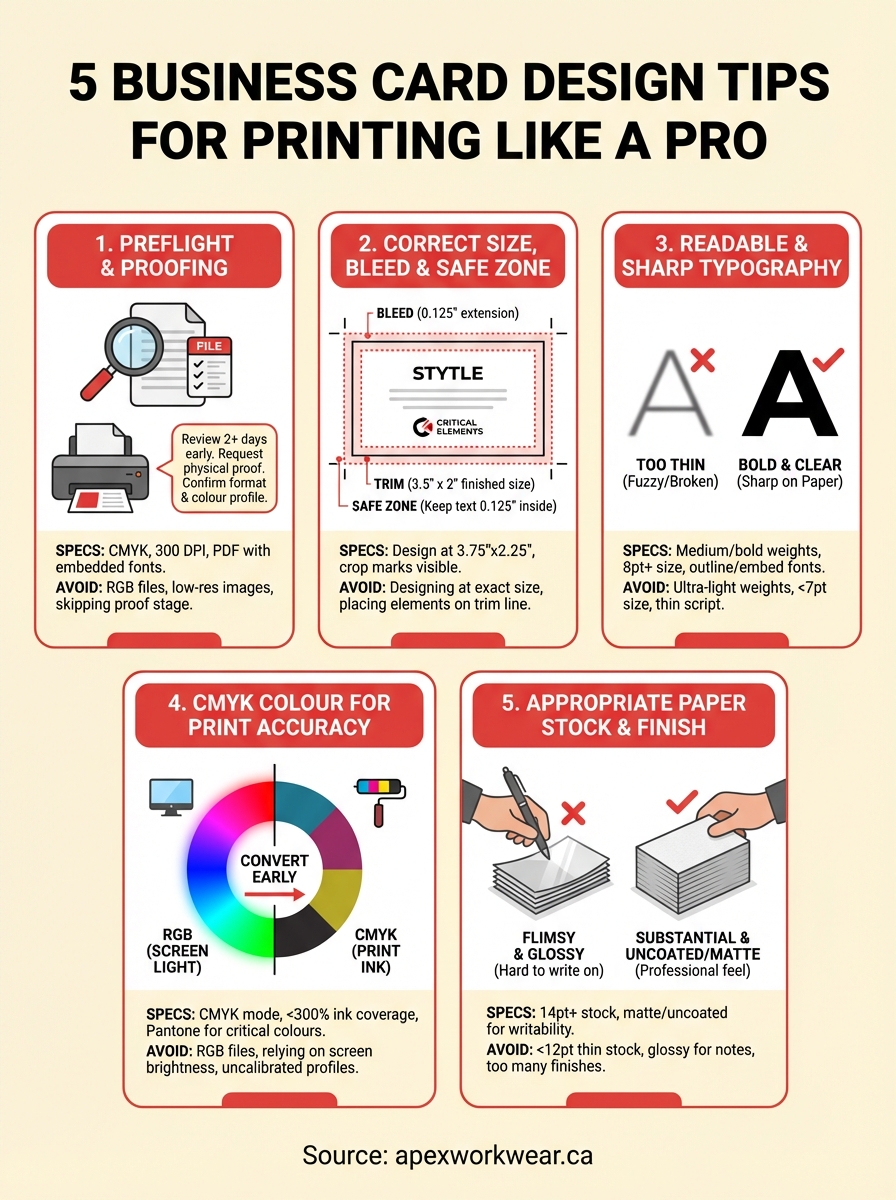
Your printer needs files in CMYK colour mode with 300 DPI resolution minimum. Save your final file as a PDF with embedded fonts and flattened transparency. These specifications ensure your printer can process the file without substituting fonts or losing design elements. Set your document to the exact finished size plus bleeds, typically 3.5" x 2" with a 0.125" bleed on all sides.
Confirm whether your printer accepts Adobe Illustrator, Photoshop, or InDesign native files as alternatives to PDFs. Some shops prefer working files because they can make quick adjustments, but others want print-ready PDFs to avoid version compatibility issues.
Mistakes to avoid
Never assume your printer uses the same colour profile or paper stock as previous jobs. Each print shop calibrates differently, and paper affects how colours appear. Submitting an RGB file forces the printer to convert colours, which often shifts your carefully chosen blues and greens into muddy approximations. Skipping the proof stage leaves you guessing until 500 cards arrive looking wrong.
Don’t send low-resolution images pulled from websites or stretched beyond their original size. Pixelation that barely shows on screen becomes glaringly obvious on paper. Avoid submitting files without confirming whether effects like drop shadows or gradients will reproduce cleanly on your chosen stock.
2. Set the right size, bleed, and safe zone
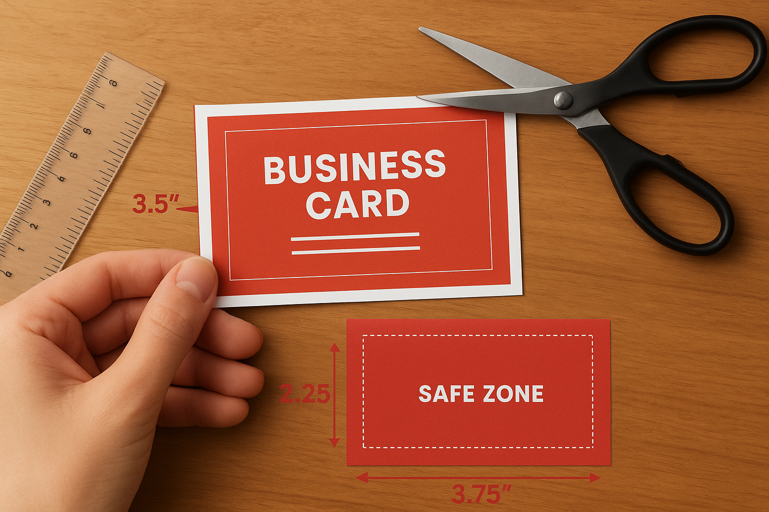
Your business card dimensions control how printers cut, trim, and finish your cards. Standard cards measure 3.5" x 2" in North America, but your design file needs extra space around the edges called bleed. The bleed extends 0.125" beyond your finished size on all sides, giving the cutting blade room for minor shifts without leaving white edges. Inside your design, you need a safe zone where all critical text and logos stay 0.125" away from trim lines to prevent accidental cropping.
What to do
Design your cards at 3.75" x 2.25" to include the required bleed on all sides of a standard 3.5" x 2" card. Extend your background colours, patterns, and images all the way to the edge of this larger canvas. Keep all text, logos, and contact details at least 0.125" inside the trim line to ensure nothing important gets cut off during production. Mark your trim lines clearly in your design software so you can see exactly where the blade cuts.
Print specs to follow
Set your document size to 3.75" x 2.25" with crop marks and bleed marks visible. Your printer needs these marks to align their cutting equipment correctly. Position all essential elements within a safe zone that measures 3.25" x 1.75", which sits comfortably inside your final card size. These measurements apply to standard cards, but always confirm dimensions if you order rounded corners or non-standard sizes before finalising your layout.
Bleed and safe zones prevent white edges and cropped text from ruining your printed cards.
Mistakes to avoid
Never design at the exact finished size without accounting for bleed. Your backgrounds will show white strips along the edges after cutting. Don’t place contact information or logos right at the trim line, because cutting tolerances vary by 0.03" to 0.06" even on professional equipment. Ignoring these business card design tips for printing leads to cards where phone numbers get sliced in half or brand elements disappear entirely.
3. Use typography that stays sharp on paper
Font choices that look crisp on your monitor often turn fuzzy or broken when printed, especially at small sizes. The physical process of pressing ink onto paper creates different challenges than rendering pixels on a backlit screen. Thin strokes disappear, decorative serifs clog with ink, and script fonts lose legibility when printed at business card scale. Your typography needs to account for how ink spreads slightly as it hits paper fibres, which thickens fine lines and fills in tight spaces between letterforms.
What to do
Choose fonts with medium to bold weights for body text and contact information. Stick to sizes 8 points or larger for any text you expect people to read without squinting. Test your font choices by printing a sample page on your home printer at actual size before sending files to production. Simple, clean typefaces with good spacing between characters maintain clarity better than ornate options with thin strokes or tight kerning.
Print specs to follow
Set body text at 8 to 10 points minimum and keep font weights at regular or bold rather than light or thin. Maintain letter spacing of at least 0 tracking to prevent characters from touching when ink spreads. Convert all text to outlines or embed fonts in your PDF to prevent font substitution errors at the print shop.
Typography that works on screen often fails on paper without proper sizing and weight adjustments.
Mistakes to avoid
Never use ultra-light font weights or sizes smaller than 7 points for any text element. Avoid script fonts with connecting strokes that close up when printed, making words illegible. Don’t rely on fancy display typefaces for critical contact information, because these business card design tips for printing prevent readability issues that waste your investment.
4. Control colour so it prints the way you expect
Colours shift dramatically between your screen and printed cards because monitors emit light while paper reflects it. Your RGB display shows millions of colours that CMYK printing simply cannot reproduce. Bright blues turn purple, vibrant greens go muddy, and that perfect orange ends up looking brown. These shifts happen because digital screens create colour through light emission, whilst printing mixes cyan, magenta, yellow, and black inks on paper.
What to do
Design your cards in CMYK colour mode from the start rather than converting RGB files later. Request a printed colour proof on your chosen paper stock before approving the full run, because the same ink looks different on glossy versus uncoated paper. Compare your proof against your screen under natural daylight rather than fluorescent office lighting to see accurate colour representation.
Print specs to follow
Work exclusively in CMYK colour space with colour profiles that match your printer’s press. Specify Pantone spot colours for brand-critical elements like logos when exact colour matching matters more than cost. Keep your total ink coverage below 300% to prevent oversaturation that causes smudging and extended drying times.
CMYK mode prevents colour shock when your printed cards arrive looking nothing like your screen preview.
Mistakes to avoid
Never send RGB files expecting accurate colour reproduction. Don’t choose colours based only on how they appear on your monitor without checking CMYK values. Avoid relying on screen brightness to judge contrast, because these business card design tips for printing prevent disappointment when physical cards look duller than your glowing display predicted.
5. Pick paper stock and finishes that match the job
Paper stock transforms how your design appears in the recipient’s hand. The weight, texture, and finish of your card stock affect colour vibrancy, text readability, and perceived quality. A matte finish absorbs light and reduces glare, making text easier to read but dulling bright colours. Glossy coatings make colours pop but create reflections that obscure information under certain lighting. Your paper choice directly impacts whether people keep your card or bin it.
What to do
Match your paper weight to your brand positioning. Standard cards use 14-point stock, whilst premium options range from 16 to 18 points for a more substantial feel. Select uncoated stock for a natural, professional look that accepts pen marks, or choose coated paper when vibrant colours matter more than writability. Request physical samples from your printer to feel the difference between options before committing to hundreds of cards.
Print specs to follow
Specify 14-point or heavier stock for durability that prevents cards from feeling flimsy. Choose between matte, glossy, or silk finishes based on whether you prioritise readability or colour intensity. Consider spot UV coating on logos or soft-touch lamination for premium tactile appeal when your budget supports these enhancements.
Paper stock decisions affect both visual impact and physical durability of your finished cards.
Mistakes to avoid
Never select thin stock below 12 points that bends easily and signals low quality. Don’t pick glossy finishes for cards where people need to write notes, because these business card design tips for printing prevent ink from adhering properly. Avoid mixing too many finishes on one card, which creates a cluttered appearance rather than a polished result.
Next steps before you hit print
These business card design tips for printing prevent the costly mistakes that turn great designs into unusable cards. You now understand how to work with printers for preflight checks, set proper bleeds and safe zones, choose readable typography, control colour accuracy, and select appropriate paper stocks. Each decision compounds to create either professional results or expensive failures that waste your budget and damage your brand reputation.
Before you approve any print run, complete a final checklist. Verify your file uses CMYK colour mode at 300 DPI minimum, includes proper bleeds on all sides, keeps critical text in the safe zone, and embeds all fonts. Request a physical proof on your chosen paper stock and review it under natural light rather than office fluorescent tubes. These verification steps take an extra day but save you from reprinting hundreds of cards that completely miss the mark.
Get a free quote for your business cards and let experienced print professionals review your files before production starts. Professional guidance catches technical issues you might overlook and ensures your finished cards represent your brand exactly as intended.