When you’re creating a printed magazine, catalogue, or lookbook for your business, the paper you choose affects everything from how it feels in your reader’s hands to how long it survives on a coffee table. Understanding magazine paper types (text vs cover) helps you make informed decisions that align with your budget and quality expectations. The distinction between these two categories isn’t just about thickness, it’s about matching the right stock to the right purpose.
At Apex Workwear, we produce a range of printed marketing materials for Canadian businesses, from brochures and catalogues to presentation folders. We’ve seen firsthand how paper selection shapes the final product, and how confusing it can be when suppliers throw around terms like "80 lb text" and "80 lb cover" as if they’re interchangeable (they’re not). This guide breaks down the technical differences between text and cover stocks, including weights, GSM measurements, and finish options, so you can confidently specify exactly what you need for your next print run.
Why text and cover stocks matter for magazines
You can’t print a professional magazine on a single paper type and expect good results. The inside pages need to be light enough to flip easily without adding bulk, while the cover must protect those pages from handling, moisture, and time. When you ignore this distinction, you end up with magazines that either feel cheap or cost more than necessary because you’ve over-specified the interior stock.
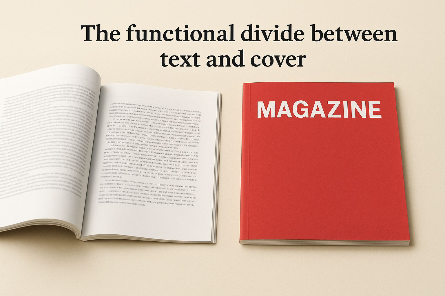
The functional divide between text and cover
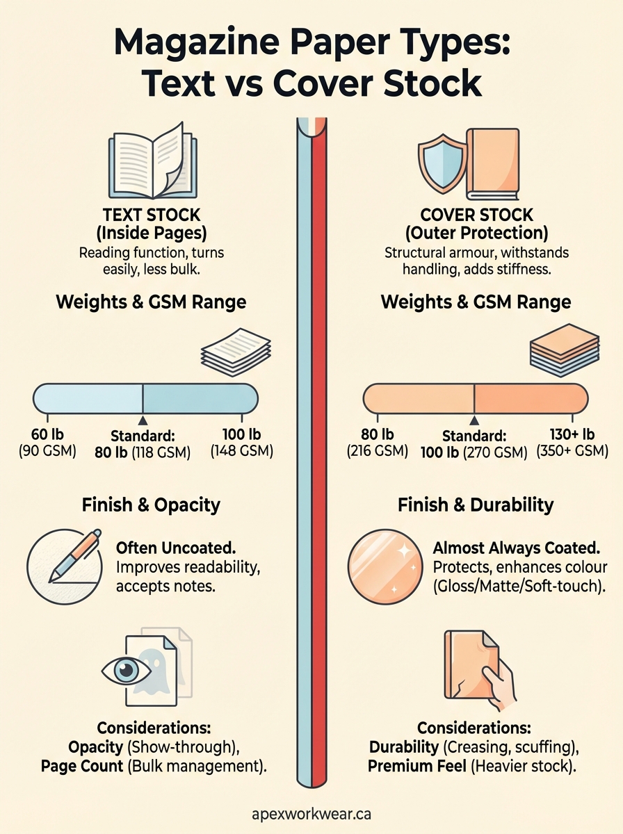
Text stock serves a reading function. You want pages that turn smoothly, don’t add weight, and still deliver clear images and legible type. Cover stock, by contrast, acts as structural armour. It takes the wear from fingers, bags, and surfaces, which means it needs extra thickness and often a protective coating. This is why magazine paper types (text vs cover) aren’t interchangeable, they’re engineered for different jobs in the same product.
Choosing the wrong stock for the wrong application wastes money and creates a poor user experience.
The weight difference between text and cover isn’t arbitrary. Text stock typically ranges from 60 to 100 lb (90 to 148 GSM), keeping your page count manageable without sacrificing print quality. Cover stock starts where text stock ends, usually between 80 and 130 lb (216 to 350 GSM), giving you the rigidity and durability that protect everything inside. If you use text stock for a cover, it bends and scuffs immediately. If you use cover stock for inside pages, your magazine becomes stiff, heavy, and expensive to produce and ship. Understanding this functional split lets you specify exactly what you need for each part of your publication.
Text stock for inside pages
Text stock forms the body of your magazine, where readers spend most of their time. You need paper that turns easily without adding excessive weight or bulk, while still reproducing images and text with clarity. Most printers offer text stock in weights between 60 lb and 100 lb (90 to 148 GSM), and your choice depends on page count, image density, and budget. Understanding magazine paper types (text vs cover) starts here, with the stock that carries your content.
Standard weights and GSM ranges
The most common text stock for magazines sits at 80 lb (118 GSM), which balances printability with handling. If you’re producing a glossy lifestyle magazine with heavy photography, you might step up to 100 lb text (148 GSM) for richer colour saturation and less show-through. Budget catalogues often use 60 lb or 70 lb text (90 to 104 GSM) to keep costs down when image quality isn’t the priority.
Heavier text stock doesn’t always mean better quality, it means choosing the right weight for your content and reader expectations.
Opacity considerations
Opacity measures how much light passes through the paper, which affects show-through on printed pages. Text stock with low opacity lets you see ghosted images from the reverse side, distracting readers. Look for opacity ratings above 90% for magazines with double-sided colour printing, especially if you’re working with darker backgrounds or full-bleed images.
Cover stock for magazine covers
Cover stock protects your magazine from physical wear while creating the first impression that determines whether someone picks it up. This paper must withstand repeated handling, resist moisture, and support vibrant printing without warping. The distinction between magazine paper types (text vs cover) becomes obvious when you compare the stiffness and durability required for outer protection versus interior readability. Cover stock typically starts at 80 lb (216 GSM) and extends to 130 lb or higher (350+ GSM), giving you the structural integrity text stock simply cannot deliver.
Weight ranges and rigidity
Most commercial magazines use 100 lb cover stock (270 GSM), which provides adequate protection without making the publication feel like a hardback book. Premium publications step up to 130 lb cover stock (350 GSM) for a luxurious feel that signals quality immediately. Budget catalogues may use 80 lb cover (216 GSM), though this lighter option shows creasing and corner damage more quickly with regular handling.
Cover stock below 100 lb saves money upfront but often costs more in reprints when copies arrive damaged or age poorly.
Coating requirements
Cover stock almost always carries coating or lamination because uncoated covers absorb oils from hands, scuff easily, and fade faster under light exposure. You’ll typically choose between gloss, matte, or soft-touch finishes that add both visual appeal and functional protection to the printed surface.
How to choose weights, GSM, and thickness
Selecting the right paper specifications requires balancing physical constraints with reader experience and budget. You start by determining your page count, because a 200-page magazine on heavy stock becomes unwieldy and expensive to mail. From there, you match weights to content type and reader expectations. Understanding magazine paper types (text vs cover) guides these decisions, but you still need a framework for choosing specific weights within each category.
Match paper weight to page count
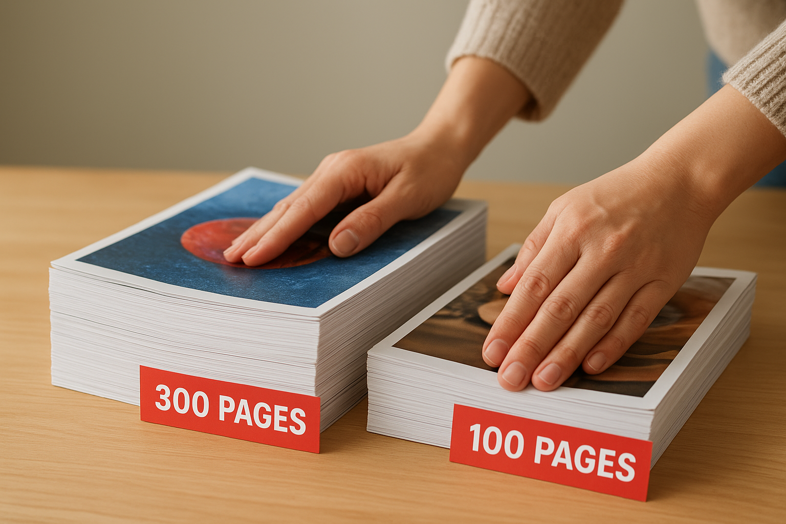
Your magazine’s physical bulk increases with both page count and paper weight. A 100-page publication on 100 lb text stock (148 GSM) remains manageable, but that same stock in a 300-page issue creates a thick, heavy book that readers struggle to handle. For higher page counts, drop to 70 lb or 80 lb text stock (104 to 118 GSM) to keep the spine reasonable and shipping costs down.
Heavier paper doesn’t compensate for poor design or weak content.
Consider reader expectations and handling
Premium lifestyle magazines justify heavier stocks because readers expect substantial feel and durability. Budget catalogues or event programmes prioritise cost efficiency over longevity, so lighter stocks make sense when the publication serves a short-term purpose.
Coatings and finishes for magazine paper
Coating determines how your magazine looks and survives under real-world conditions. The finish you choose affects colour vibrancy, glare, fingerprint resistance, and durability over time. While magazine paper types (text vs cover) dictate structural properties, coatings handle the surface characteristics that readers notice immediately. Most text stock remains uncoated to preserve readability, whilst cover stock almost always carries protection against moisture, scuffing, and UV damage.
Standard coating options
Gloss coating delivers maximum colour saturation and sharp image reproduction, making it ideal for photography-heavy magazines. The reflective surface catches light and draws attention, but shows fingerprints easily and creates glare under direct lighting. Matte coating offers a subdued finish that reduces glare whilst still protecting the paper, though colours appear slightly less vibrant. Soft-touch or velvet coatings provide a premium tactile experience with excellent durability, but add significant cost per unit.
Coating adds protection and visual appeal but changes how readers interact with your printed content.
When to skip coating
Uncoated paper suits text-heavy publications where readability outweighs visual drama. Journals, literary magazines, and business reports often use uncoated stock because it eliminates glare and accepts handwritten notes. This choice works best when your content prioritises information over visual impact.
Next steps for your magazine print
Choosing between magazine paper types (text vs cover) comes down to matching specifications to your publication’s purpose and reader expectations. You now understand the weight ranges, GSM measurements, and coating options that separate functional interior pages from protective outer covers. This knowledge prevents costly specification errors and ensures your printed materials deliver the quality your brand demands.
Before you send files to your printer, confirm your text stock weight suits your page count and image density. Verify that your cover stock provides adequate protection for the handling your magazine will receive. Specify coatings based on visual priorities and durability needs, not assumptions about what looks professional.
When you’re ready to produce catalogues, brochures, or presentation folders for your Canadian business, Apex Workwear provides expert guidance on paper selection alongside fast turnaround times and honest pricing. We help you specify exactly what you need without overspending on unnecessary upgrades.