You need a banner for your next trade show or a poster that stops people in their tracks. You open your design software and realize large format printing is nothing like designing for letter size paper or web screens. Get the resolution wrong and your banner prints blurry. Miss the bleed area and you end up with white borders. Pick the wrong colours and your brand blue prints as purple.
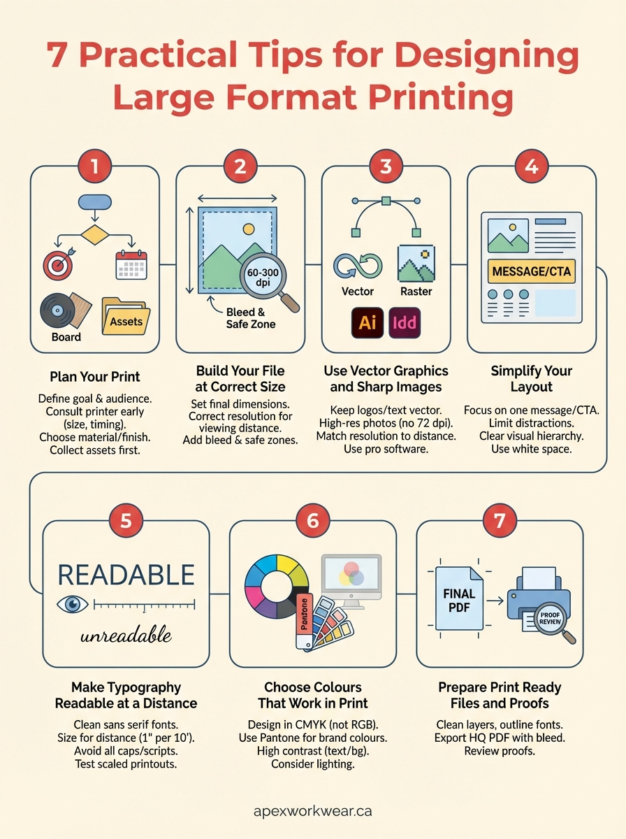
This guide walks you through seven practical steps to design print ready files for banners, posters, signs, and other large format projects. You will learn how to set up your files at the correct scale, choose the right resolution for viewing distance, work with vector graphics, create layouts that communicate instantly, select typography that reads from afar, handle colour modes properly, and deliver files that print exactly as intended. Each tip includes specific specifications and clear actions you can apply to your next project. Whether you are designing your first yard sign or your fiftieth trade show banner, these fundamentals will help you avoid costly mistakes and produce professional results.
1. Plan your print with Apex Workwear
Learning how to design for large format printing starts before you ever open design software. The decisions you make in the planning stage determine whether your finished banner ships on time, fits your budget, and actually delivers the impact you need. Most printing problems stem from unclear goals or missing specifications, not bad design skills.
Clarify your goal and target audience
You need to define what success looks like for your print piece. A trade show banner must grab attention from across a crowded hall, while a retail window poster needs to communicate a promotion clearly to passing foot traffic. Write down where your print will hang, how far away viewers will stand, and what action you want them to take. Your target audience shapes every design choice from colour palette to font size.
Talk to Apex Workwear early about size and timing
Contact Apex Workwear before you start designing to confirm the exact dimensions, bleed requirements, and material options for your project. The team can tell you which banner size works best for your intended location and whether rush production is available for your deadline. This conversation prevents you from designing a file in the wrong dimensions or choosing a material that doesn’t suit outdoor use.
Early consultation saves you from redesigning your entire file because you missed a critical specification.
Choose the right product material and finish
Your choice between vinyl banners, foam boards, coroplast signs, or aluminum affects both durability and visual impact. Vinyl works well for temporary indoor events, while aluminum signs withstand Canadian weather for months. Consider whether you need a matte or gloss finish based on lighting conditions at your display location.

Collect logos brand colours and copy before you design
Gather all vector logos, approved brand colours in CMYK or Pantone, and final copy from stakeholders before you begin layout work. Missing assets force you to pause mid-design and often lead to rushed decisions. Store everything in one folder so you can access high-resolution files instantly as you build your design.
2. Build your file at the correct size
File setup determines whether your design prints correctly or requires expensive adjustments at the last minute. You need to establish the correct dimensions, resolution, and safety margins from the first moment you create your document. This foundation prevents scaling errors and ensures your text and graphics remain crisp at their final printed size.
Set page dimensions to the final print size
Create your design document at the exact dimensions Apex Workwear confirms for your banner, sign, or poster. If your finished piece measures 3 feet by 6 feet, set your page size to 36 inches by 72 inches in your design software. Working at the actual size eliminates confusion about how elements scale and helps you evaluate proportions accurately as you design.
Decide whether to work at full or reduced scale
Large files can overwhelm your computer and slow down your workflow. You can design at a reduced scale such as 25% or 50% of the final size, provided you adjust your resolution accordingly to maintain print quality. A 36-inch by 72-inch banner designed at 25% scale becomes a 9-inch by 18-inch document at four times the resolution. Confirm your scale choice with Apex Workwear to ensure they can process your files correctly.
Choose resolution in dpi for viewing distance
The viewing distance of your print determines the resolution in dots per inch you need. Prints viewed up close require 150 to 300 dpi, while banners viewed from 10 feet or more can use 60 to 100 dpi without visible quality loss. Understanding how to design for large format printing means balancing file size with visual sharpness based on where people will actually see your piece.
Lower resolution for distant viewing keeps your files manageable without sacrificing perceived quality.
Add bleed, trim, and safe zones as Apex Workwear specifies
Extend your background colour or imagery at least 0.25 inches beyond the trim line on all sides to create a bleed area. Keep critical text and logos inside a safe zone at least 0.5 inches from the edge to prevent accidental trimming during finishing. These margins ensure your design prints edge to edge without white borders or cut-off elements.

3. Use vector graphics and sharp images
The difference between a professional large format print and an amateur one often comes down to image quality and file type. You need artwork that scales without losing sharpness and photographs that maintain clarity when printed at massive sizes. Poor image choices lead to pixelated logos, blurry photos, and prints that communicate unprofessionalism instead of credibility.
Keep logos, icons, and text as vector artwork
You must use vector files such as EPS, AI, or SVG formats for all logos, icons, and decorative elements that require sharp edges. Vector graphics use mathematical equations to define shapes, which means they scale infinitely without pixelation or blur. Convert any raster logos to vector format before placing them in your layout, or request vector files directly from your brand team.
Use high-quality images instead of web screenshots
Photographs and raster images need sufficient resolution at their final printed size to avoid visible pixelation. Never pull images from websites, as these files are typically saved at 72 dpi for screen display and will print poorly. Source images from professional stock libraries or shoot your own photos at the highest quality your camera allows.
Low-resolution web images cannot be fixed after the fact, no matter which design tricks you apply.
Match image resolution to final size and distance
Calculate the minimum resolution your photos need based on viewing distance. Images viewed from 10 feet or more can work at 60 to 100 dpi, while closer viewing requires 150 to 300 dpi. Knowing how to design for large format printing includes right-sizing your images so they remain sharp without creating unnecessarily large files.
Use design software that supports large format work
Professional tools like Adobe Illustrator and InDesign handle large dimensions and high-resolution files more efficiently than basic programs. These applications also support CMYK colour modes, vector editing, and proper bleed setup, making them essential for production-ready artwork.
4. Simplify your layout for instant impact
People glance at large format prints for just seconds, not minutes, so your design must communicate its core message instantly. Complex layouts with multiple competing elements confuse viewers and dilute your impact. Understanding how to design for large format printing means stripping away every unnecessary detail until only the essential message remains.
Focus on one primary message and call to action
You should identify the single most important message your print needs to deliver and design everything else to support that message. A banner promoting a sale needs the discount percentage and expiry date front and centre, not buried among product images and brand history. Your call to action must tell viewers exactly what to do next, whether that’s visiting a website, scanning a QR code, or stopping at your booth.
Limit extra elements that distract from the message
Remove decorative graphics, stock photos, and secondary information that don’t directly support your primary goal. Each additional element competes for attention and weakens the overall impact of your design. Ask yourself whether each logo, image, or text block actively helps viewers understand your message or simply fills space.
Build a clear visual hierarchy with size and contrast
Your most important element should be the largest and boldest item on your print, followed by secondary information in descending order of importance. Use high contrast between your headline and background to ensure readability from a distance. Size differences create natural reading patterns that guide viewers through your content.
Visual hierarchy tells viewers where to look first without requiring conscious thought.
Use white space to separate sections and improve clarity
White space prevents your design from feeling cluttered and helps viewers process information quickly. You need generous margins around headlines, adequate spacing between text blocks, and breathing room around your call to action. Crowded layouts force viewers to work harder to extract meaning, which they simply won’t do when passing a banner at walking speed.
5. Make your typography readable at a distance
Your text must communicate clearly from the viewing distance where people will actually see your banner or poster. Typography that works perfectly on a business card fails completely when scaled to large format sizes viewed from metres away. Poor font choices force viewers to squint or move closer, which most people simply won’t do when passing your print.
Pick clean sans serif fonts for headlines and copy
You need sans serif typefaces like Arial, Helvetica, or Open Sans for maximum readability on large format prints. These fonts maintain clarity at any size because their simple letterforms lack decorative elements that blur together from a distance. Serif fonts work for print publications read up close but create visual noise on banners viewed from several metres away.
Size text so it reads from typical viewing distance
Calculate your minimum text size based on where viewers will stand relative to your print. A general rule suggests one inch of letter height for every ten feet of viewing distance, meaning a banner viewed from 20 feet needs two-inch tall letters. Understanding how to design for large format printing includes right-sizing your typography so every viewer can read your message effortlessly.
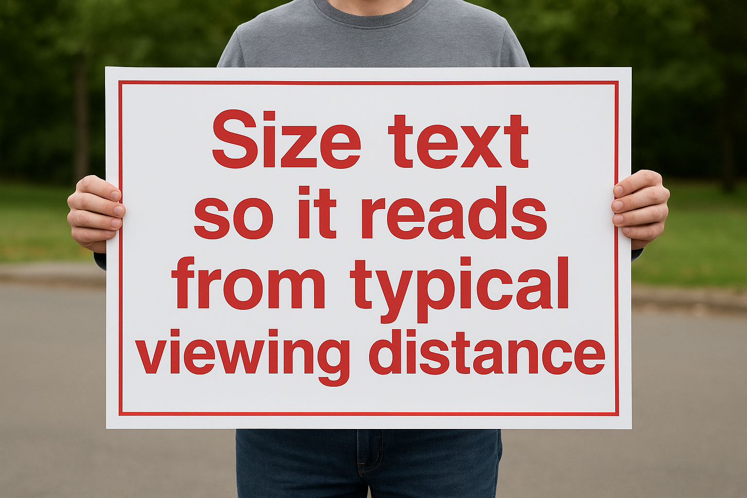
Text sized for arm’s length reading becomes invisible when viewed from across a room or street.
Avoid all caps, scripts, and ultra thin font styles
All capitals reduce reading speed because words lose their distinctive shapes, making them harder to process quickly. Script and decorative fonts introduce unnecessary complexity that disappears at distance. Ultra-thin or ultra-light font weights lack sufficient contrast against backgrounds and vanish in bright lighting conditions.
Test legibility with scaled printouts on standard paper
Print your design at a reduced scale on regular paper and view it from the proportional distance to simulate how your finished piece will appear. A design printed at 10% scale viewed from two feet approximates a full-size banner viewed from 20 feet. This simple test reveals readability problems before you commit to expensive production.
6. Choose colours that work in print
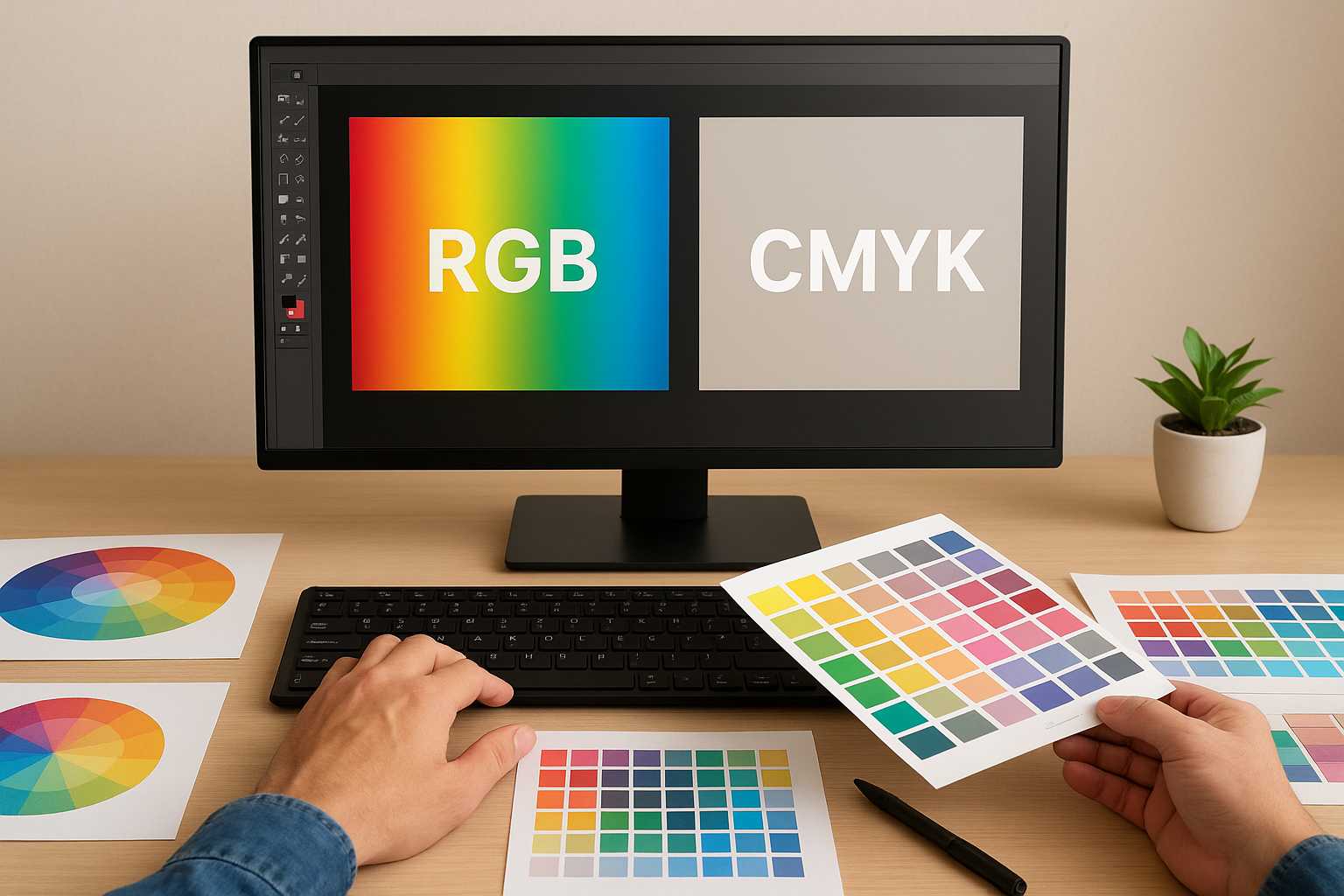
Your screen displays colours using light-based RGB values, while printers reproduce colours using ink-based CMYK pigments. This fundamental difference causes bright colours you see on your monitor to shift, dull, or change completely when printed. Colours that look vibrant on screen often translate to muddy or inaccurate prints unless you design with print processes in mind from the start.
Design in CMYK rather than RGB from the start
You must set your colour mode to CMYK in your design software before you place any colours, images, or graphics. Designing in RGB and converting later produces unpredictable shifts that can turn your brand blue into purple or your vibrant red into brown. CMYK mode shows you a closer approximation of how your colours will actually print, though your screen can never perfectly replicate printed ink.
Use Pantone for critical brand and spot colours
Pantone colours give you consistent, predictable results for brand colours that must match exactly across all printed materials. Specify Pantone Matching System numbers directly to Apex Workwear for logos and brand elements rather than relying on CMYK approximations. This precision matters when your brand identity depends on exact colour reproduction.
Pantone colours eliminate guesswork and ensure your brand maintains consistency across every print piece.
Increase contrast between text and background areas
Strong contrast between text and background ensures readability from the viewing distances typical of large format printing. Light text on light backgrounds or dark on dark creates strain that viewers won’t tolerate. Test your colour combinations by converting your design to greyscale to verify sufficient tonal separation exists.
Consider lighting conditions in the final location
Your print will appear different under indoor fluorescent lights versus outdoor natural sunlight. Colours shift dramatically based on ambient lighting, with some hues washing out completely in bright conditions. Think about where your banner or sign will hang and adjust your colour saturation accordingly to maintain impact in those specific lighting conditions.
7. Prepare print ready files and proofs
Your design work ends when you deliver files that print correctly without corrections or delays. Understanding how to design for large format printing includes mastering the technical steps that transform your creative work into production-ready artwork. Skipping file preparation leads to failed print runs, colour shifts, missing fonts, and broken images that force expensive reprints or missed deadlines.
Clean up layers and remove unused elements
You need to delete hidden layers, unused colour swatches, and placeholder elements before finalizing your file. These remnants increase file size, slow down processing, and sometimes cause unexpected printing errors. Flatten any effects or transparency that might render differently on the printer’s system.
Embed or outline fonts and relink missing images
Convert all text to outlines or curves to prevent font substitution errors when Apex Workwear opens your files. This step locks your typography exactly as you designed it. Verify that all placed images link correctly to their high-resolution source files and embed them directly into your document if your design software supports it.
Export a high-quality PDF with bleed included
Save your final design as a PDF file with crop marks and bleed set to the specifications Apex Workwear provided. Choose the highest quality export settings to preserve image clarity and colour accuracy. Your PDF should include all fonts, images, and bleed areas in a single file ready for production.
Production-ready PDFs eliminate technical issues that delay printing and increase costs.
Review digital or hard proofs with Apex Workwear
Request a digital proof or hard copy sample before approving the full production run. Check colours, text accuracy, image placement, and overall layout against your original design. This final review catches problems while you can still make corrections at minimal cost.
Bringing it all together
You now have a complete framework for producing professional large format prints that communicate clearly and print correctly the first time. These seven steps cover everything from initial planning through final file delivery, giving you the technical specifications and design principles needed to avoid the most common mistakes. Learning how to design for large format printing transforms your approach from guesswork into predictable, repeatable success.
Your next banner, poster, or sign starts with the choices you make before opening design software. Planning with the right team eliminates confusion about dimensions, materials, and deadlines. Building files at correct specifications, using appropriate graphics and colours, and preparing production-ready artwork ensures your vision translates accurately from screen to finished print.
Apex Workwear produces high-quality large format prints with fast turnaround times and expert guidance throughout the process. Contact the team today to discuss your project requirements and receive a free quote within 24 hours.