Most business cards follow the same horizontal layout. They work fine, but they rarely stand out. Vertical business cards flip the format on its side, literally, and that simple change creates a first impression that actually sticks. Whether you’re a contractor handing one out on a job site or a creative agency pitching a new client, orientation matters more than most people think.
But going vertical isn’t just about turning a rectangle 90 degrees. You need to think about standard sizing, how your text and logo sit within the layout, and whether your design holds up once it’s printed on quality card stock. Get those details wrong and the card looks off. Get them right and you’ve got something people keep.
This guide breaks down everything you need to know, from dimensions and design tips to finishing options and print-ready file setup. And when you’re ready to order, Apex Workwear prints business cards right here in Canada with no minimums, free digital proofs, and free shipping across the GTA.
What makes vertical business cards different
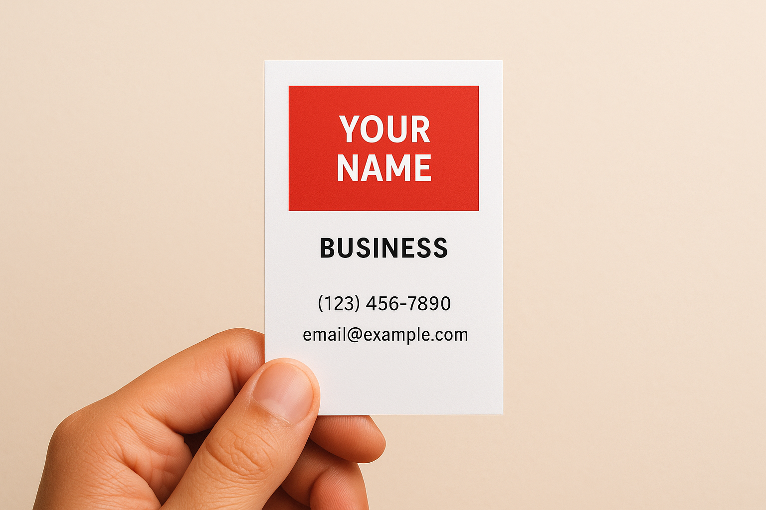
A standard horizontal card follows the way most people read, left to right across a wide rectangle. Vertical business cards break that pattern by presenting your information in a taller, narrower format. That shift changes how someone picks up the card, how they look at it, and what they notice first. It’s a small mechanical difference with a real psychological effect.
The visual impact of a portrait layout
When someone receives a vertical card, the eye naturally travels downward instead of across. That means your most important element, whether that’s your logo, name, or a bold visual, lands at the top and commands attention before anything else. The rest of your details follow in a natural downward reading path, which feels intentional rather than crammed.
This layout also creates a stronger sense of hierarchy. Designers find it easier to separate contact details, job titles, and branding when working within a vertical space, because each element gets its own horizontal band. The result is a card that looks organised and considered, not stuffed.
A well-structured vertical card tells people you paid attention to how they’ll actually read it, not just what you wanted to put on it.
How the reading direction changes the experience
Horizontal cards sit comfortably in a standard cardholder’s slot because most holders are designed for landscape orientation. Vertical cards stand out in a stack precisely because they don’t conform to that default. When someone flips through a pile of cards, yours requires a moment of adjustment, and that moment is exactly when they pause and look more closely.
Physical handling plays a role too. People tend to hold portrait-orientation cards with two hands, similar to how they’d hold a phone, which makes the interaction feel slightly more deliberate. That subtle difference in how someone holds your card can make the whole exchange feel more personal.
When vertical cards make the most sense
Not every industry or individual benefits equally from a vertical format. Creative professionals, photographers, tattoo artists, and personal trainers often find that a vertical layout reflects their brand personality better than a conventional horizontal one. It signals that they’ve made deliberate choices, which is exactly the impression a creative or personal service brand wants to make.
Contractors and tradespeople also benefit, particularly when they want to include a QR code, a small portfolio image, or a service list alongside their contact details. Vertical space gives those elements room without making the card look cluttered. If your information is more visual than text-heavy, a portrait layout gives you the structure to carry it off cleanly.
Vertical business card sizes in Canada
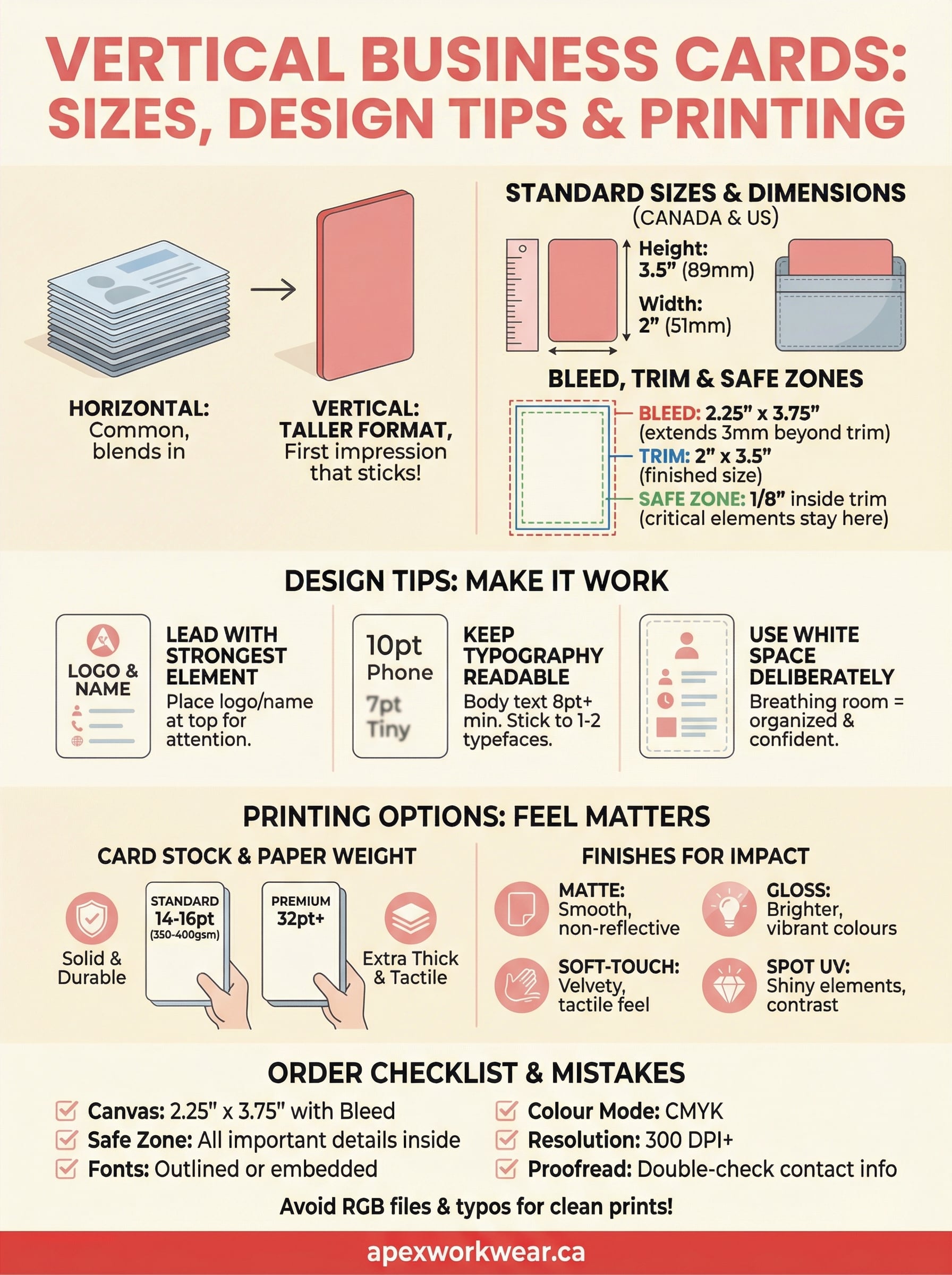
The standard business card size in Canada is 3.5 inches wide by 2 inches tall, which is roughly 89mm x 51mm. When you flip that to a portrait layout, your card becomes 2 inches wide by 3.5 inches tall. That’s the dimension your printer needs, and it’s the format most cardholders and wallets are built to accommodate, even in a vertical orientation.
Standard vertical card dimensions
Canadian printers follow the same North American standard that applies across the US and most of the English-speaking world. Your vertical business card measures 2" x 3.5", which converts to approximately 51mm x 89mm in metric. That dimension fits comfortably in a standard wallet slot or card case, which means you get the visual advantage of a portrait layout without any practical trade-off in how people carry or store the card.
| Measurement | Width | Height |
|---|---|---|
| Inches | 2" | 3.5" |
| Millimetres | 51mm | 89mm |
The dimensions don’t change when you go vertical, only the orientation does. Your card still fits everywhere a standard card does.
Bleed, trim, and safe zones
Before you send your file to print, you need to understand three measurements that affect the finished result. Bleed extends your background colour or edge design 1/8 inch (3mm) beyond the trim line on all sides, so there are no white edges if the cut runs slightly off. Trim is the actual finished size of your card once it has been cut. The safe zone sits 1/8 inch inside the trim line, and all of your text, logos, and contact details must stay within it.
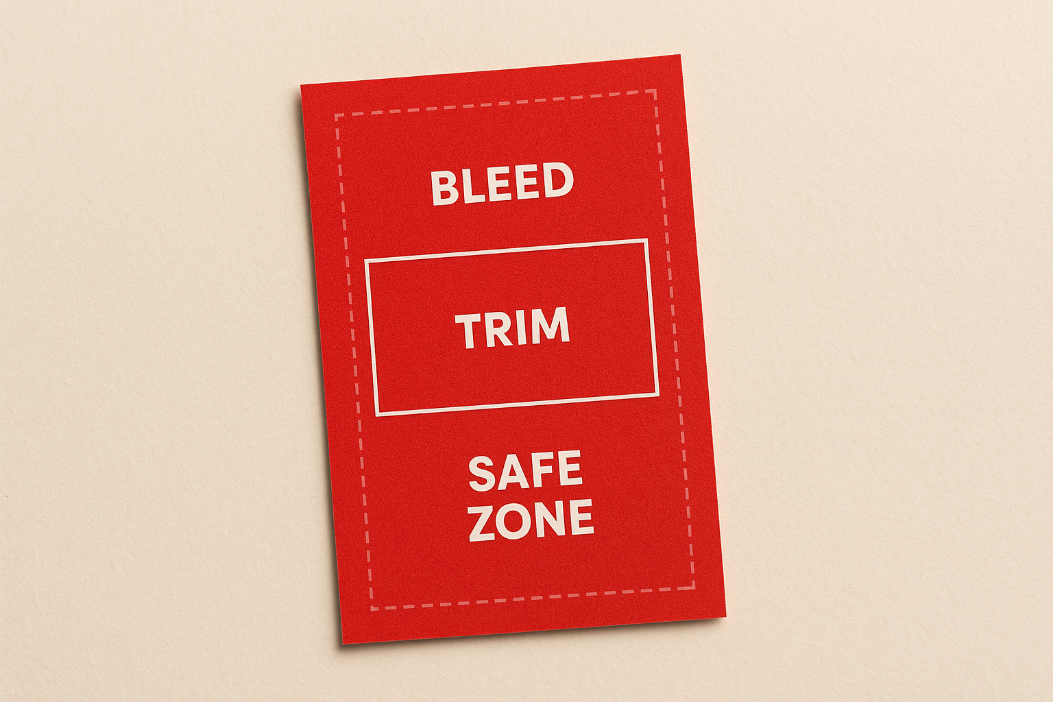
For a vertical card, your design file should be 2.25" x 3.75" with bleed included. Keep all critical information at least 3mm from the trim edge to avoid anything important getting clipped during production. If your printer provides a template, use it. If not, set up those guides manually before you place a single element on the canvas.
How to design a vertical business card that works
Designing for a vertical layout follows different rules than a horizontal one. The taller format rewards clear hierarchy and intentional spacing, but it also punishes clutter more visibly than a wider card does. Before you place any element on the canvas, decide what you want people to notice first, second, and third. That reading order should drive every design decision you make from start to finish.
Lead with your strongest element
Your logo or name belongs at the top of the card, where the eye lands first in a portrait layout. Place it in the upper third, give it room to breathe, and resist the urge to fill the remaining space with too much else. A clear focal point at the top makes vertical business cards feel polished, not accidental.
Keep your typography readable
Font size matters more in a narrow layout. Body text should sit at a minimum of 8pt, though 9pt or 10pt is safer for contact details like phone numbers and email addresses. Stick to one or two typefaces at most to keep the card looking clean and controlled. Mixing three or more fonts in a small space creates visual noise that pulls attention away from what matters.
If someone has to squint to read your card, they won’t call you.
Align your text consistently throughout the design, either all left-aligned or centred, not a combination of both. Inconsistent alignment breaks the visual flow that makes a well-designed card easy to scan at a glance.
Use white space deliberately
White space is not wasted space. Leaving breathing room around your contact details, logo, and tagline makes each element easier to read and the overall card feel more considered. Cramming information into every available millimetre signals a lack of confidence in the design. Trust the layout, keep it clean, and let the card do its job without competing with itself.
Printing options: paper, finishes, and durability
The design gets people to look. The paper stock and finish are what people feel the moment they pick your card up, and that physical experience shapes how they judge your professionalism. Choosing the right print specification matters as much as the layout itself, so it pays to understand what your options actually are before you place your order.
Card stock and paper weight
Paper weight is measured in pounds (lb) or grams per square metre (gsm). Most quality business cards use stock between 14pt and 16pt, which sits at roughly 350gsm to 400gsm. Anything below that starts to feel flimsy, and a card that bends easily sends exactly the wrong message. For vertical business cards, a heavier stock works especially well because the narrower width means the card needs that extra rigidity to hold its shape when someone picks it up by the edge.
A card that feels solid in the hand signals that you take your business seriously, before the person has even read a word.
If you want an even more substantial feel, ask about premium or extra-thick card options, which typically run at 32pt or higher and are increasingly available through Canadian printers. These premium stocks are noticeably heavier and create a genuinely tactile impression that standard cards cannot match.
Finishes that protect and impress
Your finish choice affects both appearance and durability. Matte laminate gives you a smooth, non-reflective surface that reads as understated and modern. It also resists fingerprints well, which keeps the card looking clean after multiple handoffs. Gloss laminate delivers a brighter, more polished look that makes colours and photography pop, though it does show fingerprints more readily.
Soft-touch laminate sits between the two and has become increasingly popular for premium cards because it provides a velvety, tactile feel that standard laminate cannot replicate. Spot UV coating adds a layer of gloss to specific design elements, such as your logo or name, creating a contrast between matte and shiny surfaces that draws the eye exactly where you want it.
Order checklist and common mistakes to avoid
Getting your vertical business cards printed correctly the first time saves you both time and money. Before you approve any proof, run through a quick set of checks on your file. Small oversights at the design stage become permanent once the cards are cut, and reprints are an avoidable expense that catches far more people than it should.
Before you send your file
Review every detail in your design before you submit it for production. Fonts must be embedded or converted to outlines so your printer’s software reads them exactly as you intended. Check your file resolution too: images should sit at a minimum of 300 DPI at the final print size. Anything lower will look blurry in print, and that problem does not always show up clearly when you preview the file on screen.
Use this checklist before you click submit:
- Canvas size is 2.25" x 3.75" with bleed included
- All text and logos sit at least 3mm inside the trim line
- Fonts are outlined or embedded
- Colour mode is set to CMYK, not RGB
- Resolution is 300 DPI or higher
- Contact details have been proofread at least twice
Mistakes that cost you a reprint
The most common mistake is submitting files in RGB colour mode instead of CMYK. Screens display RGB, but printing uses CMYK, and the colour shift between the two can be significant. Reds often turn orange, and blues go flat. Always convert your colour mode before sending the file.
Check your proof on a calibrated monitor if possible, because a screen set too bright will hide colour problems that show up clearly on the finished card.
Forgetting to proofread contact details is the second most expensive mistake you can make. A single wrong digit in a phone number or a typo in an email address makes the entire print run useless. Read every character out loud before you approve the final proof, and ask someone else to check it too.
Key takeaways
Vertical business cards give you a format that stands out in any stack, and that advantage only holds if the execution is solid. Your dimensions, design hierarchy, and print specifications all need to work together. Keep your canvas at 2.25" x 3.75" with bleed, place your strongest element at the top, stick to readable font sizes, and choose a card stock heavy enough to hold its shape in someone’s hand.
Your finish and paper weight shape how people perceive you before they read a single word, so treat those choices as seriously as you treat the design itself. Running through a pre-submission checklist saves you from reprints caused by RGB colour modes, low-resolution images, or typos in your contact details. Every detail counts at this size.
When you’re ready to print, order your business cards from Apex Workwear and get Canada-based production, free digital proofs, and no minimum order requirements.