A well-designed product catalogue can do serious heavy lifting for your business, but only if the printed result matches what you had in mind. Knowing how to prepare a catalog for print saves you from costly reprints, washed-out colours, and that sinking feeling when a box of catalogues arrives looking nothing like your screen proof. Whether you’re showcasing a seasonal product line or building a comprehensive sales tool for your team, the preparation stage is where quality is won or lost.
This guide walks you through the full process, from setting up your layout and choosing the right paper stock to exporting files that your printer can actually work with. We’ll cover bleed, resolution, colour modes, binding options, and the small details that separate a sharp, professional catalogue from a DIY disaster. Every step is practical and based on real production knowledge, the same standards we follow at Apex Workwear when producing print materials for businesses across Canada.
If you’re a small business owner, startup, or creative agency getting ready to send a catalogue to press, this is your pre-flight checklist. Follow it, and you’ll hand off files that are print-ready from the start, no back-and-forth, no surprises.
Print prep basics and printer requirements
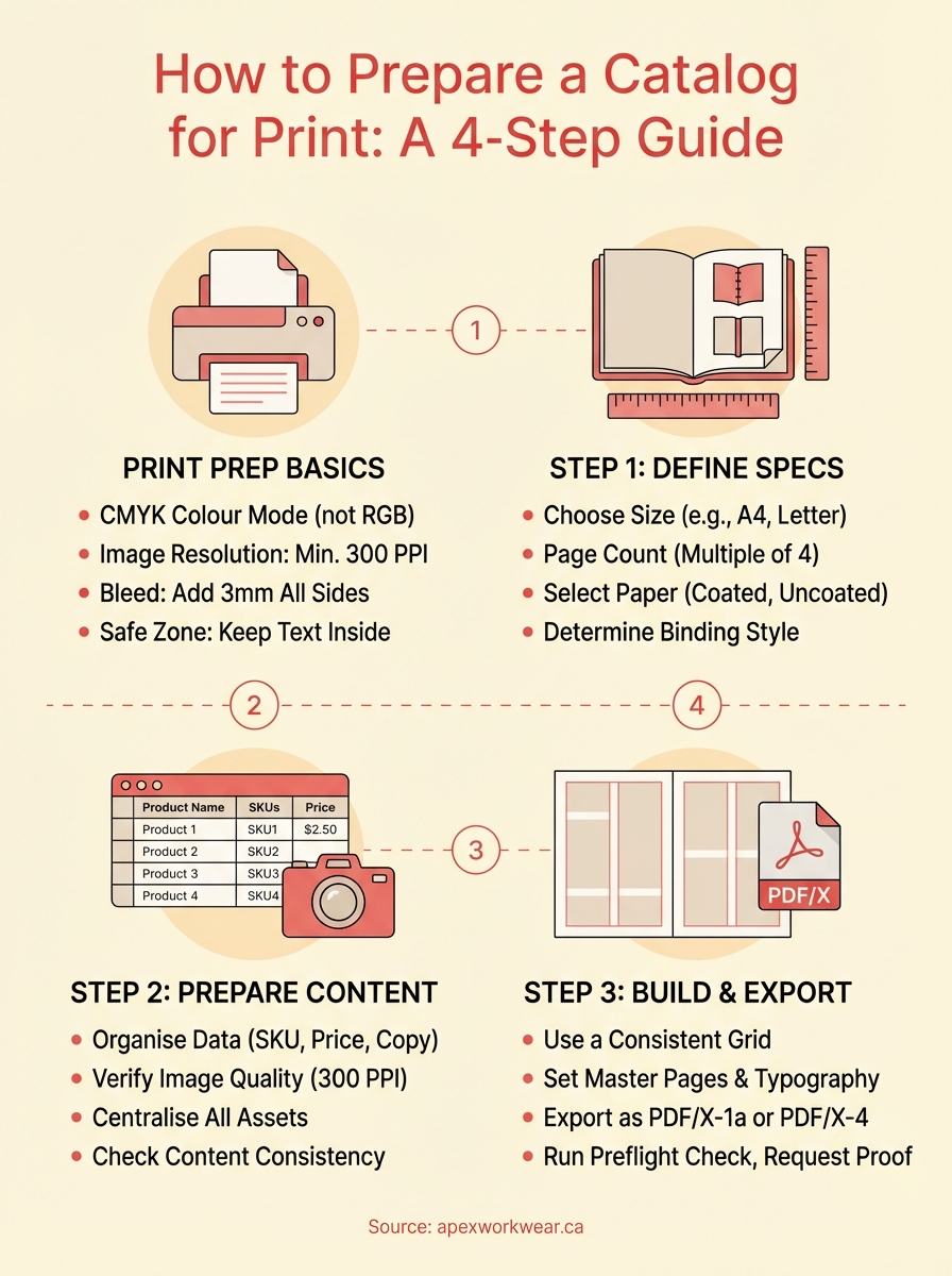
Before you touch a layout tool, you need to understand what your printer actually requires. Most file rejections happen not because of bad design, but because the colour mode, resolution, or bleed settings didn’t match what the press expects. Getting these basics right is the foundation of knowing how to prepare a catalog for print, and it saves you from redoing work after a printer sends your files back.
Colour mode and image resolution
Your screen displays colour using RGB (red, green, blue), but printing presses use CMYK (cyan, magenta, yellow, black). If you build your catalogue in RGB and export without converting, colours shift, sometimes dramatically. Blues can go purple, bright reds can dull. Set your document to CMYK before you start, not at the end.
Image resolution is equally critical. Screen images sit at 72 PPI, which looks fine on a monitor but prints soft and blurry on paper. For sharp print output, every image in your catalogue needs to be at least 300 PPI at its final printed size. If you scale a 300 PPI image up 200%, it effectively drops to 150 PPI, which is too low.
A quick rule: always source or shoot images at a higher resolution than you think you need, because you can scale down but you cannot scale up without losing quality.
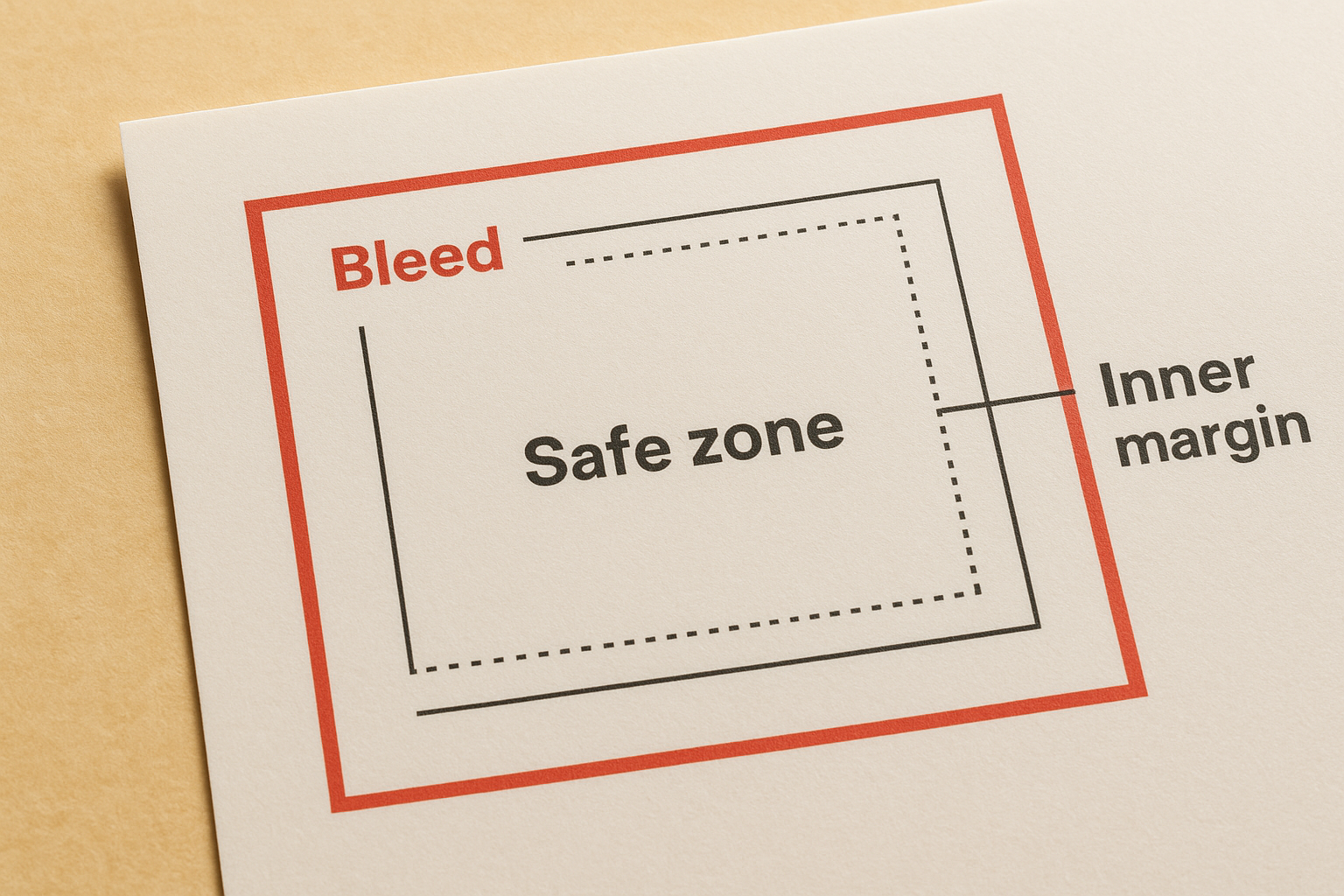
Bleed, safe zone, and margins
Bleed is the extra artwork that extends beyond the trim edge of your page. It exists because cutting machines aren’t perfectly precise, and without bleed you end up with thin white lines along edges. Your safe zone, where all critical content like text and logos must sit, keeps important elements away from accidental cropping. Here are the standard settings most Canadian print shops require:
| Zone | Recommended distance |
|---|---|
| Bleed (beyond trim) | 3 mm all sides |
| Safe zone (inside trim) | 3-5 mm all sides |
| Inner margin (binding side) | 10-15 mm |
Step 1. Choose size, pages, paper, and binding
Your physical format choices shape everything else in your catalogue, from how your layout grid works to what binding method is even possible. Lock in your size, page count, paper weight, and binding style before you open any design software, because changing these later can force you to rebuild your entire document.
Size and page count
The most common catalogue sizes in North America are 5.5 x 8.5 inches (digest), 8.5 x 11 inches (letter), and 8.5 x 14 inches (legal). Letter size works well for most product catalogues because it’s familiar and easy to display. Your page count must always be a multiple of four when saddle-stitching, since pages fold in sets of four. A 10-page catalogue isn’t printable without a blank page or a format change.
Paper and binding
Paper weight and finish affect how professional your catalogue feels in someone’s hands. Coated gloss stock (100 lb text) suits product photography, while uncoated matte stock reads better for text-heavy pages. For binding, saddle-stitching works well for catalogues under 64 pages, while perfect binding suits thicker volumes and gives a clean spine for shelf display.
Choose your binding method before finalising your page count, as this directly affects your inner margin requirements.
Step 2. Prepare product data, copy, and images
Your content quality determines whether your catalogue converts browsers into buyers. Before you drop anything into your layout, gather and finalise all product data, copy, and images in one place. Making changes after you’ve built pages is slow and error-prone, which is why this step is one of the most important parts of knowing how to prepare a catalog for print.
Organise your product content
Build a simple spreadsheet that captures every product name, SKU, price, and description before you open your design software. This becomes your single source of truth during layout and prevents inconsistencies across pages.
| Column | What to include |
|---|---|
| Product name | Full and short version |
| SKU / code | As it appears in your system |
| Price | Including any bulk pricing tiers |
| Description | 20-40 word copy block |
| Image filename | Linked to your asset folder |
Source and check your images
Every product image must be at least 300 PPI at its final printed size and saved in CMYK colour mode before you place it. Reject any image that looks sharp on screen but falls below that threshold, because soft, blurry product photos undermine credibility faster than any other print issue.
Run a resolution check on every image before placing it in your layout, not after you’ve spent hours building pages.
Step 3. Build a print-safe layout
Your layout is where design decisions become print decisions. Every spacing choice, font size, and colour value you make here either helps or hinders the final result. Knowing how to prepare a catalog for print means building your pages with the press in mind, not just your screen.
Set up your grid and typography
A consistent column grid keeps your catalogue readable and professional across every spread. Use a 2- or 3-column grid depending on your product density, and keep all text at least 3-5 mm inside the safe zone to avoid cropping. Set your body copy at 9-11 pt, and never drop below 7 pt for any printed text.
Avoid fonts with very thin strokes at small sizes, as fine details drop out on press and make text hard to read.
Structure your pages consistently
Product pages should follow a repeatable template to keep your catalogue consistent and fast to build. Set this up as a master page in your design software before you start individual spreads, and lock all non-changing elements like headers, page numbers, and footers so they don’t shift accidentally.
| Zone | Content |
|---|---|
| Top or left | Product image (min 300 PPI) |
| Centre | Product name in headline style |
| Below name | Short description (20-40 words) |
| Bottom or right | Price and SKU |
Step 4. Export, preflight, and proof your files
Exporting incorrectly is one of the most common ways a well-built catalogue falls apart at the final stage. When learning how to prepare a catalog for print, treat your export settings and preflight check as seriously as any design decision. A wrong export setting can strip your bleed, shift colours, or compress images past the point of usability.
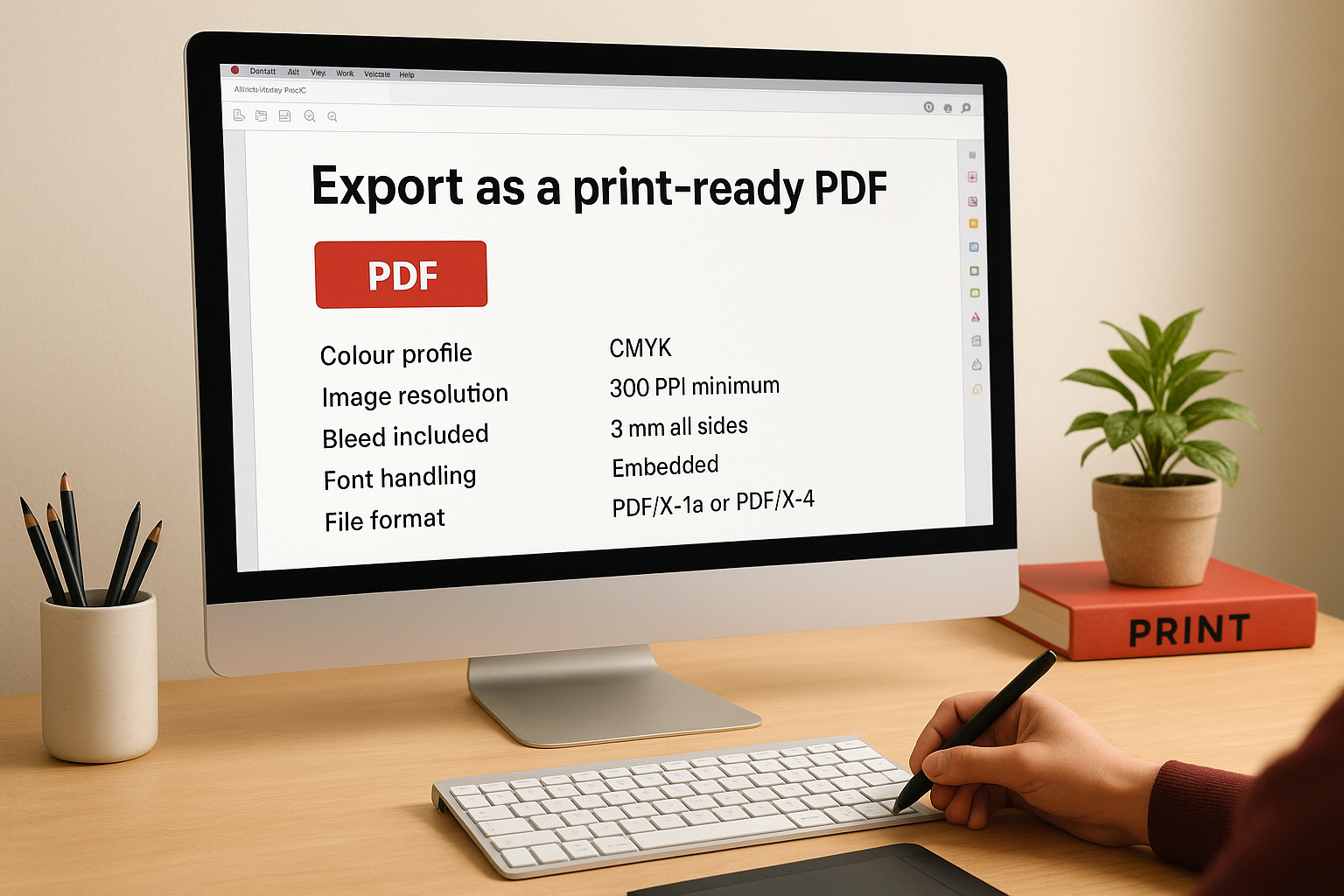
Export as a print-ready PDF
Your printer needs a PDF/X-1a or PDF/X-4 file, not a standard screen PDF. When exporting from InDesign or Illustrator, select the "Press Quality" PDF/X preset, confirm bleed marks are set to 3 mm on all sides, and embed all fonts. Never compress images below 300 PPI during export.
| Export setting | Correct value |
|---|---|
| Colour profile | CMYK |
| Image resolution | 300 PPI minimum |
| Bleed included | 3 mm all sides |
| Font handling | Embedded |
| File format | PDF/X-1a or PDF/X-4 |
Run a preflight check and request a proof
Preflight tools built into InDesign or Acrobat Pro flag missing images, RGB elements, and fonts that failed to embed before anything goes to press. Fix every flagged issue before submitting your file.
Once your file is submitted, always request a digital proof from your printer and review it on a calibrated monitor before approving. Check text sharpness, image clarity, and colour accuracy against your original document.
Never approve a proof on a phone screen, as colour rendering on mobile displays varies too much for an accurate review.
Next steps
You now have a complete, practical framework for how to prepare a catalog for print, from setting your document to CMYK before you start, to running a preflight check before you submit. Follow the steps in order, lock in your size, paper, and binding first, then build your content, layout, and export settings around those decisions. That sequence prevents the most common and costly mistakes.
Print quality comes down to preparation, not luck. Every hour you spend checking resolution, bleed, and export settings before you submit saves you from reprints, delays, and the cost of starting over. Review your completed PDF on a calibrated monitor, fix every preflight flag, and only approve the proof when you’re confident it matches your original.
When you’re ready to send your catalogue to press, the team at Apex Workwear can review your files, answer questions about specs, and get your order moving fast with no minimum requirements and free local shipping across the GTA.