A well-designed product catalogue does something your website can’t, it sits on a desk, gets passed around a meeting, and stays in someone’s hands long after a browser tab closes. But getting from a blank page to a print-ready file takes more than good photos and a logo. Product catalog design for printing demands careful planning around layout, typography, colour accuracy, and file preparation, all before ink ever hits paper. Skip a step, and you risk costly reprints or a final product that doesn’t represent your brand the way it should.
Whether you’re showcasing a seasonal product line, building a wholesale catalogue, or putting together a leave-behind for trade shows, the process follows a clear structure. You need to nail your layout grid, choose the right paper stock, set up bleeds correctly, and export files that your printer can actually work with. This guide walks you through each stage from concept to print-ready PDF, so nothing gets lost along the way.
At Apex Workwear, we print catalogues, brochures, and a full range of business materials right here in Canada, with expert design review on every order and digital proofs before anything goes to press. So if you’re planning a catalogue run, you’re in the right place. Let’s break down exactly how to design one that looks sharp, reads well, and prints cleanly.
What "print-ready" catalog design means
"Print-ready" is the term printers use when your file arrives with everything they need to run the job without going back to you. It means your design file meets a specific set of technical standards: correct colour mode, sufficient image resolution, proper bleed and margins, and embedded or outlined fonts. When any of these elements are missing or wrong, the printer has to stop, contact you, and wait. That delay costs time, and fixing files at the last minute often introduces new errors.
Understanding what print-ready means is the foundation of any solid product catalog design for printing project. You can have stunning photography and a clean layout, but if your file exports at 72 DPI or uses RGB colours instead of CMYK, the printed result will look nothing like what you saw on screen. Printers work with physical ink on physical paper, and the rules that govern how that ink behaves are different from the rules that govern how pixels appear on a monitor.
The technical specs printers actually need
Most commercial printers will give you a spec sheet when you request a quote, and it will contain the same core requirements every time. Your file needs to be set up at the correct final trim size, with a bleed of at least 3mm (roughly 1/8 inch) on all sides that will be cut. It also needs to include a safe zone, typically 3 to 5mm inside the trim line, where you keep all text and critical elements so they don’t get cropped during cutting.
If your printer doesn’t provide a spec sheet upfront, ask for one before you open your design software. Building a file around the wrong dimensions wastes hours.
Fonts are another common problem. If your fonts aren’t embedded or converted to outlines before export, your printer’s system will substitute a default font, and your headings will come out looking completely different. The same applies to linked image files: if you place a low-resolution image in your layout and forget to swap in the high-resolution version, that blurry photo goes to press.
Colour mode, resolution, and bleed explained
Your monitor displays colour using RGB (red, green, blue) light, which produces a much wider range of visible colour than ink can replicate. Commercial printing uses CMYK (cyan, magenta, yellow, black) inks, and when you convert an RGB file to CMYK at the end of a project, colours often shift significantly, especially bright blues and vivid oranges. The fix is straightforward: set your document to CMYK from the moment you create the file.
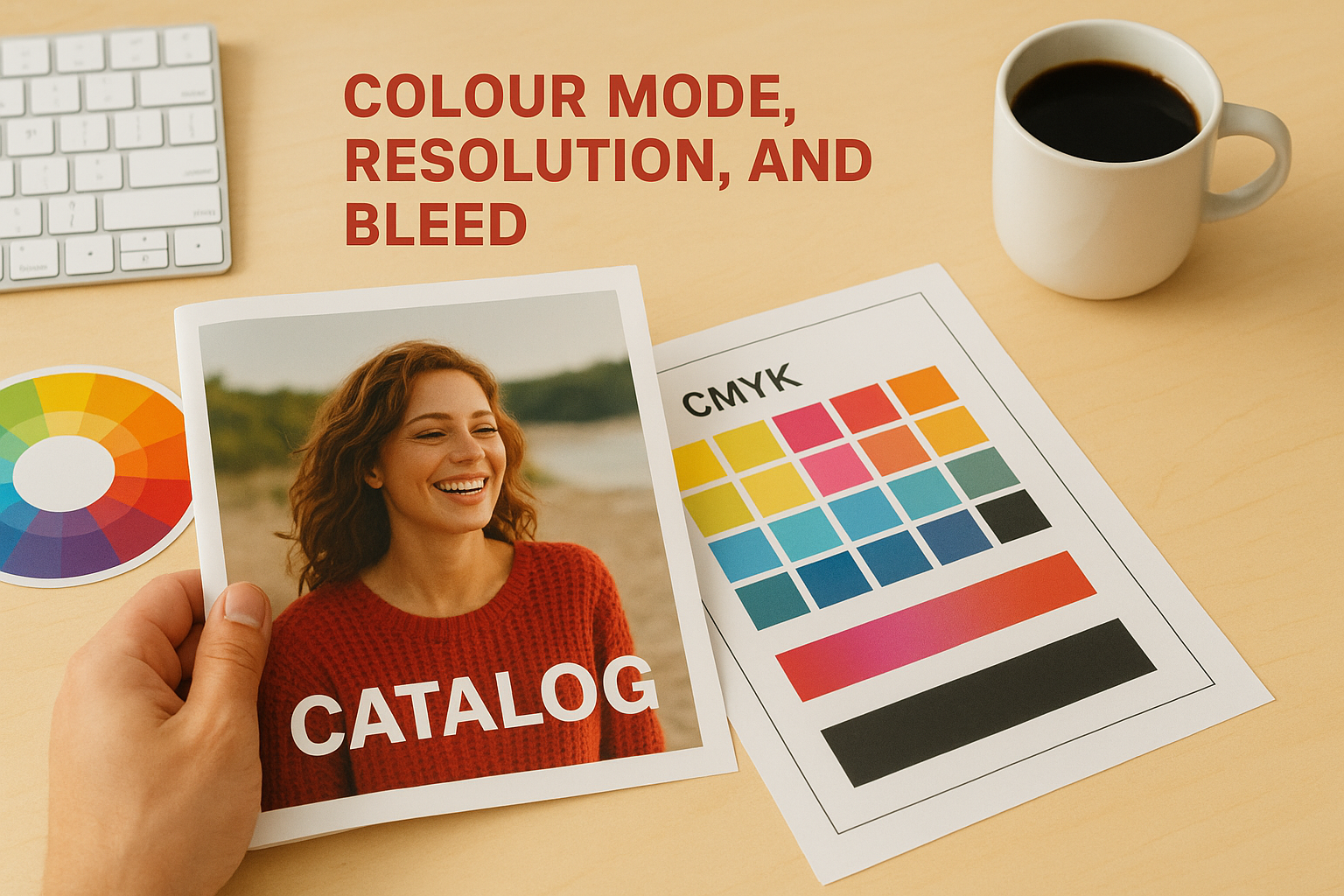
Resolution works differently in print than it does on screen. A 300 DPI (dots per inch) minimum is the standard for sharp, clean printed output. Images that look perfectly crisp on your monitor at 96 DPI will appear noticeably soft or pixelated when printed. The table below gives you a quick reference for the most common resolution and colour requirements:
| Element | Minimum standard | Recommended |
|---|---|---|
| Product photos | 300 DPI at print size | 300-400 DPI |
| Logo files | Vector (EPS/AI/SVG) | Vector |
| Background images | 300 DPI at print size | 300 DPI |
| Colour mode | CMYK | CMYK with ICC profile |
| Bleed | 3mm on cut edges | 3-5mm |
Bleed is the part of your design that extends beyond the trim line so that when the printer cuts the stack of sheets, no white edge appears where a background or full-bleed image should reach. Without it, even a tiny shift in the cutting machine produces a thin white strip that immediately looks like a production error. Setting up bleed at the start of your project takes seconds; adding it after you’ve finished designing can break your entire layout.
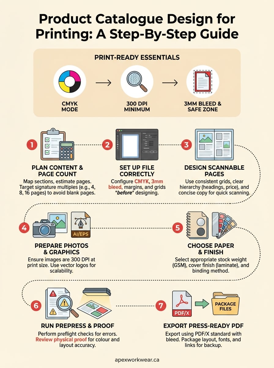
Step 1. Plan the content, structure, and page count
Before you open any design software, write out what your catalogue needs to contain. This sounds obvious, but skipping this step is the most common reason catalogues end up overdesigned, cluttered, and expensive to print. A clear content plan tells you how many pages you need, how much space each product or category requires, and where you need full-page imagery versus simple product listings. Getting this right at the start saves you from rebuilding layouts mid-project.
Decide what goes in and what stays out
Start by listing every section your catalogue needs: cover, introduction, product categories, individual product pages, pricing tables, contact details, and any legal or specification pages. Then assign a rough page count to each. Be ruthless about what earns space. If a product isn’t strong enough to include, cut it rather than padding your page count to fit it in.
A catalogue with 24 tight, well-designed pages will always perform better than a 40-page catalogue where half the pages are filler.
A simple content map works well here. Write each section as a row and note the page count next to it. For example:
| Section | Estimated pages |
|---|---|
| Cover (front) | 1 |
| Brand introduction | 1 |
| Category A products | 4 |
| Category B products | 6 |
| Category C products | 4 |
| Pricing and specs | 2 |
| Contact and ordering | 1 |
| Back cover | 1 |
| Total | 20 |
This gives you a working target before you touch a single design file. It also makes your product catalog design for printing easier to quote accurately, since printers price by page count and paper weight.
Map your page count to a print signature
Printed catalogues are produced in signatures, which are groups of pages printed on a single sheet and folded together. Most commercial printers work in multiples of four. If your content plan gives you 22 pages, you either trim content to hit 20 or add two pages to reach 24. Trying to print a catalogue with a page count that doesn’t match your printer’s signature will either waste paper or leave you with blank pages at the back that you have to fill.
Ask your printer what their standard signature size is before you finalise your page count. Most will tell you on request. Common options are multiples of 4, 8, or 16 depending on the press and binding method you choose.
Step 2. Set up your file for print from the start
Opening your design software and immediately starting to place images is the fastest way to end up rebuilding your file from scratch. Every setting you configure at document creation, including colour mode, page size, bleed, and margins, flows through the entire project. Changing these settings halfway through forces you to revisit every page, recheck every image, and often re-export everything anyway. Getting this foundation right takes less than five minutes and protects every hour of work that follows.
Choose software that supports commercial print output
Not every design tool handles print-ready file export equally well. Adobe InDesign is the industry standard for multi-page documents and gives you full control over bleed settings, CMYK colour management, and PDF export presets. Adobe Illustrator works well for shorter catalogues or single-spread layouts. If your budget doesn’t stretch to Adobe software, Affinity Publisher is a capable alternative that supports full CMYK output, bleed, and press-ready PDF export at a one-time cost.
Avoid building a product catalog design for printing in tools that don’t support CMYK colour mode or proper bleed settings. Converting and rebuilding a finished file takes far longer than starting in the right software.
Canva and similar browser-based tools can produce attractive designs, but they often export in RGB by default and give you limited control over bleed and resolution. If your printer requires a true press-ready PDF, a professional layout application will save you significant back-and-forth on file corrections.
Configure your document settings before you design anything
When you create your document, set these values immediately before placing any content. These are the core settings your printer needs and the ones that determine whether your file is clean from the start:
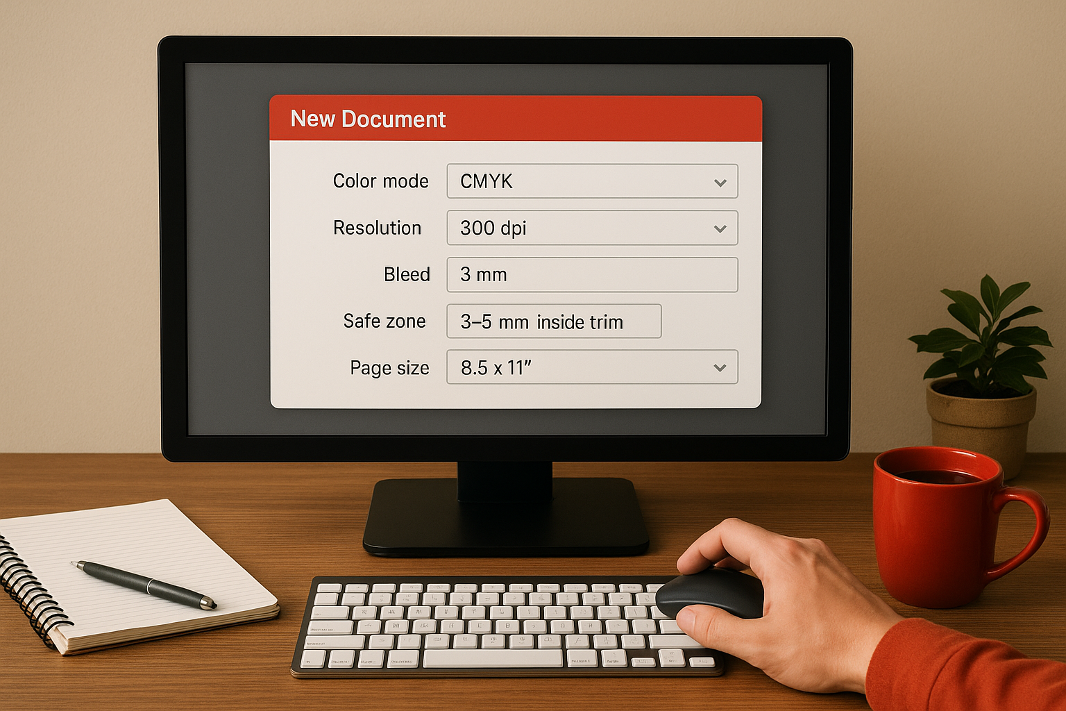
| Setting | Value |
|---|---|
| Colour mode | CMYK |
| Resolution (images) | 300 DPI minimum |
| Bleed | 3mm on all cut edges |
| Safe zone | 3-5mm inside trim line |
| Page size | Final trim size (e.g. 8.5" x 11") |
Set up master pages in InDesign, or equivalent page templates in your chosen software. Add your margin guides, column grid, and any repeating elements like page numbers, running headers, and logo placement. Doing this once on the master page means every new page inherits the same structure automatically, keeping your catalogue visually consistent and significantly cutting layout time on every page you add. This single step also makes your layout far easier for a printer or designer to pick up and work with if late changes are needed.
Step 3. Design pages that people can scan and buy from
A catalogue page that looks good in a design file often fails in print because it wasn’t built for how people actually read. Readers don’t move through catalogues cover to cover; they scan headings, stop on images, and dip into copy only when something catches their eye. Every page in your product catalog design for printing project needs to be structured so that a reader can extract the key information, product name, price, key features, and how to order, in under five seconds.
Build a grid that controls your layout
A layout grid is the invisible scaffolding that keeps your pages looking intentional rather than random. Set up a column grid that suits your content density: a two-column grid works well for feature-heavy products that need longer descriptions, while a three or four-column grid suits catalogues with many smaller items. Apply the same grid across every page so that your catalogue reads as a single, unified document rather than a collection of disconnected design decisions.
Readers trust a consistent layout. When columns, margins, and image sizes stay the same across pages, the eye learns where to find information and moves through the catalogue faster.
Use visual hierarchy to guide the reader’s eye through each page. Your product name should be the largest text element, followed by a short benefit statement or key specification, then price, then supporting copy. Keep body text between 9pt and 11pt for comfortable reading at catalogue scale, and give every page enough white space so the content breathes rather than crowds.
Write product copy that converts on the page
Printed catalogues don’t get a second chance with a reader the way a website does. Every product entry needs a clear name, one or two specific benefits, and a price or pricing indicator. Vague copy like "high-quality construction" tells the reader nothing; "reinforced double-stitched seams rated for 500+ washes" gives them a concrete reason to buy.
Keep your product descriptions short and scannable: three to five lines maximum per entry on a standard product grid page. Use consistent formatting across every product so the reader doesn’t have to relearn the layout on each spread. A simple product entry template looks like this:
| Element | Example |
|---|---|
| Product name | Heavyweight Cotton Work Tee |
| Key benefit | Pre-shrunk, 280gsm, embroidery-ready |
| Sizes/variants | XS-5XL, 12 colours |
| Price indicator | From $18.00 (bulk pricing available) |
| Order reference | SKU: WT-280 |
Step 4. Prepare photos, logos, and graphics for press
Weak images are the most visible flaw in any printed catalogue, and they’re almost always fixable before the file goes to press. Every photo, logo, and graphic you place in your layout needs to meet minimum technical standards before you export your final PDF. Checking your assets at this stage of your product catalog design for printing project costs a few minutes per file, but it prevents the kind of result you can’t undo once the job is running.
Get your product photos to the right resolution
Product photos need to be 300 DPI at the exact size they’ll appear on the printed page. This trips up a lot of people because images look sharp on screen at much lower resolutions. A photo that’s 300 DPI when placed at 3 inches wide becomes effectively 150 DPI if you scale it up to 6 inches in your layout. The key rule is to check resolution at the placed size, not the file’s native dimensions.
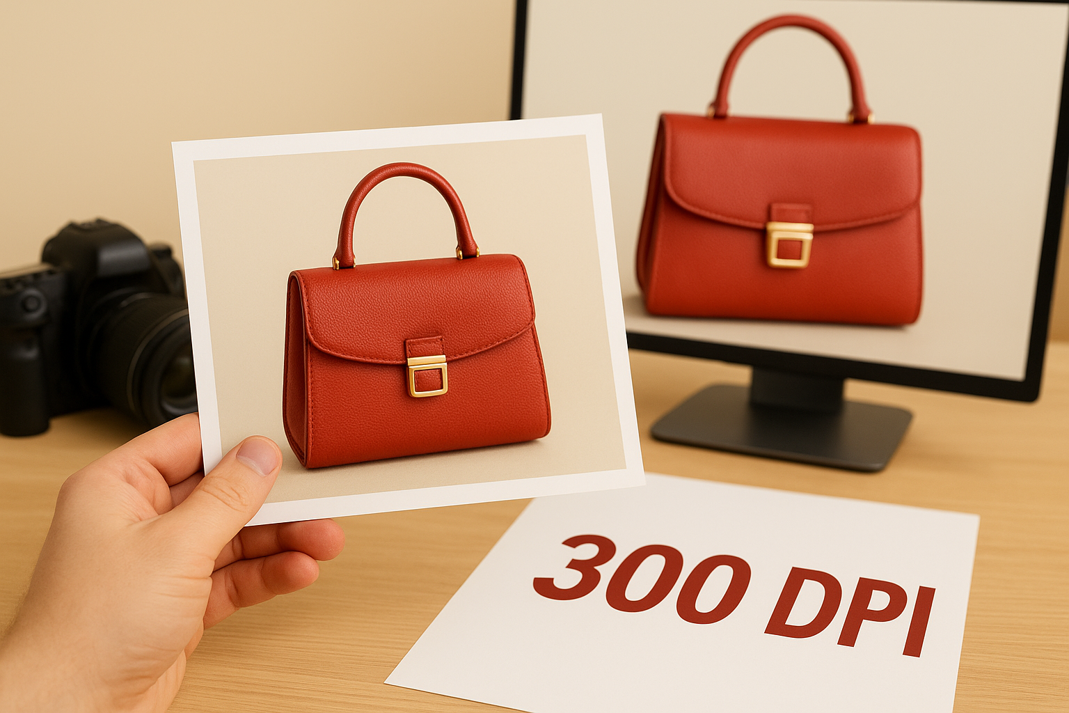
Never scale a placed image above 100% in your layout application. If the image looks too small at full size, you need a higher-resolution source file.
Use the table below as a quick reference when reviewing your assets before export:
| Asset type | Minimum resolution | Notes |
|---|---|---|
| Product photos | 300 DPI at placed size | Check after scaling in layout |
| Background images | 300 DPI at placed size | Enlarge source file if needed |
| Texture or pattern fills | 300 DPI at placed size | Tile rather than stretch |
| Screened or halftone images | 600 DPI | Higher resolution improves dot clarity |
Handle logos and vector graphics correctly
Your logo and any icon or graphic used as a design element should be supplied as a vector file, not a raster image. Vector files, typically in EPS, AI, or SVG format, scale to any size without losing quality because they’re built from mathematical paths rather than pixels. If you only have a PNG or JPEG version of your logo, place it at 100% of its original size and avoid enlarging it, since even a slight upscale on a raster logo produces visible softness at print resolution.
Colour accuracy matters here too. Your logo’s CMYK values should match your brand’s colour specification sheet exactly. Spot colours like Pantone references need to be properly mapped to their CMYK equivalents in your document, since commercial presses typically run CMYK inks by default. If your printer offers Pantone matching, confirm this in writing before you finalise your file, as the cost and process differ from standard four-colour printing.
Step 5. Choose paper, finishes, and binding that fit the job
The physical feel of your catalogue shapes how readers perceive your brand before they read a single word. Paper weight, surface finish, and binding method all send signals about quality, and choosing them correctly for your content type makes a real difference to how your product catalog design for printing project lands with the reader. These decisions also directly affect your print cost and turnaround time, so locking them in early keeps your project on schedule.
Pick the right paper stock for your catalogue
Paper stock is measured in grams per square metre (GSM), and the higher the GSM, the heavier and more substantial the sheet feels. For most product catalogues, covers use a heavier stock than interior pages to create a clear distinction between the outer wrap and the content inside. Use the table below as a starting point when specifying your paper:

| Page type | Recommended GSM | Common use |
|---|---|---|
| Interior pages | 100-130 GSM | Standard product listings |
| Interior pages (premium) | 150-170 GSM | High-end product catalogues |
| Cover (soft) | 250-300 GSM | Most business catalogues |
| Cover (thick) | 350-400 GSM | Trade show leave-behinds |
Glossy coated stock makes photos pop, but if your catalogue includes pages where readers might write notes or prices, an uncoated or silk stock gives them a surface they can actually write on.
Coated stocks, including gloss and silk, sharpen image contrast and deepen colour saturation, making them the natural choice for product photography. Uncoated stock suits text-heavy sections and gives a more tactile, premium feel for certain brand identities.
Add finishes that protect and present your cover
A cover laminate or UV coating extends the life of your catalogue significantly, especially for high-circulation copies used at trade shows or in sales meetings. Gloss laminate amplifies colour brightness and adds a reflective sheen. Matte laminate gives a flat, sophisticated finish that reduces fingerprints and feels noticeably higher-end in the hand. Soft-touch laminate goes a step further and creates a velvet-like surface that stands out from standard print finishes.
Match binding to your page count
Your page count determines which binding methods are practical. Saddle stitching, two staples through the spine, works cleanly for catalogues up to around 64 pages. Perfect binding, where pages are glued to a flat spine, suits anything above that threshold and looks closer to a paperback book. Spiral or coil binding costs more but lays completely flat when open, which works well for technical product catalogues where readers need both hands free to reference specifications while working.
Step 6. Run prepress checks and proof like a printer
Sending a file to press without running prepress checks is the same as submitting a document without proofreading it. Errors that seem minor on screen, a missing bleed here, an RGB image there, become permanent once ink hits paper. This stage of your product catalog design for printing project is where you catch those problems before they cost you a reprint. Work through your checks systematically, in the same order every time, so nothing slips through.
Run a preflight check inside your layout software
Most professional layout applications include a built-in preflight panel that flags technical errors automatically. In Adobe InDesign, the preflight panel runs continuously in the background and lists every issue it detects, from low-resolution images to missing fonts and RGB colour objects. Enable it, read every warning it raises, and resolve each one before you export. Do not ignore preflight warnings on the assumption that they are cosmetic; even a single missing font or out-of-gamut colour can change your printed output significantly.
Fix every preflight warning your layout software raises before you export. A clean preflight report is the minimum standard your file needs to meet before going to press.
Use this checklist to work through the most common prepress errors before you export:
| Check | What to look for |
|---|---|
| Image resolution | All placed images at 300 DPI at placed size |
| Colour mode | All elements in CMYK, no RGB objects |
| Bleed | 3mm bleed on all cut edges confirmed |
| Fonts | All fonts embedded or converted to outlines |
| Safe zone | No text or logos inside the 3-5mm safe zone margin |
| Overprint settings | No unintended overprint on white or light elements |
| Page count | Matches your agreed signature multiple |
Proof the physical output before you approve
A digital proof on screen and a printed proof in your hands are two different things. Request a physical proof from your printer before the full run goes ahead. This is particularly important for catalogues with accurate product colour requirements, because monitor calibration and CMYK ink behaviour will always produce some variation from what you see on screen. Review the physical proof in daylight or consistent office lighting, not under warm incandescent bulbs that shift colour perception.
When reviewing your proof, check each spread for image sharpness, colour consistency across pages, text legibility at small sizes, and whether the bleed reaches the trim edge cleanly. Mark any corrections clearly and request a revised proof if the changes affect colour or layout. Approving a proof with unresolved issues removes your ability to request a reprint at no charge, so take the time to review it thoroughly before you sign off.
Step 7. Export a press-ready PDF and package files cleanly
Exporting your finished catalogue is not the same as saving it. A press-ready PDF packages your colours, fonts, bleed, and image data into a single file your printer can run without tracking down missing assets. This final step in your product catalog design for printing project determines whether every decision you made in the previous six steps actually reaches the press intact. Export incorrectly, and a clean file becomes a problem file the moment it leaves your machine.
Use the correct PDF export preset
Most professional layout applications include built-in PDF export presets designed for commercial printing. In Adobe InDesign, select "PDF/X-4:2008" or "PDF/X-1a:2001" as your export standard. PDF/X-4 supports transparency and is preferred by most modern printers. PDF/X-1a flattens transparency and is the safer choice if your printer has not confirmed their workflow. Always confirm which standard your printer accepts before you export, since sending the wrong type creates unnecessary delays.
Use the export settings table below to configure your PDF correctly before you send anything:
| Setting | Value |
|---|---|
| PDF standard | PDF/X-4 or PDF/X-1a (confirm with printer) |
| Colour output | Convert to destination: CMYK |
| Marks and bleeds | Include 3mm bleed, no crop marks unless requested |
| Image compression | Zip or no compression; avoid heavy JPEG compression |
| Font embedding | All fonts embedded (enabled by default in most presets) |
| Resolution (downsampling) | Do not downsample below 300 DPI |
Check your bleed settings in the export dialogue every single time, even if you set them correctly in your document setup. Some applications reset bleed values when you switch export presets.
Package your files before you send anything
Packaging your project creates a single folder containing your layout file, all linked images, and all fonts used in the document. In InDesign, this is the "Package" function under the File menu. In Affinity Publisher, it is "Collect Resources". This folder is what you keep as your master backup and what you send if your printer ever needs to make corrections directly in your file rather than asking you to re-export.
Run the package function even if you plan to send only the final PDF to your printer. A packaged folder protects you the moment a client requests a late change, a supplier needs a revised version, or your own storage fails. Label the folder clearly with the project name, version number, and export date so you can identify the correct file instantly. Sloppy file naming is how good print jobs get sent to press with the wrong version, and it costs time and money to fix.
Ready to print
Every step in this guide builds on the one before it. Plan your content first, set up your file correctly from the start, prepare your assets for press, and proof your output before you approve anything. Cut a corner early and it compounds into a bigger problem by the time you export. Follow the steps in order and your product catalog design for printing project reaches press as a clean, professional file that produces exactly what you intended.
You now have a complete framework for designing, checking, and exporting a catalogue that prints well. The technical side is manageable once you know what each setting does and why it matters. What matters next is putting it into production with a printer who reviews your file and flags issues before they become costly mistakes. If you’re ready to get your catalogue printed in Canada with expert support on every order, get a free quote from Apex Workwear and we’ll take it from there.