You’ve spent hours perfecting your logo or design on screen, only to receive a print that looks dull, muddy, or completely off from what you expected. Nine times out of ten, the culprit is a colour mode mismatch, specifically, the difference between CMYK vs RGB printing. It’s one of the most common (and most preventable) issues we see at Apex Workwear when customers submit files for custom apparel, business cards, banners, and other printed products.
RGB and CMYK aren’t just obscure design acronyms. They represent two fundamentally different ways of producing colour, one built for screens, the other for ink on paper or fabric. Using the wrong one means your printer is essentially guessing at what your colours should look like, and it will guess wrong.
This article breaks down exactly how each colour mode works, why CMYK is the standard for physical printing, and how to convert your files properly so the final product matches your vision. Whether you’re preparing artwork for custom hoodies or a batch of flyers, you’ll walk away knowing how to get accurate, consistent colour every time.
Why RGB and CMYK matter for print results
The colour mode your file uses determines how colour is built and ultimately how it appears in the final printed product. Most people design on a screen, which uses light to generate colour. A printer, however, lays down ink. These two processes work in completely opposite ways, and when there’s a mismatch between them, the printed result looks nothing like the original design. Understanding this isn’t just technical trivia. It directly affects the quality of every order you place, whether that’s a banner, a batch of business cards, or a run of custom hoodies.
How screens and printers produce colour differently
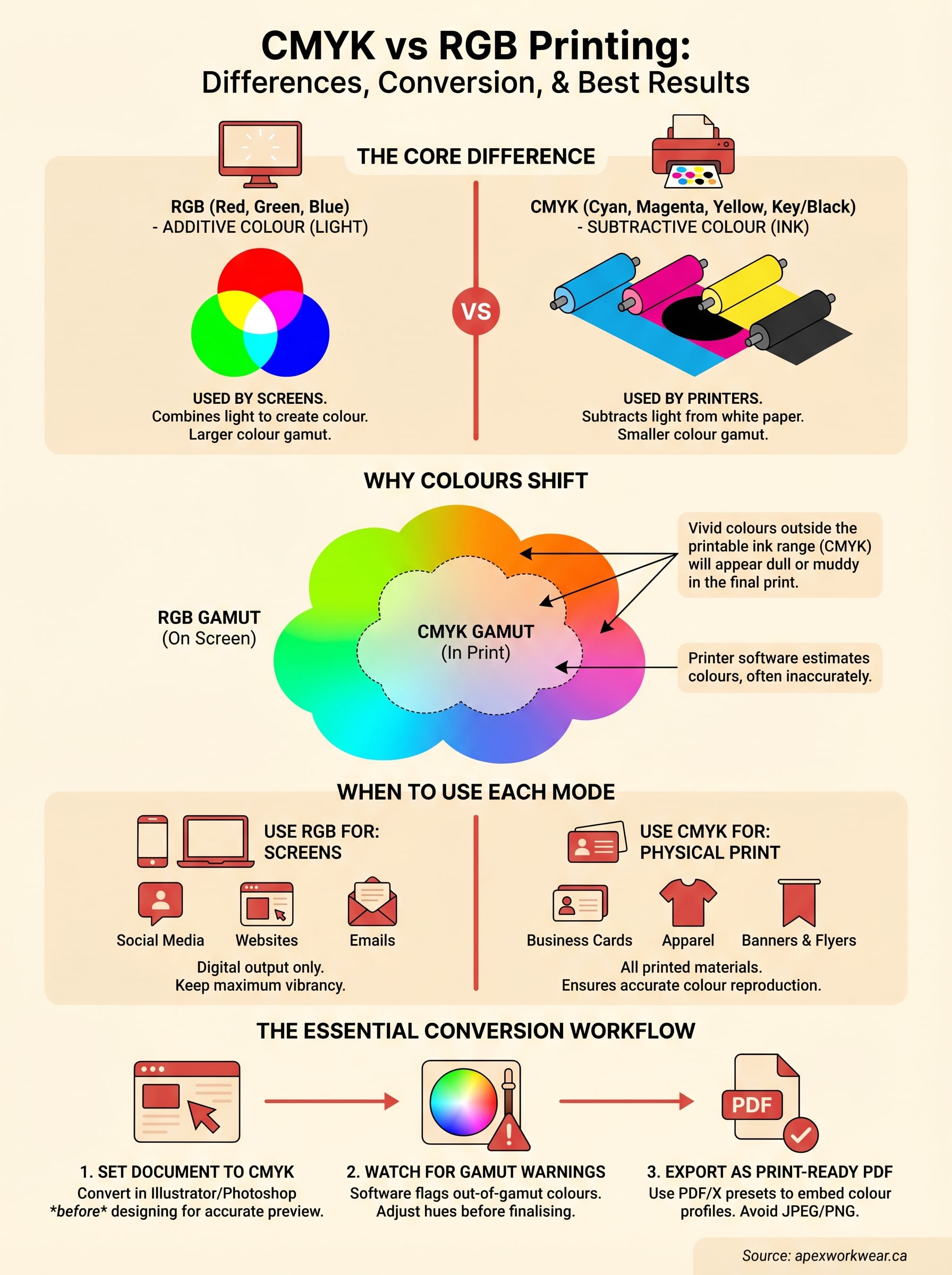
Your monitor creates colour by combining red, green, and blue light at varying intensities. When all three channels are at full strength, you get pure white. When all three are off, you get black. This is called additive colour, because you’re adding light together to produce brightness and hue.
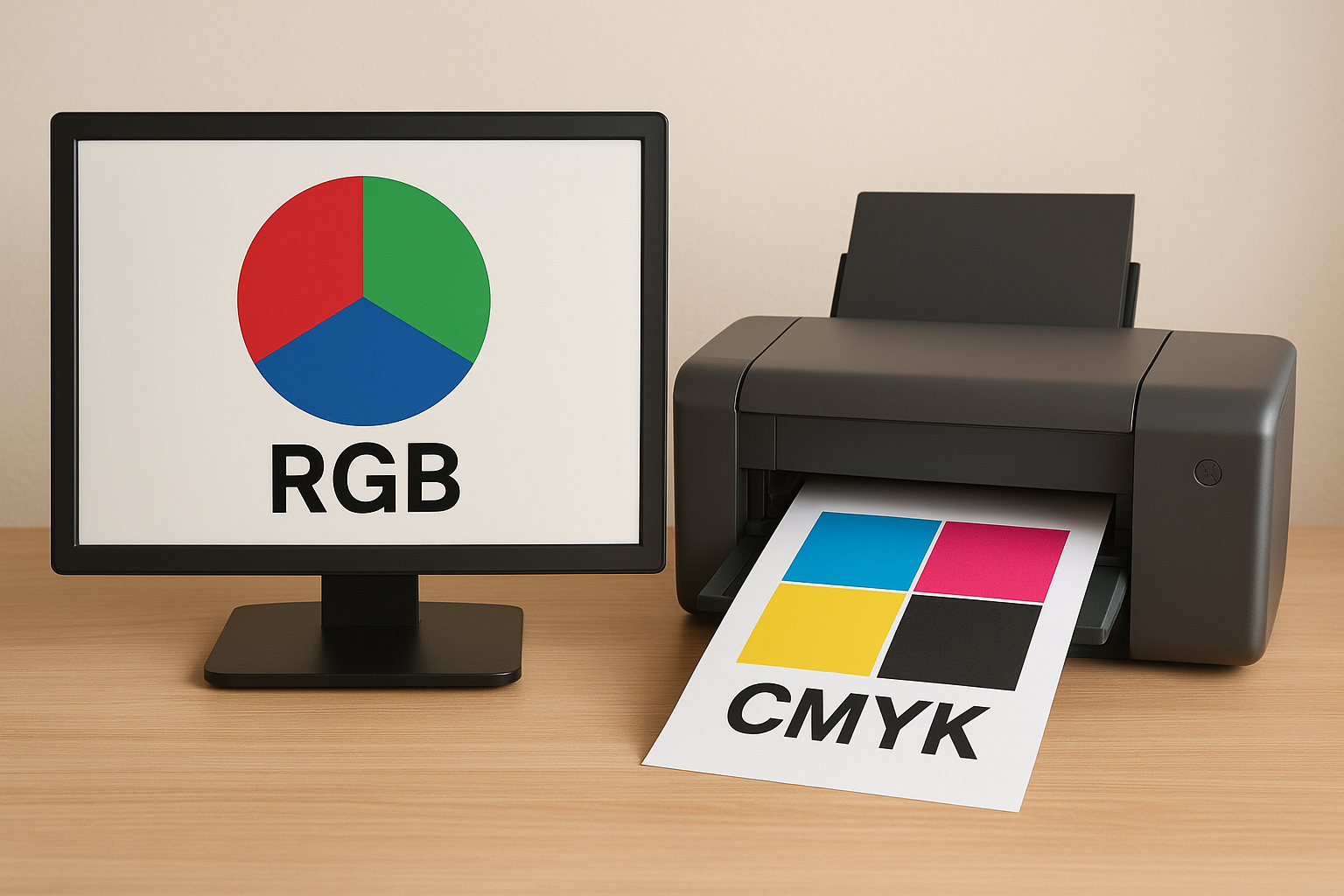
A printer works the opposite way. It starts with white paper or fabric and applies layers of ink to subtract light. The inks are cyan, magenta, yellow, and black (CMYK), and the more ink you apply, the darker the result gets. This is called subtractive colour. The two systems are fundamentally different, which is why a colour that looks vivid on your laptop screen can print flat or lifeless on a physical product.
The core tension in the cmyk vs rgb printing conversation isn’t about which system is superior. It’s about understanding which one your output device actually uses.
Why colour shifts happen at the printer
When you send an RGB file to a commercial printer, the printer’s software has to translate every colour value into an ink combination on the fly. That translation is never perfect. Bright blues, vivid oranges, and neon greens are notoriously difficult to reproduce with ink because the CMYK colour gamut (the total range of colours it can physically produce) is narrower than what RGB can display on screen. Some colours simply do not exist in print form.
The result is that colours often shift toward dull, grey, or muddy tones when an untranslated RGB file hits the press. Reds can turn orange, blues can go purple, and greens can look brown. The more saturated your original colours are, the more noticeable the shift becomes in the finished piece.
What this means for your file setup
Setting your design file to CMYK mode from the start gives you the most accurate on-screen preview of what will actually print. You see roughly what you’ll get in hand before you ever place an order. If your file is still in RGB when you export or submit it, the printer’s software makes its own conversion, and you lose control over the outcome entirely.
This is why print shops and apparel providers ask for CMYK-ready files before going to press. It’s not a bureaucratic hurdle. It’s the step that keeps your brand colours consistent across every printed piece, from a single business card to a full set of staff uniforms. Getting this right at the file stage takes a few minutes and saves you from reprints, delays, and the frustration of holding a finished product that looks nothing like your design.
RGB vs CMYK in plain English
Strip away the technical language and the core difference between the two colour systems comes down to this: RGB uses light, CMYK uses ink. Everything else, the gamut differences, the conversion challenges, the file settings, all flows from that single distinction. Once you understand how each system actually builds colour, the practical decisions around file setup start to make a lot more sense.
How RGB works
RGB stands for red, green, and blue. Your monitor, phone screen, and TV all use this model. Each pixel on your screen emits light at varying intensities across those three channels, and by mixing different combinations, the display produces the full spectrum of colours you see. Turn all three channels to maximum and you get white. Drop them all to zero and you get black. This is why RGB is called an additive colour model, because you are literally adding light to produce colour.
The RGB colour space is wider than what any printer can reproduce. It includes highly saturated blues, vivid greens, and bright neon tones that simply have no ink equivalent. This is the core reason colours shift when you move from screen to print without properly converting your file first.
If your design was built in RGB and you skip the conversion step, the printer’s software makes its own colour decisions, and you have no control over the result.
How CMYK works
CMYK stands for cyan, magenta, yellow, and key (black). Unlike RGB, this model starts with a white surface and subtracts light by applying layers of ink. The more ink you add, the darker and less reflective the surface becomes. This is called a subtractive colour model, and it is the foundation of how virtually all commercial and home printers operate.
Understanding the cmyk vs rgb printing difference at this level matters practically. When you set your design file to CMYK mode before you start building your artwork, the colours you choose are already constrained to what ink can physically reproduce. You avoid the guesswork entirely, and what you see on screen becomes a far closer match to what comes off the press.
When to use RGB, CMYK, or spot colours
Knowing the difference between colour models is only useful if you know when to apply each one. The decision comes down to your output: where will the finished piece live? On a screen, or in someone’s hands? Get this right at the start of your project and you avoid the most common colour mode mistakes that lead to reprints and wasted budget.
Use RGB for screens and digital output
If your design will only ever appear on a screen, such as a social media graphic, website banner, or email header, RGB is the right choice. Screens emit light and can display the full width of the RGB colour space, including highly saturated colours that ink simply cannot replicate. Working in RGB for digital-only assets means you keep maximum colour vibrancy without any unnecessary conversion steps.
The moment your design is destined for print, whether that is a flyer, hoodie, or yard sign, switch to CMYK before you do anything else.
Use CMYK for physical print
Any design headed to a physical output needs to be in CMYK mode before you submit it. This applies to business cards, banners, apparel, brochures, and signage. Understanding the cmyk vs rgb printing distinction becomes critical here because commercial presses and direct-to-garment printers all operate in the CMYK colour space. When your file arrives already in CMYK, the printer reproduces your colours accurately rather than making its own conversion guesses.
Building your artwork in CMYK from the start means the on-screen preview you see in your design software is already calibrated to what ink can produce. You catch colour limitations early, adjust your palette if needed, and submit a file with zero ambiguity for the press operator.
When spot colours make sense
Spot colours, most commonly from the Pantone Matching System (PMS), are pre-mixed inks used when colour accuracy is non-negotiable. If your brand has a specific shade that must look identical across every printed piece, a spot colour guarantees that result in ways that CMYK process printing cannot always match.
They add cost because they require a dedicated ink station on press, but for brand-critical applications like staff uniforms or premium packaging, the consistency they deliver is worth the investment.
How to convert and export files for printing
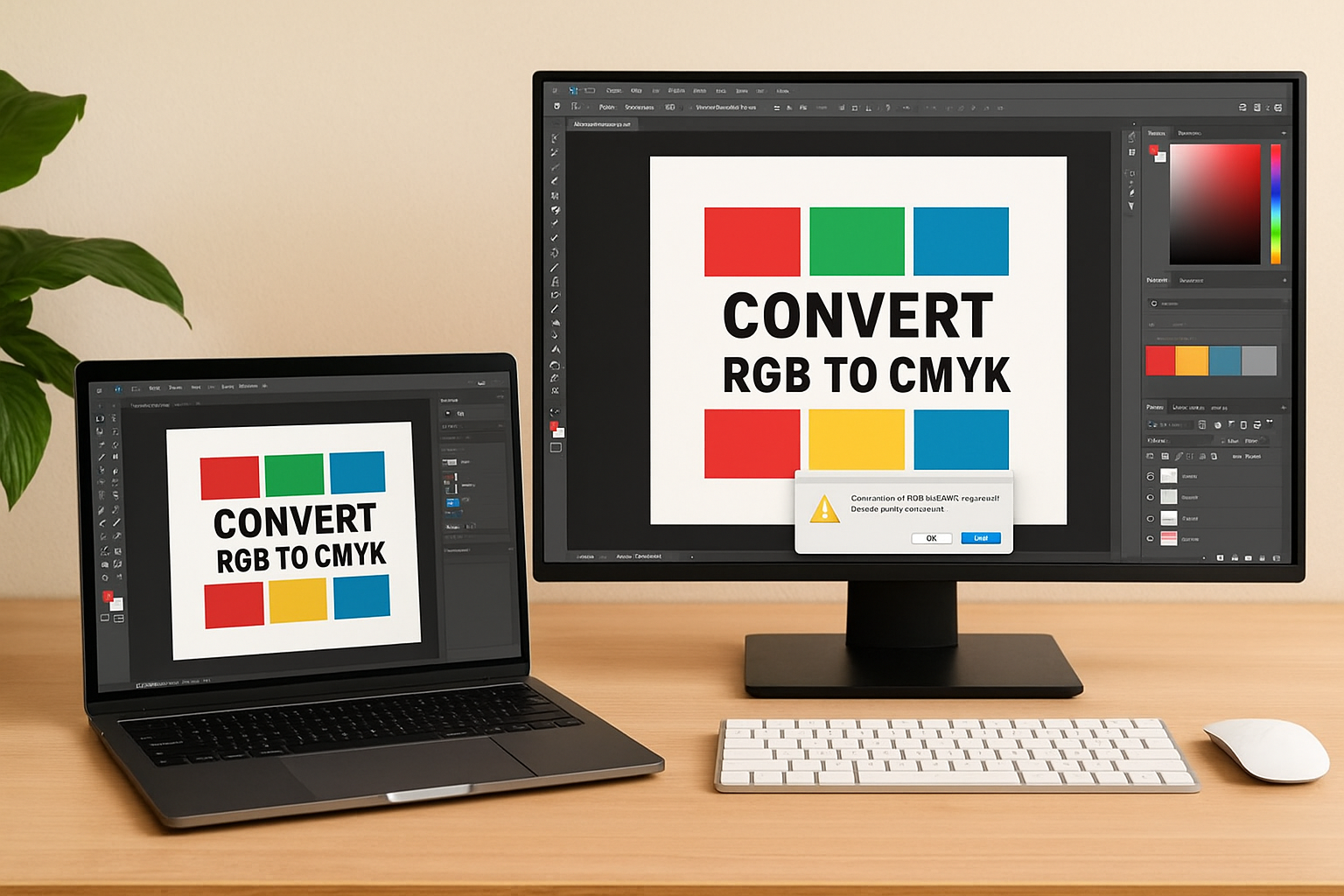
Converting your file from RGB to CMYK is a straightforward process in most professional design applications, and doing it before you export is the single most important step in the entire cmyk vs rgb printing workflow. The goal is to make the conversion on your terms, using your own design software, rather than handing that control to the printer’s automatic colour engine, which has no visibility into your original intent or brand colours.
Converting in Adobe Illustrator or Photoshop
In Adobe Illustrator, go to File > Document Colour Mode > CMYK Colour. This switches the entire document over in one step. In Adobe Photoshop, navigate to Image > Mode > CMYK Colour. Photoshop will warn you that the conversion may shift some colours. Accept it, then review your artwork carefully and correct any hues that appear flat or muddy before you move to the export stage.
Do this conversion step before you finalise any colours in your design, not as a last-minute action right before you export.
Here is a quick reference for the two most common applications:
| Software | Conversion path |
|---|---|
| Adobe Illustrator | File > Document Colour Mode > CMYK Colour |
| Adobe Photoshop | Image > Mode > CMYK Colour |
Exporting the right file format
Once your document is in CMYK mode, export as a PDF using the PDF/X-1a or PDF/X-4 preset. These presets are built specifically for commercial print production and embed all the colour profile information your printer needs to reproduce your file accurately. Avoid exporting as JPEG or PNG for print submissions. These formats compress colour data and do not reliably preserve CMYK values across different printing systems.
If you are working in Canva or another browser-based tool, be aware that these platforms operate entirely in RGB. Export your file from there, then open it in Illustrator or Photoshop to convert and re-export it properly before you submit to your print provider. Skipping this step is one of the most frequent reasons customers receive colour-shifted results that do not match the design they built on screen. At Apex Workwear, we review every submitted file before going to press, but starting with a correctly converted CMYK file keeps your order accurate and on schedule.
Common colour problems and how to avoid them
Even when you understand the cmyk vs rgb printing distinction, specific colour issues can still catch you off guard after conversion. Most of these problems have a clear cause and a straightforward fix. Knowing what to watch for before you submit your file keeps you in control of the result rather than discovering problems after your order arrives.
Dull or muted colours in the final print
This is the most common complaint in print production. Highly saturated RGB colours, particularly vivid blues, bright greens, and electric purples, fall outside the CMYK gamut and lose intensity once converted to ink. Your design software will flag these with a gamut warning, shown as a small exclamation icon in Photoshop or Illustrator, whenever a colour sits outside the printable range. Pay attention to those warnings and shift the affected hues toward more achievable tones before you export. Catching this at the file stage saves you from holding a finished product that looks flat and washed out compared to what you designed on screen.
If a colour looks unnaturally bright on your monitor, that is often a sign it will not survive the conversion to ink.
Blacks that appear grey or washed out
Simple black elements set to CMYK values of 0/0/0/100 print as a clean, sharp black. The problem surfaces when designers leave black objects in RGB mode (0,0,0), which can translate to a weak, slightly grey tone on press. For large black backgrounds or bold graphic shapes, many print professionals use a rich black mix of approximately C:60 M:40 Y:40 K:100, which produces a deeper, more saturated result. Avoid applying rich black to small body text, though. The multiple ink layers can cause slight misregistration at smaller sizes and reduce overall sharpness.
Colour shifts between your proof and the final print
Digital proofs on screen give you a useful reference point, but monitor brightness and calibration vary widely between devices. Your proof may look different on a laptop versus a desktop, which makes it an imprecise standard for brand-critical colour. Requesting a physical proof before full production removes that uncertainty entirely. At Apex Workwear, we provide digital proofs as standard before any order goes to press, and we flag colour concerns during our file review so you can correct them before production begins.
Next steps
The cmyk vs rgb printing gap is one of those problems that looks technical on the surface but comes down to a few practical habits: set your document to CMYK before you start designing, watch for gamut warnings, and export as a print-ready PDF. Follow those three steps consistently and you cut out the most common causes of colour drift, dull results, and reprints. Getting this right once means your colours stay predictable across every job you send to press, from a single business card to a full batch of branded apparel.
If you are ready to put these principles into practice, Apex Workwear reviews every submitted file before production begins, flags any colour concerns, and provides a digital proof so you can approve the result before anything prints. Whether you need custom apparel, signage, or printed business materials, get a free quote from Apex Workwear and let us help you get the colour right the first time.