Choosing between Pantone vs CMYK can make or break the consistency of your brand’s printed materials. Whether you’re ordering custom apparel, business cards, banners, or packaging, the colour system you pick directly affects how your designs look once they’re off the press. Get it wrong, and that signature brand red shows up as something closer to tomato soup. Get it right, and every print run matches the last.
The two systems work differently, cost differently, and suit different projects. CMYK mixes four ink colours during printing, while Pantone uses pre-mixed spot colours for precise, repeatable results. Each has clear strengths, and real trade-offs in terms of price, accuracy, and flexibility.
At Apex Workwear, we handle custom apparel and print production across Canada daily, from embroidered hoodies to large-format signage. Colour accuracy matters in every single order. This article breaks down the technical differences between Pantone and CMYK, compares their costs, and helps you decide which system fits your next print project, so you spend less time guessing and more time getting it right.
Why Pantone and CMYK matter in print
When you send a file to print, you’re not just choosing a design. You’re choosing a colour system that determines whether the output matches your expectations. The difference between Pantone and CMYK is not academic; it shows up in the real world every time a customer picks up your business card, sees your signage, or wears your branded apparel. Colour systems are the invisible infrastructure behind every printed product, and understanding them saves you money and prevents costly reprints.
Colour consistency shapes brand perception
Your brand colour is part of your identity. A specific shade of blue or green signals your business to customers before they read a single word. When that colour shifts between print runs, on a banner versus a business card versus a uniform, your brand looks inconsistent. Brand inconsistency erodes trust, and customers notice it even when they can’t explain why something feels off.
Colour recognition can boost brand recognition by up to 80%, which is why maintaining accurate colour across every print format is a business priority, not a design preference.
Maintaining that consistency is precisely where the Pantone vs CMYK debate becomes practical. Pantone assigns a specific code to each colour, so every printer using that code produces the same result. CMYK relies on mixing four inks during the print process, which means results vary depending on the machine, paper stock, and ink calibration. Both systems are widely used, but they serve different purposes across different print applications.
The stakes are higher than you think
Reprints are expensive. If you order 500 custom hoodies and the colour comes back wrong because you used CMYK on a job that required Pantone, you’re looking at wasted materials, wasted time, and a difficult conversation with your supplier. Choosing the right colour system upfront is not a minor technical detail; it’s a decision that directly affects your budget and your timeline.
Many small businesses and teams don’t think about colour systems until something goes wrong. Print specifications are often left to the printer or designer to sort out, which blurs responsibility for accuracy. That gap between what you expected and what gets delivered usually traces back to a colour system mismatch, not a machine fault or a poor design.
Understanding how these two systems work, and when to use each one, puts you in control of the outcome before the press ever runs. The next sections break down exactly how each system functions, what it costs, and which projects call for which approach.
How Pantone and CMYK actually work
Both systems produce printed colour, but they do it through completely different processes. Understanding the mechanics behind each method helps you make smarter decisions about colour accuracy and which printing system fits your job.
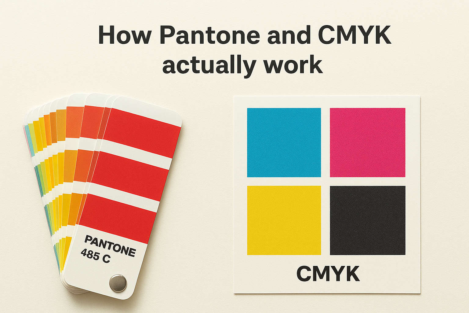
How CMYK printing works
CMYK stands for Cyan, Magenta, Yellow, and Key (Black). During printing, tiny dots of these four inks are layered on top of each other at different angles and densities to simulate a wide range of colours. Your eye blends those dots together and reads them as a single colour. The result depends heavily on the ink calibration, paper stock, and printer settings in use at the time of production.
Because CMYK builds colour from four variables, the same file can produce slightly different results on different machines or even across separate print runs on the same machine.
This variability is manageable for most general print jobs, particularly when exact colour matching is not critical. Photographs, flyers, and brochures typically work well in CMYK without issue.
How Pantone spot colours work
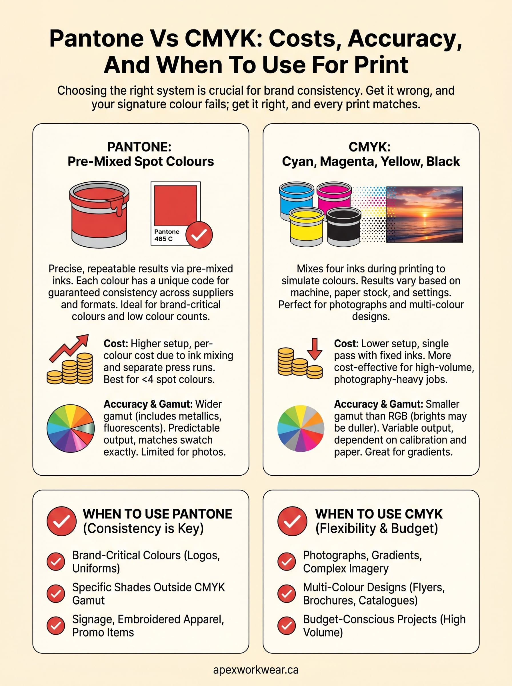
Pantone colours are pre-mixed inks prepared to an exact formula before they ever touch the press. Each colour carries a unique code, such as Pantone 485 C for a specific red, and any printer using that code produces the same result regardless of their machine or location. This makes Pantone the standard for brand-critical colour consistency across multiple print suppliers and formats.
In the Pantone vs CMYK comparison, Pantone’s biggest advantage is predictability. You specify a code, and the output matches it. There are no four-ink variables at play, no mixing drift, and no surprises when your job comes off the press. That reliability comes at a cost, which the next section covers in detail.
Cost differences and what drives pricing
When it comes to pantone vs cmyk, pricing is one of the clearest differences between the two systems. Pantone printing typically costs more because it requires additional setup, separate ink mixing, and dedicated press cleaning between colour runs. CMYK printing uses the same four inks for every job, which keeps setup costs low and makes it the default choice for high-volume, general print work.
Why Pantone printing costs more
Pantone inks are pre-mixed to a specific formula before printing begins. Each spot colour requires its own ink preparation and a separate pass through the press, which adds time and material cost to every job. If your design uses three Pantone colours, the printer runs the press three separate times, each requiring its own ink wash and recalibration.
For jobs with more than three or four spot colours, Pantone costs can quickly exceed the equivalent CMYK print run by a significant margin.
Setup fees for Pantone jobs are also higher because press operators must verify each mixed ink against the physical Pantone swatch before printing starts. That verification step protects colour accuracy but adds labour to every order.
When CMYK saves you money
CMYK works with four fixed ink cartridges that stay loaded in the press across every job. There is no custom mixing, no per-colour setup charge, and no additional press passes for multi-colour designs. For photography-heavy layouts, brochures, and flyers, CMYK is almost always the more cost-effective option.
If your design uses many colours, gradients, or photographic images, CMYK handles all of it in a single pass, which keeps your per-unit cost low. The trade-off is that you accept some variation in colour output rather than paying for the guaranteed consistency that Pantone delivers.
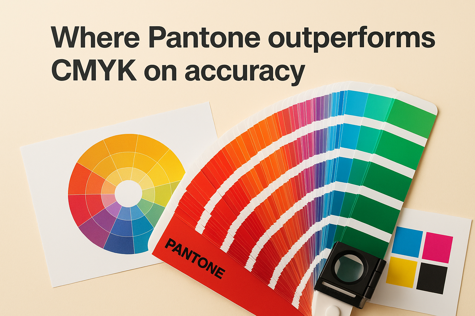
Accuracy, gamut, and colour matching realities
Accuracy is where the pantone vs cmyk conversation gets most important for brand-sensitive work. Both systems can produce excellent results, but they operate with different colour ranges, or gamuts, and that range determines whether your printed output can actually reproduce the colour you designed on screen.
What "gamut" means for your print job
Gamut refers to the total range of colours a printing system can reproduce. CMYK has a smaller gamut than the RGB colour space your monitor uses, which means some vivid colours you see on screen simply cannot be reproduced accurately in CMYK print. Colours like electric blues, bright oranges, and neon greens often shift noticeably when converted from RGB to CMYK, sometimes landing several shades duller than intended.
If you design in RGB and send the file directly to a CMYK printer without converting it first, the colour shift can be significant enough to change how your brand reads entirely.
Where Pantone outperforms CMYK on accuracy
Pantone inks are formulated outside the CMYK gamut, which means they can reproduce colours that four-ink mixing simply cannot reach. Specific metallics, fluorescents, and deep solid shades all fall into this category. When your brand uses any of these high-demand colour types, Pantone is the only way to guarantee consistent, accurate output across different print runs and suppliers.
Where CMYK colour matching has limits
CMYK colour accuracy depends on machine calibration and paper stock. A matte stock absorbs ink differently than a coated sheet, and that difference shifts the final colour output. Your printer can manage this with colour profiles and proofing, but some variation is always present. For logos and brand colours that need to match across formats, that variation adds up over time and across multiple vendors.
How to choose Pantone vs CMYK for your job
The right choice in the Pantone vs CMYK debate comes down to three factors: what you’re printing, how many colours your design uses, and whether exact colour matching is critical to your project. Neither system is universally better. Each one suits specific jobs, and picking the wrong one wastes money or delivers output you didn’t expect.
Choose Pantone when colour consistency is non-negotiable
If your design relies on a specific brand colour that must match exactly across multiple print runs or suppliers, Pantone is the right call. This applies directly to logos, uniforms, and any branded item where your customers will see the same colour on different materials side by side. A branded hoodie and a business card sitting next to each other need to read as the same brand.
Pantone also works best when your design uses fewer than three or four solid colours, since the cost per spot colour stays manageable at lower colour counts.
Signage, embroidered apparel, and promotional products are strong candidates for Pantone when your logo contains a defined spot colour that falls outside the standard CMYK gamut.
Choose CMYK for multi-colour and photographic work
When your print job includes photographs, gradients, or designs with many colours, CMYK is the practical choice. It handles complex colour blending in a single press pass, which keeps your unit cost low without sacrificing quality on the work it handles best. Brochures, flyers, postcards, and catalogues all fall comfortably within CMYK’s strengths.
Use CMYK when budget matters more than spot colour accuracy, and when your design doesn’t depend on a single defined brand colour repeating across formats. For most small business print jobs, CMYK delivers solid results at a fraction of the Pantone setup cost.
Final thoughts
The pantone vs cmyk decision affects every print job you order, from business cards to banners to branded uniforms. Pantone gives you guaranteed colour consistency when your brand relies on a specific shade that must match across formats and suppliers. CMYK gives you cost-effective output for complex, multi-colour designs where exact spot colour matching is not the priority. Neither system wins outright; the right choice depends entirely on what your job demands.
Picking the wrong system before a large print run is an expensive mistake that most businesses only make once. Understanding the trade-offs between accuracy, gamut, and setup costs puts you in a position to brief your printer clearly and avoid reprints. Now that you know how each system works and where each one falls short, you can make that call with confidence on every future order.
Ready to get your next print job right? Get a custom print quote from Apex Workwear and we will guide you through the right colour approach for your project.