A sharp letterhead does more for your brand than you might expect. It turns a plain document into something that looks intentional, like you actually care about how your business presents itself. And if you’re running a small business or startup, a Google Docs letterhead template is one of the fastest ways to get there without hiring a designer or buying expensive software. Google Docs is free, accessible from any device, and surprisingly capable when it comes to creating professional-looking documents.
The problem? Finding a template that doesn’t look generic or outdated takes effort. Google’s built-in template gallery is limited, and most third-party options floating around online are either low quality or locked behind paywalls. You need something that actually represents your brand, your colours, your logo, your contact details, laid out in a way that looks polished when it hits a client’s inbox or printer. That’s worth getting right, because every invoice, proposal, and letter you send is a branding opportunity.
This article rounds up 10 professional letterhead templates you can use in Google Docs right now, plus practical customisation tips to make them your own. And when you’re ready to take your branding further, whether that’s printed letterheads, business cards, or custom apparel, Apex Workwear handles all of that from right here in Canada, with no minimums and free local shipping in the GTA.
1. Apex Workwear print-ready branded letterhead
This is the most complete option on the list if you want a google docs letterhead template that works both on screen and in print. It combines your logo, brand colours, and full contact details into a clean, structured layout that looks consistent whether you email it as a PDF or hand it to a client in person.
What this template looks like
The layout puts your logo in the top-left corner, with your business name in a bold heading font beside or below it. A thin horizontal rule sits beneath the header block, separating your branding from the letter body. The footer mirrors this structure, carrying your address, phone number, website, and email in a compact single row. The result is a frame that keeps the body of your letter as the clear focal point.
When to use it
Use this template for any outward-facing business document where your brand needs to show up consistently. Think client proposals, formal quotes, partnership letters, or internal policy documents that staff will print and file. If you run a trades company, a retail business, or a service firm with repeat clients, a consistently branded letterhead builds recognition fast.
Every document you send is a touchpoint. A letterhead that matches your other branded materials tells clients you run a tight operation.
How to build it in Google Docs
Open a blank Google Doc and go to Insert > Header and Footer to enable the header area. Upload your logo using Insert > Image, then resize it to roughly 2.5 cm in height so it does not crowd the page. Add your business name as a text box beside the logo using a bold sans-serif font at around 14pt. Draw a horizontal line beneath the header using Insert > Horizontal Line, then repeat the same process in the footer for your contact row.
Print and paper tips for a professional finish
When you print this letterhead, 80 to 100 gsm paper gives it a noticeably more professional feel than standard copy paper. If you are printing in bulk for proposals or formal correspondence, Apex Workwear can produce offset-printed letterheads on premium stock with your exact brand colours, which saves you the hassle of calibrating your office printer every time you need a crisp result.
2. Minimal logo-left header with a single divider line
This template strips everything back to two elements: your logo and a single horizontal line beneath it. It is the cleanest google docs letterhead template on this list, and that restraint is exactly what makes it effective for businesses that want to look polished without visual clutter.
What this template looks like
Your logo sits in the top-left corner of the header, aligned to the left margin. Nothing else appears in the header area except a thin divider line running the full width of the page just below it.
Contact details, if included at all, move to the footer in a compact single row, keeping the top of the page clean and focused.
When to use it
This layout works best when you already have strong brand recognition and do not need to pack your logo, tagline, and phone number into the header to be taken seriously. It suits consultants, architects, designers, and professional services firms who want their letters to feel considered rather than crowded.
A minimal layout signals confidence. It says your work speaks for itself without the header doing all the talking.
How to build it in Google Docs
Enable the header via Insert > Header and Footer, then upload your logo and align it left. Set the image height to around 2 cm to keep things tight. Add a horizontal line using Insert > Horizontal Line directly beneath the logo. That is the entire header.
Typography and spacing rules that keep it clean
Choose a single sans-serif font like Lato or Montserrat for your letter body and keep the size at 11pt. Set your line spacing to 1.15 and leave at least 6pt space after each paragraph so the content has room to breathe without the page feeling sparse.
3. Modern stacked header with a full-width colour bar
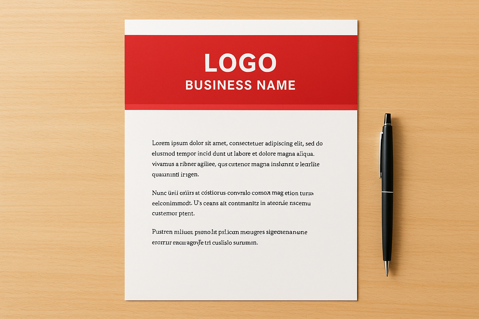
A full-width colour bar adds immediate visual weight to a letterhead without requiring complex design work. This template stacks your logo and business name vertically inside a solid-colour band that runs edge to edge across the top of the page, giving it a bold, structured feel that stands out in a pile of documents.
What this template looks like
The header is a solid rectangular colour block spanning the full page width, sitting above the body margins. Your logo and business name sit inside it, centred or left-aligned, in white or a contrasting colour. A thin secondary bar in a complementary tone can sit directly beneath it for added depth.
When to use it
This layout suits product-based businesses, marketing agencies, and retail brands that want their letterhead to reflect the same visual confidence as their other branded materials. It works particularly well for welcome packs, promotional letters, and event follow-ups where making a strong first impression matters.
A full-width colour bar is one of the fastest ways to make a Google Docs document feel like it came from a design team rather than a word processor.
How to build it in Google Docs
Use Insert > Table with a single cell set to full page width, then apply a background colour to simulate the bar. Place your logo and name inside the cell and set the table border to none. This google docs letterhead template approach gives you a clean result without image editing software.
Brand colour tips that still print well
Dark, saturated colours like navy, forest green, or charcoal reproduce reliably on most office printers. Avoid very light pastels in the bar because they often print inconsistently on standard 80 gsm paper. For guaranteed colour accuracy at volume, Apex Workwear prints letterheads on professional equipment that matches your exact brand hex values.
4. Centred logo header with a compact footer contact row
A centred layout gives your letterhead a formal, symmetrical feel that works across a wide range of business contexts. This google docs letterhead template places your logo and business name at the top-centre of the page, drawing the reader’s eye straight to your brand before they read a single word.
What this template looks like
Your logo sits centred in the header, with your business name directly beneath it in a clean heading font. A simple divider line separates the header from the letter body. At the bottom, a compact footer row holds your phone number, email, website, and address in one horizontal line, keeping everything tidy without eating into the page.
When to use it
This layout suits professional service firms, accountants, and consultants who want symmetry and order on the page. It also works well for formal correspondence like appointment confirmations, reference letters, and official notices where a balanced, authoritative look carries weight.
Centred layouts read as inherently formal, which makes them a natural fit whenever your letter needs to feel official and considered.
How to build it in Google Docs
Enable the header via Insert > Header and Footer, then insert your logo and use the centring alignment button to position it. Add your business name as a line of text directly beneath the image. Draw a horizontal divider using Insert > Horizontal Line, then switch to the footer and type your contact details in one row, also centred.
How to keep the footer consistent across pages
In Google Docs, the footer repeats automatically on every page once you enter it. Make sure you type all contact details in one sitting inside the footer area so nothing shifts between pages. Keep your font size between 8pt and 9pt in the footer to leave plenty of breathing room for the letter body above.
5. Two-tone sidebar layout for strong visual branding
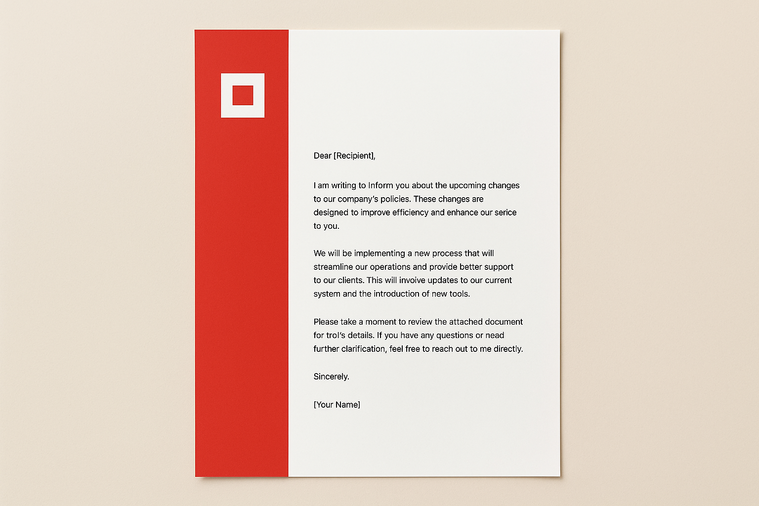
A sidebar layout adds a vertical block of colour down the left edge of your page, creating a bold visual anchor that separates your branding from the letter content. Unlike header-only designs, this google docs letterhead template uses the full height of the page to carry your brand identity, making it one of the most visually distinctive options on this list.
What this template looks like
A solid colour column runs down the left side of the page, roughly 3 to 4 cm wide, in your primary brand colour. Your logo sits near the top of the sidebar, either in white or a contrasting tone. A lighter secondary colour fills the remaining body area, or the background stays white for maximum contrast and readability.
When to use it
This layout suits creative businesses, marketing consultancies, and tech startups that want their letters to feel distinct from standard office correspondence. It also works well for company profiles, welcome letters, and event proposals where strong visual impact matters.
A full-height sidebar tells the reader your brand is deliberate and consistent before they read a single word of your letter.
How to build it in Google Docs
Insert a single-column table with no borders, set to approximately 3.5 cm in width, and apply your brand colour as the cell background. Place the table using Insert > Table, then position your logo inside it. The body text sits in the white space to the right of the table.
Margin and readability checks for long letters
Set your left page margin to at least 5 cm to prevent body text from running too close to the sidebar. Keep your body font at 11pt or 12pt and line spacing at 1.15 so longer letters remain easy to read without the sidebar competing for attention.
6. Classic legal-style letterhead with a formal address block
A classic legal letterhead relies on structured hierarchy and restrained design to project authority. Law firms, accountants, notaries, and professional registrars have used this style for decades because it signals credibility before anyone reads a single line of the letter.
What this template looks like
The header places your firm name in a prominent serif font at the top, with your full address block directly beneath it, right-aligned or centred. A thin rule separates this block from the letter body. There are no graphics, colour bars, or decorative elements. The layout communicates professionalism through structure and precision alone.
When to use it
This google docs letterhead template suits legal correspondence, formal notices, and official declarations where visual simplicity reinforces credibility. It also works well for accountants and financial advisors who want their letters to carry the same weight as those from larger, established firms.
Restraint in design is a deliberate signal. A clean, formal letterhead tells the reader your content matters more than your presentation.
How to build it in Google Docs
Enable the header via Insert > Header and Footer, then type your firm name in a serif font like Georgia at 14pt. Add your address, phone, and email on the lines beneath it. Set text to right-align or centre, then insert a dividing line using Insert > Horizontal Line to close the header block neatly.
Formal formatting details people notice
Use 12pt Georgia or Times New Roman for the letter body and set margins to 2.5 cm on all sides. Keep line spacing at 1.15 and use full-block format, meaning all text starts at the left margin with no paragraph indentation. These small formatting choices are exactly what legal and regulated industry readers notice immediately.
7. Healthcare-style letterhead with a subtle watermark look
A healthcare letterhead needs to balance professional credibility with a calm, reassuring visual tone. This google docs letterhead template achieves that by using a faint watermark element, typically your clinic logo or a medical symbol at low opacity, positioned behind the letter body to add depth without distracting from the content.
What this template looks like
The header carries your clinic or practice name in a clean sans-serif font on the left, with your practitioner credentials and registration number on the right. A soft teal or muted blue colour bar runs beneath the header at around 0.5 cm height. The watermark sits centred in the body area at 10 to 15% opacity, giving the page a layered, intentional look that feels appropriate for a medical setting.
When to use it
This layout suits medical clinics, physiotherapy practices, dental offices, and allied health providers who send formal correspondence to patients, insurers, or referring physicians. It works particularly well for referral letters, treatment summaries, and appointment confirmations where a clean, trustworthy presentation matters.
A well-structured healthcare letterhead communicates professionalism and care before the patient reads a single line.
How to build it in Google Docs
Insert your logo via Insert > Image, then reduce its transparency in the image formatting options to around 15%. Place it behind your body text area using the Behind text wrapping option. Add your header details in the header section and draw a colour bar using a single-cell borderless table.
Privacy and clarity considerations for patient-facing letters
Keep your font size at 12pt minimum so letters remain accessible to all readers. Avoid printing sensitive patient details in the footer, and confirm your layout leaves clear white space around the body text so nothing feels crowded or rushed.
8. Construction and trades letterhead with a bold top band
A trades letterhead needs to project reliability and capability without looking like it was pulled from a generic office template. This google docs letterhead template uses a thick, dark top band across the full page width to give your correspondence the visual weight that matches the work you actually do.
What this template looks like
The header is a wide, solid-colour band, typically in charcoal, navy, or deep orange, that stretches edge to edge at the top of the page. Your company name and logo sit inside it in white or a high-contrast tone. Below the band, a single row of contact details runs at the left margin in a small, clean font before the letter body begins.
When to use it
This layout works best for contractors, builders, electricians, plumbers, and landscaping companies sending formal quotes, site proposals, or subcontractor agreements. It signals professionalism to clients and project managers who deal with dozens of vendors and need to identify your documents instantly in a pile.
A well-branded trades letterhead tells clients you run your paperwork with the same discipline you bring to a job site.
How to build it in Google Docs
Use Insert > Table with a single full-width cell, apply your brand colour as the cell background, and set borders to none. Place your logo and company name inside the cell. Add contact information as standard body text directly beneath the table, then begin your letter body below that.
How to make it rugged without looking cluttered
Stick to one or two colours maximum in the band, and resist the urge to add icons, taglines, and certifications all at once. Your company name and phone number are the two most important elements. Everything else can live in the footer.
9. Creative agency letterhead with a grid-based layout
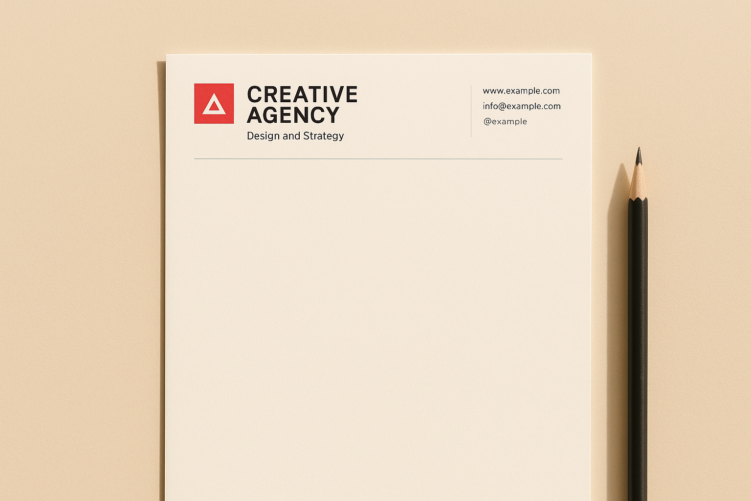
A grid-based letterhead brings structure and visual rhythm to a page without locking you into a corporate look. This google docs letterhead template uses invisible column guides to align your logo, agency name, and contact details into a layout that feels designed rather than typed.
What this template looks like
The header divides into two or three invisible columns across the top of the page. Your logo anchors the left column, your agency name and tagline sit in the centre, and a compact contact block occupies the right. A thin rule runs beneath the full row to close the header. The overall effect is structured but editorial, closer to a magazine masthead than a standard business letter.
When to use it
This layout suits creative studios, brand consultancies, and digital agencies that send proposals, creative briefs, and strategy documents to clients. It signals that you apply the same design thinking to your paperwork as you do to client deliverables.
Your letterhead is part of your portfolio. If it looks like a default template, it works against the story you are trying to tell.
How to build it in Google Docs
Use Insert > Table with three columns and a single row, set borders to none, and apply no background colour. Place your logo in the left cell, your agency name in the centre cell, and your contact line in the right cell. Adjust column widths manually by dragging the column borders until the balance looks right.
How to add website and social handles without noise
Keep your contact line to three elements maximum, typically your website, email, and one social handle. Use a 9pt font in a mid-grey tone so the details register without competing with the letter body. Drop handles that are not professionally active, because a dead link in your footer undercuts the polished impression the rest of your layout creates.
10. Non-profit and community letterhead with a mission footer
A non-profit letterhead carries a different kind of weight than a commercial one. It needs to communicate credibility and purpose in equal measure, reassuring donors, grant committees, and community partners that your organisation operates with intention and care.
What this template looks like
The header keeps things simple: your organisation name and logo sit left-aligned, with your registered charity number and tagline in a smaller font directly beneath. A thin rule closes the header block. At the bottom, a mission statement footer runs across the full page width in a muted tone, carrying a single sentence that captures what your organisation stands for.
When to use it
This google docs letterhead template suits registered charities, community groups, and social enterprises that send formal correspondence to funders, partner organisations, or local government contacts. It works particularly well for grant applications, donation receipts, and partnership proposals where transparency and accountability matter to the reader.
A mission footer reminds every recipient why your organisation exists, which reinforces trust without requiring a cover letter to do the work.
How to build it in Google Docs
Enable the header via Insert > Header and Footer, add your logo and organisation name, then insert a divider line. In the footer, type your mission statement as a single row of text at 9pt in a mid-grey tone, centred or left-aligned.
How to keep messaging brief and credible
Limit your mission statement to one clear sentence and keep your header to three lines maximum. Avoid acronyms or internal language that outside readers will not recognise immediately, as clarity builds trust faster than any design choice you can make.
A simple next step
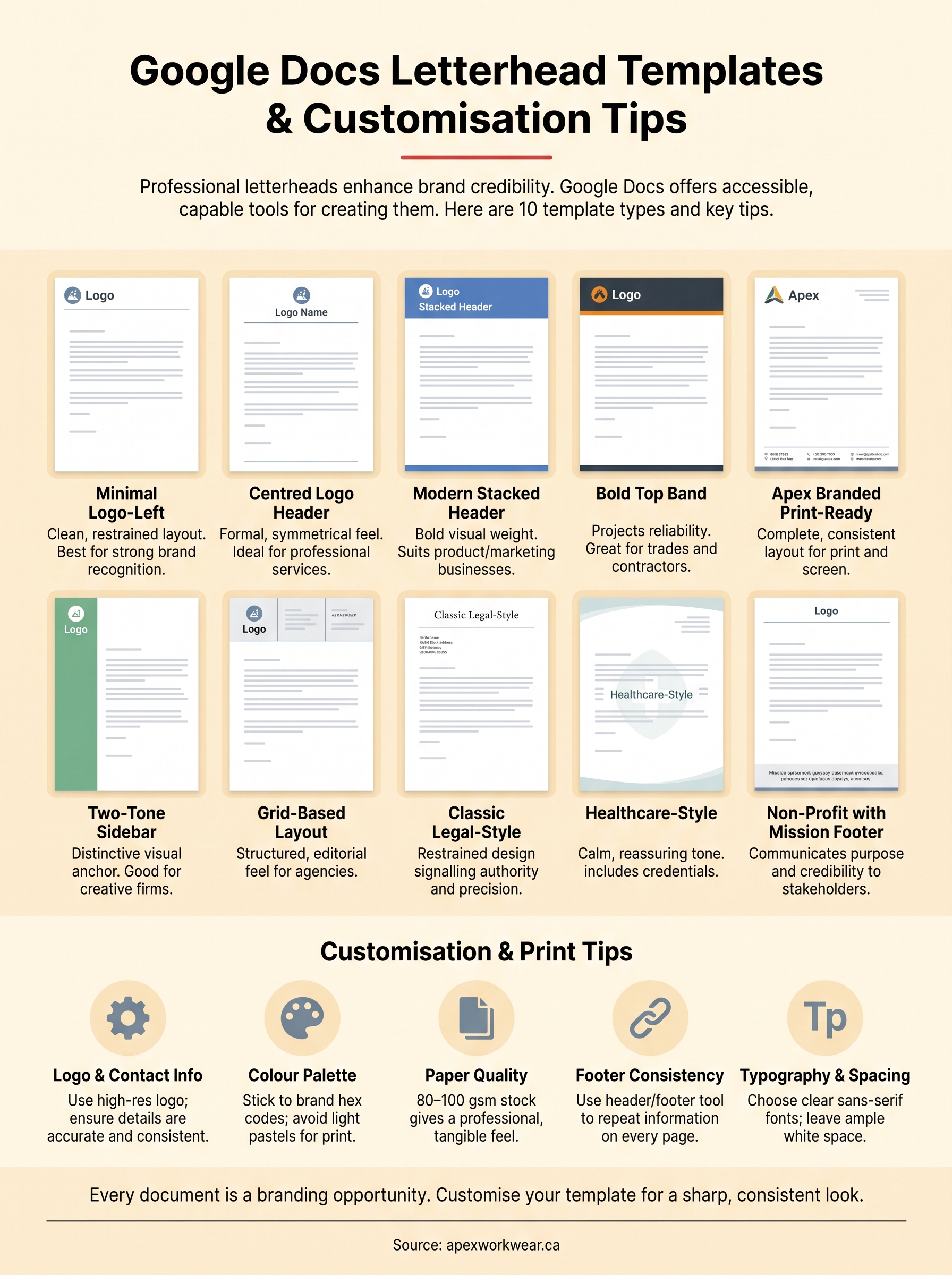
Each google docs letterhead template in this list gives you a working starting point, but the real value comes from applying your own logo, colours, and contact details so every document you send reinforces your brand. Pick the layout that fits your business type, follow the build steps, and test it by printing one copy before you send it to a client.
Once your digital letterhead is solid, printed versions on quality stock make a genuine difference for proposals, formal quotes, and anything a client will hold in their hands. That is where the screen version alone falls short. If you want letterheads, business cards, or other branded print materials produced on professional equipment with accurate colours and fast turnaround, Apex Workwear handles all of it from right here in Canada, with no minimum orders and free local shipping across the GTA.