Every letter your business sends out is a chance to look sharp or fall flat, and a blank Word document does not help your case. If you have been hunting for canva letterhead templates to sort your branding without hiring a designer, you are in the right place. Canva is genuinely one of the fastest ways to put together a professional letterhead, provided you know which templates hold up and how to tweak them properly.
This guide answers that search directly: ten solid Canva letterhead templates, picked for small business branding that still looks polished, plus the customisation tricks that separate a rushed design from one that reads as established. We will point out where fonts, spacing, and colour choices tend to go wrong, and how to fix them in minutes.
As a Canadian print shop that works with startups and contractors across the GTA every week, we see plenty of DIY letterheads before they hit our presses. Below you will find the templates worth using, the edits worth making, and a few notes on when it is time to move from a Canva file to a properly printed, business-ready stack of letterhead.
1. Apex Workwear custom letterhead design and printing
Design style
Start your letterhead search with a template that gets refined by a human, not just downloaded and left as-is. Apex Workwear works from Canva-friendly layouts and adjusts them to match your existing brand colours, logo placement, and font pairings, so the finished letterhead looks built for your business rather than pulled from a stock library. This suits businesses that want the flexibility of Canva without the guesswork of picking margins, contact block placement, or paper weight themselves.
A letterhead only works if it looks the same on screen, in print, and in every hand it reaches.
Who it’s for
Contractors, startups, and creative agencies across the GTA who need letterhead fast and don’t have a design team on staff tend to get the most value here. It also fits event coordinators juggling multiple branded documents at once, since one team handles the letterhead, business cards, and signage together instead of stitching together files from three different sources.
How to customise it
Send over your logo file, brand colours (hex codes if you have them), and any existing fonts, and the team builds a draft around those assets rather than a generic template. From there:
- Review the digital proof before anything goes to print
- Request basic layout tweaks at no extra cost
- Confirm paper stock and finish for the final run
- Approve a final file for both digital and printed use
This removes the trial-and-error of nudging text boxes around in Canva yourself, and it catches spacing or alignment issues before they show up on 500 printed sheets.
Printing options in Canada
Once the design is locked, printing happens right here in Canada, with fast turnaround typically landing within 5 to 7 business days and rush options if you’re on a deadline. Orders shipping within the GTA and surrounding areas qualify for free local shipping, and there’s no minimum order requirement, so a small batch of 50 sheets is just as easy to fill as a run of 5,000. You can get a free quote within 24 hours and have expert eyes on your design before it hits the press.
2. Minimalist and corporate letterhead templates
Design style
Search Canva’s letterhead category and you’ll find dozens of minimalist templates built around a single accent colour, plenty of white space, and a slim header with logo on one side and contact details on the other. These designs skip decorative elements entirely, relying on clean sans-serif fonts like Montserrat or Lato to carry the professional look. The layout usually keeps a thin rule line separating the header from the letter body, which keeps everything feeling structured without adding visual noise.
Who it’s for
This style suits corporate teams, consultants, and financial or accounting firms where the letterhead needs to read as serious and understated rather than eye-catching. It also works well for startups still building brand recognition, since a minimal template lets the logo and company name do the talking without competing elements pulling focus.
Minimalist doesn’t mean forgettable, it means nothing distracts from your name and message.
How to customise it
Swap the default accent colour for your brand’s primary shade, then check that your logo file has a transparent background so it doesn’t sit inside an awkward white box. A few quick fixes:
- Replace placeholder fonts with one from your brand guide
- Lock margins to at least 2cm on all sides for print safety
- Add a footer with your business number and website
Printing options in Canada
Once exported as a print-ready PDF, these templates translate cleanly onto standard letterhead stock, and a Canadian print run keeps colours consistent across every sheet.
3. Creative and artistic letterhead templates
Design style
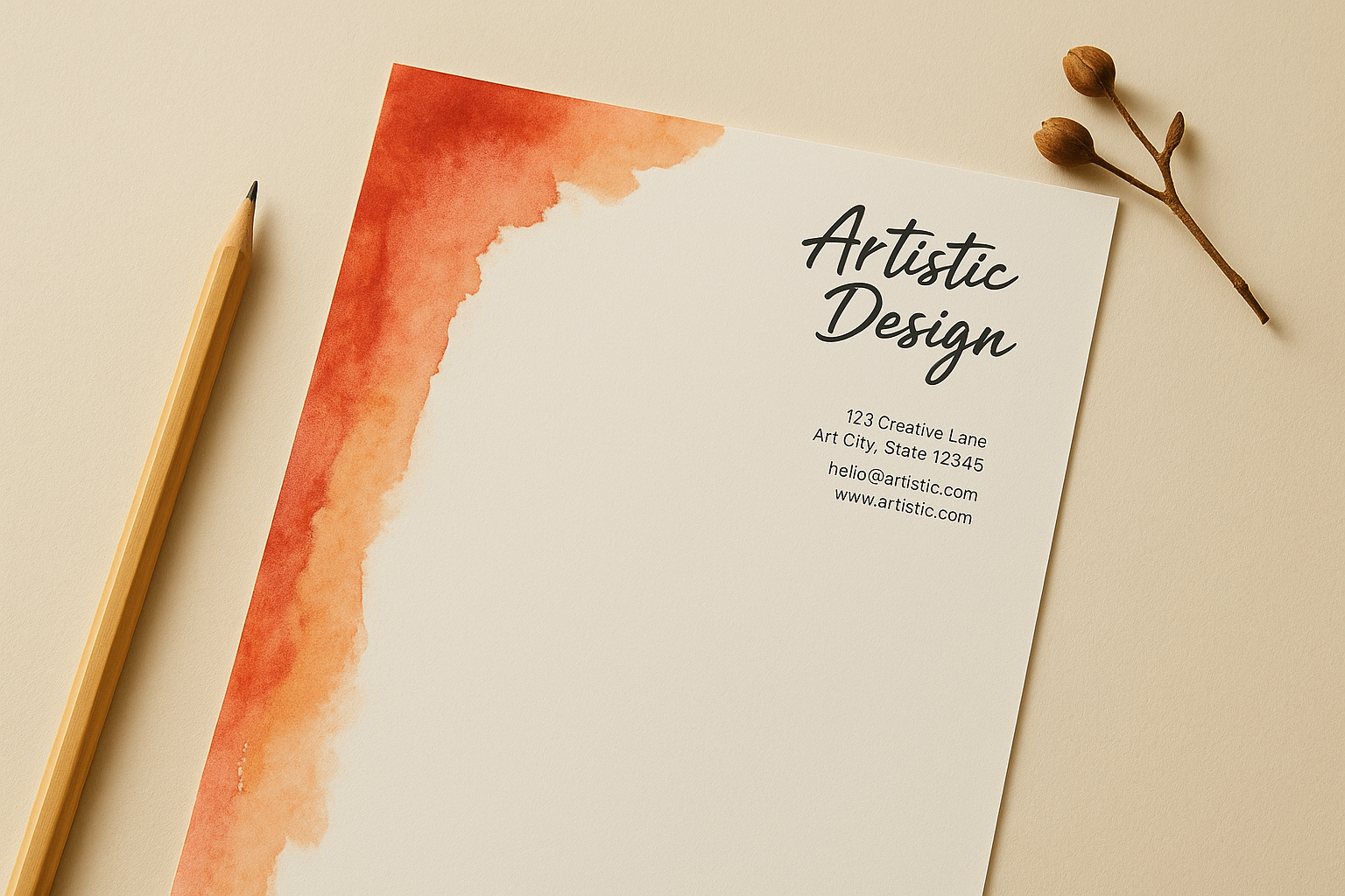
Scroll further into Canva’s library and you’ll hit a batch of artistic letterhead templates built for brands that don’t want to look like everyone else. Think watercolour washes, hand-drawn illustrations, bold geometric shapes, or a splash of colour running down one edge of the page. These templates lean on personality over restraint, often pairing a script or display font for the business name with a simpler sans-serif for the address block underneath.
Who it’s for
Creative agencies, photographers, florists, boutique studios, and anyone running a personal brand where visual flair is part of the pitch will get the most out of this style. It also suits event planners and stylists who want their letterhead to feel like an extension of their portfolio rather than a bland formality.
A creative letterhead should look like your work, not just announce your name.
How to customise it
Pull one or two colours straight from your logo rather than the template’s default palette, so the illustration feels tied to your brand instead of borrowed from a mood board. Keep the flourish contained to the header or a side border and leave the main body plain, since a busy background makes typed letters hard to read once printed.
- Test print a single page before ordering in bulk
- Check that decorative elements don’t run into the printer’s bleed area
- Keep body text in a neutral font for readability
Printing options in Canada
These designs print best on a slightly heavier stock, since thin paper lets colour washes bleed through to the back. A local printer can advise on the right weight and finish so the artwork holds its detail on every sheet.
4. Law firm and professional services letterheads
Design style
Law firms, accountants, and financial advisors need letterhead that signals trust before anyone reads a word of the letter. Canva’s professional services templates lean on serif fonts like Playfair Display or Georgia, paired with a symmetrical header, a thin border, and a colour palette rarely straying past navy, burgundy, or charcoal grey. There’s no illustration, no accent shapes, just a crest or wordmark logo, a firm name in title case, and a contact block that sits dead centre or aligned right.
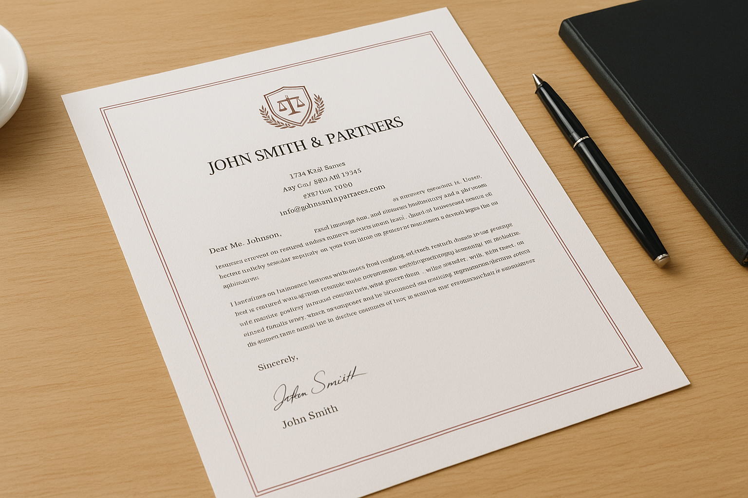
Trust is built in the details a client barely notices, like a straight margin and a font that hasn’t changed in fifty years.
Who it’s for
This template style suits law firms, notaries, insurance brokers, and accounting practices where clients expect formality over flair. It also fits consultants and financial planners who send letters covering contracts, statements, or advice that needs to read as credible on first glance.
How to customise it
Keep the font choice conservative and avoid switching between more than two typefaces on the page. A few specific checks matter here:
- Confirm the firm’s registration or licence number sits in the footer if required by your regulatory body
- Use a symmetrical layout rather than a left-heavy one
- Stick to one accent colour, used sparingly
Printing options in Canada
Once finalised, these letterheads print well on a heavier uncoated stock, which reads as more substantial when a client holds a signed agreement. A Canadian print partner familiar with legal and financial documents can also match watermark or security paper requests where a firm’s compliance standards call for it.
5. Personal, church and nonprofit letterheads
Design style
Not every letterhead needs a logo or a slick colour scheme. Canva’s personal letterhead templates often use a simple monogram, a soft serif font, and a single decorative line rather than a corporate header block. Church and community group templates lean similarly light, sometimes adding a small icon, a scripture reference line, or a muted background tint instead of bold branding elements. Nonprofit versions usually make room for a mission statement or tagline near the footer, since these letters often go out to donors rather than clients.
Who it’s for
Households writing formal correspondence, freelancers without a full brand kit, and small churches or community groups all fit this category well. It also suits nonprofit organisations sending donor thank-you letters or grant correspondence where warmth matters more than polish.
A letterhead for a cause should feel human first, formal second.
How to customise it
Swap any generic monogram for your actual initials or organisation name, and pick a font that matches the tone you want, gentle for a church newsletter, sturdier for a nonprofit report. Among the many canva letterhead templates available, this style benefits most from small personal touches:
- Add a short tagline or mission line under the name
- Choose a soft, muted colour rather than bright branding tones
- Keep contact details minimal, just phone and email
Printing options in Canada
These letterheads work well on lighter, uncoated paper, which keeps printing costs low for organisations working with a tight budget. A local Canadian printer can also help with small runs, since nonprofits rarely need thousands of sheets at once.
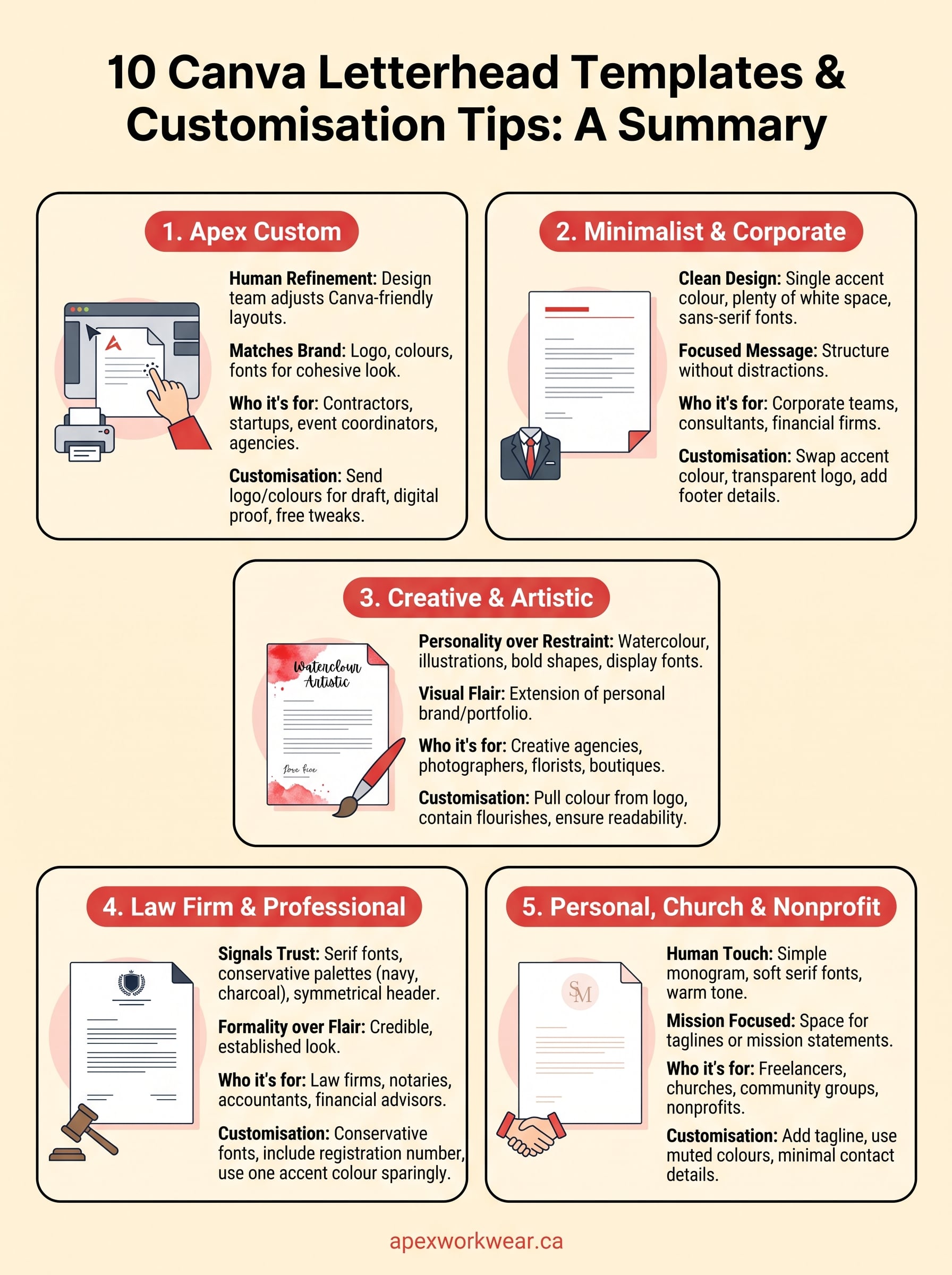
Picking the best template for your brand
Match the template to how your letter gets read, not just how it looks in the Canva preview. A law firm needs restraint, a florist needs personality, and a nonprofit needs warmth over polish. The mistake most people make is picking a template that suits their taste rather than their audience, then wondering why the finished letter feels off once it’s printed and sitting on someone’s desk.
Once you’ve settled on a direction, the real test is how it holds up outside the screen: paper weight, colour accuracy, and margins that don’t shift when a printer trims the sheet. That’s where a DIY Canva file and a properly produced letterhead start to differ. If you’d rather skip the guesswork on stock, bleed, and finish, get a free quote from Apex Workwear and have your design checked by someone who prints letterhead every week.