Most business cards end up in a drawer or a bin within minutes. The ones that stick around tend to have something a little different going on, and sometimes that difference is as simple as the shape. Rounded corner business cards swap out the standard sharp edges for a softer, more polished look that catches fingers and eyes alike. It’s a small design choice that carries more weight than you’d expect.
Whether you’re a contractor handing cards out on job sites or a startup founder networking at events, the shape of your card says something about your brand before anyone reads a word. This guide breaks down what rounded corner cards actually are, how they compare to standard cuts, and practical design tips to make sure yours look sharp. We’ll also cover how to get them printed right, something we handle daily at Apex Workwear, where we produce custom business cards and print products for businesses across Canada, with free shipping in the GTA and no minimum order requirements.
What rounded corner business cards are
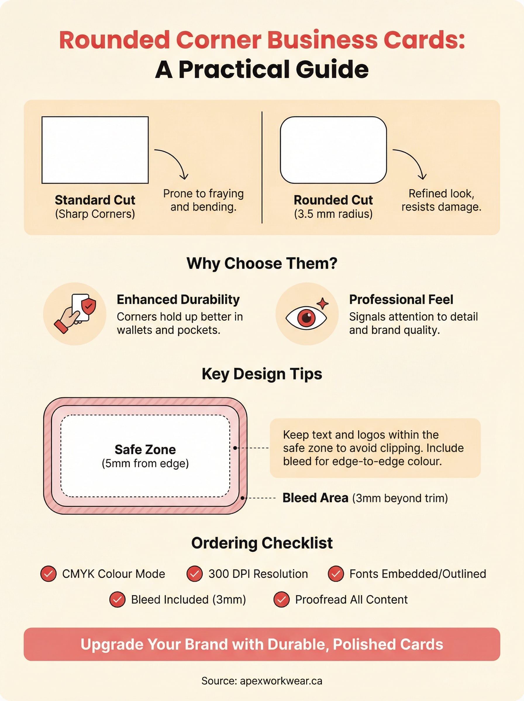
A standard business card has four sharp, 90-degree corners. Rounded corner business cards replace those points with a smooth, curved edge, typically cut to a radius of 3.5 mm, though some printers offer slightly larger or smaller curves depending on their equipment. The result is a card that feels more refined in the hand and holds up better over time, since corners are the first part of any card to fray, peel, or bend after a few days in a wallet or pocket.
The standard cut vs. the rounded cut
The difference between a straight-cut card and a rounded one is purely about the corners, not the overall dimensions. Both formats typically come in the standard size of 3.5 x 2 inches (88.9 x 50.8 mm), which fits neatly into wallets, cardholders, and standard business card slots. What changes is how the card feels and reads to the person holding it. Sharp corners can come across as functional and no-frills, while rounded edges tend to signal that someone paid attention to the details of their brand presentation.
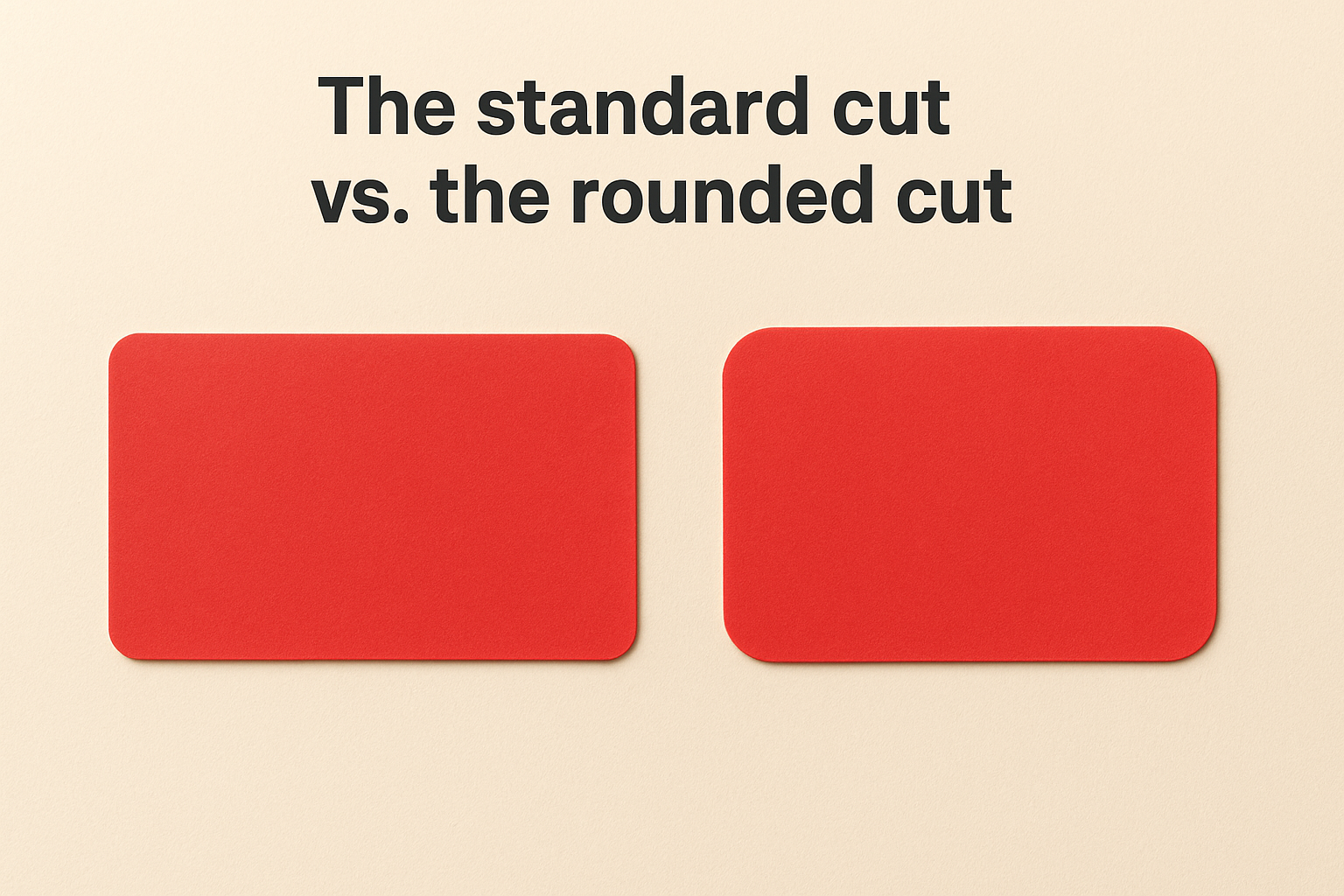
A small radius on each corner shifts the whole feel of a card from standard to deliberate.
The choice between the two formats comes down to brand personality and context. A law firm or financial advisor might prefer the authority that clean, sharp corners project. A photographer, designer, or lifestyle brand often finds that rounded edges better match their visual identity. Neither option is objectively superior, but one of them will fit your brand better, and that alignment is worth thinking through before you place an order.
How the corners are made
Printers create rounded corners using a corner rounding punch or a die-cut machine that trims each corner to a consistent curve after the card is printed and cut to its base dimensions. Most professional print shops, including Apex Workwear, handle this as part of the finishing process, so you do not need to manually build the curve into your design file. Your printer applies it after the flat cut is done.
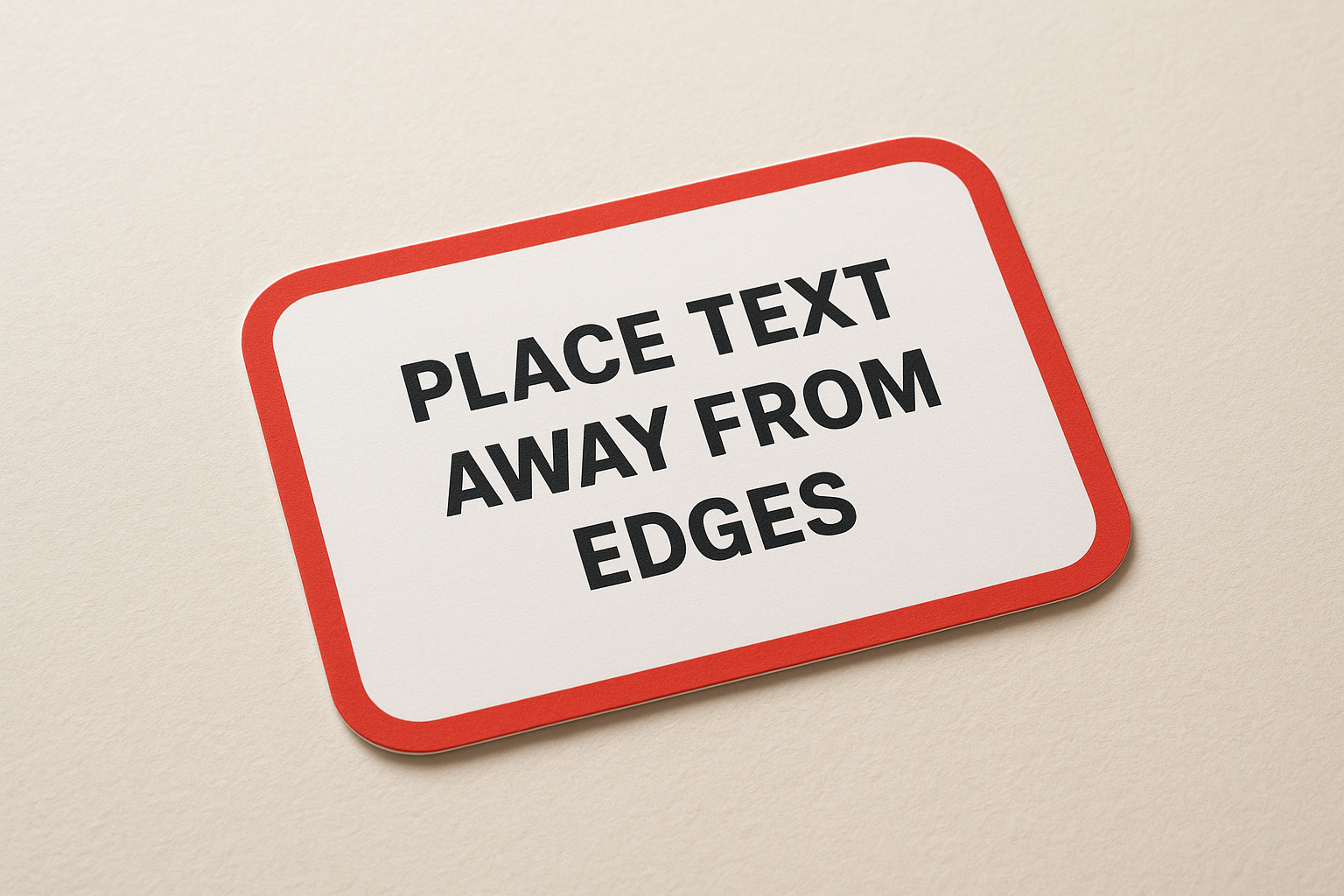
What you do need to account for in your file is your safe zone and bleed margins. Any important text or logos should sit far enough from the edge that the rounding cut will not clip them. Keeping all key design elements at least 5 mm from each edge gives the finishing process enough room to work cleanly without affecting your layout.
Why rounded corners are worth it
Rounded corner business cards offer more than a visual upgrade. The benefits are both practical and brand-related, and both matter when you are handing someone a card and hoping they actually keep it. Understanding why the shape works helps you make a more deliberate choice rather than just picking it because it looks different.
They hold up better physically
Sharp corners on a standard card are the first part to fold, fray, or peel after a few days in a wallet. Rounded corners remove the weakest structural point from each edge, which means your card survives longer in someone’s pocket or cardholder without looking worn. A card that still looks clean two weeks after you handed it out is still doing its job.
The longer a card holds its shape, the longer it holds your brand in front of someone.
Durability matters most if you are printing on thinner stock or handing cards out at outdoor events, job sites, or trade shows where they travel through bags and pockets before landing on a desk.
They signal attention to detail
When someone picks up a rounded corner card, they notice it before they read it. The smooth edge is a deliberate design signal that tells the person holding it you paid attention to how your brand is presented. That impression carries weight, particularly for contractors, creatives, and service providers whose work quality is the whole selling point.
First impressions form fast, and the physical feel of a card shapes how someone perceives your business before a single word on the card registers. A well-finished card does quiet work on your behalf.
Choosing size, stock, and finish
Size, card stock, and finish work together to define how your card feels and reads in someone’s hand. Getting one wrong can undermine an otherwise solid design, so it is worth making deliberate choices before you send files to print.
Size and dimensions
Most rounded corner business cards stick to the standard 3.5 x 2 inch format, and there is good reason for that. It fits every wallet slot, cardholder, and standard business card holder without friction. Going custom with dimensions can be a creative move, but it often costs more and risks the card not fitting where people expect to store it. Unless your brand specifically calls for an unusual shape, start with the standard size and let the rounded corners do the distinguishing work.
Stock weight
Card stock thickness is measured in points, and the number you choose affects how solid and professional your card feels the moment someone picks it up. A 16 pt stock is a reliable choice for most business uses, offering firmness without being stiff or awkward to hand out. Thinner stocks like 14 pt work fine for high-volume printing but can feel lightweight. Going up to 18 pt or 20 pt delivers a noticeably premium feel that pairs well with rounded corners when you want the card to make a stronger impression.
Heavier stock reinforces the quality signal your rounded corners already create.
Finish options
Matte finishes give your card a clean, modern look and are easy to write on, which matters if you ever jot a note on the back. Gloss finishes make colours more vibrant and add visual punch, though they show fingerprints more readily. A soft-touch laminate sits between the two and gives the card a tactile quality that tends to hold people’s attention a few seconds longer.
Design tips for a clean rounded card
Good design on rounded corner business cards starts with understanding how the shape affects your layout. The curved corners remove a small sliver of space at each edge, which means any content sitting too close to a corner risks getting clipped during finishing. Treating the corners as a layout constraint from the beginning saves you from fixing issues after your proof comes back.
Keep your content away from the edges
Safe zone discipline is the most important habit in business card design. Keep all text, logos, and critical elements at least 5 mm from every edge, and give a little extra clearance near each corner to account for the rounding curve. If your card uses a full bleed background, extend the colour or image 3 mm beyond the trim line so no white gap appears after cutting.
Building your layout around the rounded corners rather than compensating for them at the end produces a far cleaner result.
Use colour and contrast strategically
High contrast between your text and background keeps your card readable at a glance. Light text on a dark background or dark text on a light one both work well. Avoid mid-tone pairings where your type blends into the colour sitting behind it. Bold brand colours carry well at this size without crowding the layout.
Limiting your palette to two or three colours keeps the card looking deliberate rather than cluttered. A restrained design signals confidence, which is exactly the impression you want the card to leave.
Match your typography to the card’s feel
Font size for contact details should sit between 7 pt and 10 pt to stay legible without overwhelming the layout. Going smaller makes the card frustrating to read; going larger pushes other elements out of place. Stick with one primary typeface across both sides for a consistent, professional result.
Ordering checklist and common pitfalls
Getting your rounded corner business cards printed correctly comes down to preparation. Most delays and reprints trace back to avoidable mistakes that happen before the file even reaches the printer. Running through a short checklist before you submit saves time, money, and the frustration of a reprint.
Before you send your files
Review your design file against these points before uploading:
- Set your document to CMYK colour mode, not RGB, to avoid colour shifts between screen and print
- Include a bleed of at least 3 mm beyond the trim line on all sides
- Keep all text and logos 5 mm inside each edge, with extra clearance near the corners
- Embed all fonts or convert text to outlines so nothing shifts during printing
- Confirm your resolution sits at 300 DPI or higher for sharp results
Sending a print-ready file the first time cuts your turnaround significantly and reduces the chance of your proof coming back with layout issues.
Mistakes that cost you time and money
Low-resolution images are the most common reason a card looks sharp on screen but soft in print. Always source or export images at 300 DPI before placing them in your layout. If your logo only exists as a small PNG, ask your designer or printer for a vector version before you order.
Forgetting to proof both sides of a double-sided card is another frequent slip. Read every line of text on your digital proof carefully, including phone numbers, email addresses, and your website URL, before you approve it. A typo confirmed at proof stage means a full reprint at your cost.
Final thoughts
Rounded corner business cards are a straightforward upgrade that delivers real returns. The curved edge holds up better in pockets and wallets, signals that you take your brand seriously, and gives people a reason to hold onto your card a little longer. None of that requires a large budget or a complex design, just deliberate choices about size, stock, finish, and layout before you send your file to print.
The tips in this guide cover everything you need to get from concept to a finished card that looks and feels right. Keep your content clear, your margins clean, and your file print-ready, and the rest follows. If you want a printer that reviews your design, answers questions the same day, and ships quickly across Canada, order custom business cards with Apex Workwear and get a quote back within 24 hours. No minimums, no guesswork, just a card worth keeping.