You’re finally ready to order business cards, and then the finish question stops you cold. Matte vs glossy business cards isn’t a trivial detail, it changes how your logo looks, how the card feels in someone’s hand, and whether your contact details are still legible after a week in someone’s wallet. Get it wrong and you’ve spent money on cards that don’t match the image you’re trying to build.
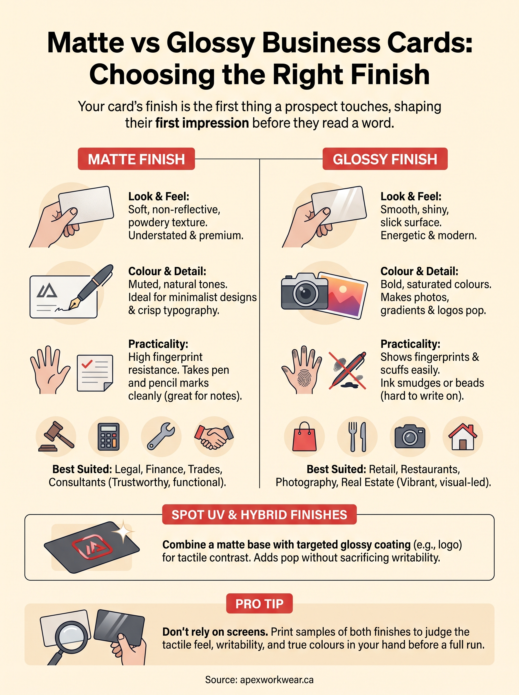
The short answer: matte gives you a soft, professional finish with no glare, ideal for minimalist designs and easy handwriting on the back. Glossy delivers bold, saturated colour and shine that makes photos and logos pop, but it scuffs more easily and can be hard to write on. Which one wins depends on your industry, your artwork, and how the card gets used day to day.
In this guide, we’ll break down the practical differences between the two finishes, including durability, print quality, and cost, then walk through which finish suits specific business types. As a Canadian print shop that produces business cards in-house with no minimum order, we’ve seen firsthand which finishes hold up and which ones businesses regret. That experience shapes every recommendation here.
Why your business card finish matters more than you think
Consider what happens in the three seconds after you hand someone your card. They glance at the logo, run a thumb across the surface, then either pocket it or set it aside. That tactile moment is where finish choice does its quiet work. A card that feels cheap, reflects glare under office lighting, or smudges the moment someone tries to write on it undermines a polished pitch before you’ve said a word. This is why the matte vs glossy business cards decision matters more than most business owners assume when they’re rushing to place an order before a trade show or networking event.
The finish on your card is the first thing a prospect touches, long before they read a single word on it.
First impressions and tactile feel
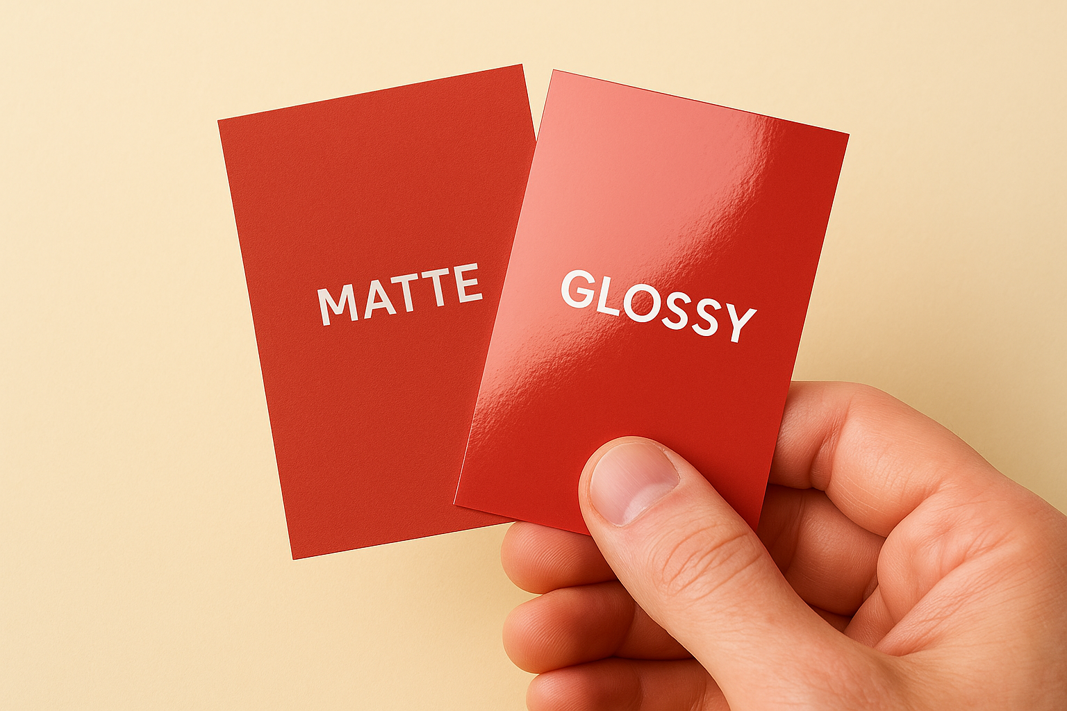
Touch communicates something a logo alone can’t. Matte stock has a soft, almost powdery texture that reads as understated and premium, which is why law firms, financial consultants, and wellness brands lean toward it. Glossy stock feels slicker and cooler, closer to laminated plastic, and it signals energy and modernity, which suits creative studios, restaurants, and retail brands. Neither texture is objectively better; they just send different signals about your business before anyone reads your title or checks your website.
Print quality and colour accuracy
Colour behaves differently on each finish, and that’s where design decisions get tricky. Glossy coating reflects light back through the ink, so colours look richer, blacks look deeper, and photos appear sharper, which explains why photography studios and real estate agents favour it. Matte coating absorbs more light, muting colours slightly but keeping fine text, thin lines, and small logos crisp without any glare interfering with readability. If your card leans on a photo-heavy design, a bold gradient, or vivid brand colours, glossy will make it pop under any lighting. If it’s mostly typography, whitespace, and a simple wordmark, matte keeps everything clean and easy to read at a glance.
Durability and daily handling
Longevity separates the two finishes just as much as looks do. Glossy cards resist moisture reasonably well because the coating seals the surface, but that same shine shows fingerprints, scuffs, and scratches within days of being carried in a wallet, glovebox, or tool bag. Matte cards hide fingerprints and minor wear far better, though an unlaminated matte surface can absorb sweat or oils over weeks of handling. If your card gets handed out at construction sites, farmers’ markets, or events where it sits in a pocket for a month before someone calls, durability deserves real weight in your decision, not an afterthought.
| Factor | Matte Finish | Glossy Finish |
|---|---|---|
| Texture | Soft, non-reflective | Smooth, shiny |
| Colour vibrancy | Muted, natural tones | Bold, saturated colours |
| Writability | Takes pen and pencil cleanly | Ink smudges or beads |
| Fingerprint resistance | High | Low |
| Best suited to | Text-heavy, minimalist designs | Photo-heavy, bold designs |
Practicality also comes down to whether people actually write on your card. Matte stock takes pen and pencil marks cleanly, which matters if a client jots down a meeting time, a booth number, or a discount code on the back. Glossy stock repels ink, so pen marks smear or never dry properly, a frustration we hear about constantly from first-time clients who assumed all business card stock behaved the same way. Weigh this against how your card gets used in the field, not just how it looks sitting on your desk, before landing on a finish that fits daily reality rather than just first impressions.
How to choose between matte and glossy for your cards
Deciding between matte vs glossy business cards doesn’t need to be a coin flip. Start by looking at your artwork before anything else. A logo built from thin lines, small serif type, or a single accent colour will look sharp on matte stock, while a design with a full-bleed photo, gradient background, or bold brand colours needs the shine of glossy coating to hit properly. Pull up your design file and ask honestly whether it depends on vibrancy or on crisp detail, because that answer usually points you straight to the right finish.
Order sample cards before committing to a full run
Guessing from a screen is where most people go wrong. Screens back-light everything, so colours look punchy no matter what finish you eventually choose, and that gap between screen and paper trips up first-time buyers constantly. Ordering a small batch of both finishes, even just 25 of each, lets you see your actual logo colours, test how your signature or handwriting looks on the back, and hand a few to colleagues for honest feedback before you print hundreds.
Don’t choose a finish from a screen. Print a handful of each and judge them in your hand.
Think about how the card will actually be used
Usage habits matter as much as looks. If you’re constantly writing appointment times, referral codes, or a quick note on the back of your card, matte wins because pen ink sets cleanly without smudging. If your card mostly gets photographed for a contact app or displayed in a holder at a reception desk, glossy’s shine reads better and rarely gets touched enough to scuff. Sales reps who hand out dozens of cards a week at trade shows often prefer matte for its resistance to visible fingerprints, while retail and hospitality brands lean glossy because the card rarely leaves a countertop.
Weigh cost, turnaround, and reorder frequency
Cost differences between the two finishes are usually minor at a Canadian print shop, so budget shouldn’t be your deciding factor on its own. What matters more is how often you’ll reorder. A field-heavy job like a contractor or electrician goes through cards faster, so matte’s better wear resistance saves you from reordering as often. A photographer or interior designer who leans on visuals might accept faster wear in exchange for a finish that shows their portfolio properly. Bring your production timeline into the decision too. If you need cards for an event next week, ask your printer whether either finish adds time, since coatings sometimes require extra drying before cutting and packaging.
Matte vs glossy by industry and use case
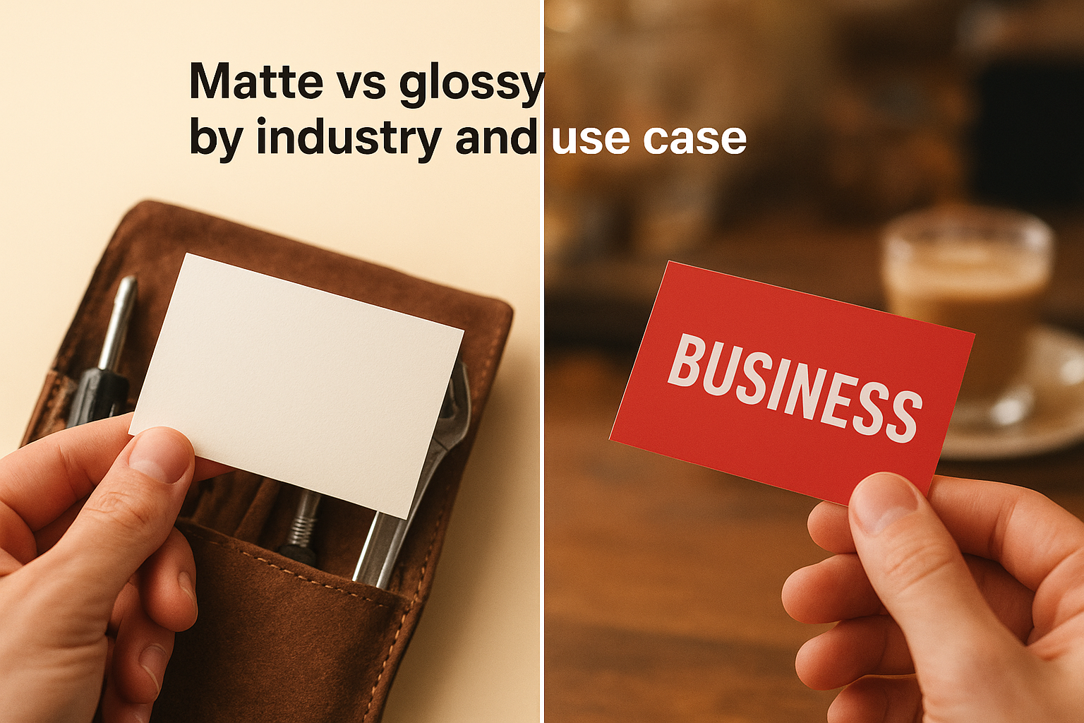
Some industries lean so heavily toward one finish that the choice practically makes itself. Trade and service businesses like plumbers, electricians, and landscapers usually do better with matte, since their cards travel in toolboxes and glove compartments where scuffing is constant. Creative and hospitality businesses like restaurants, salons, and design studios tend to favour glossy, because their brand colours and photography need that extra punch to stand out on a crowded counter or gift bag insert. Matching finish to trade isn’t about following a rule blindly, it’s about recognising how each industry’s cards actually get handled once they leave your hand.
Professional services and finance
Lawyers, accountants, mortgage brokers, and consultants almost always reach for matte. The muted, non-reflective surface reads as understated and trustworthy, which fits an industry where clients are judging your credibility as much as your service. A matte card also takes a signature or a quick note on the back cleanly, useful when a client wants to jot down a file number or appointment time during a first meeting.
Retail, food, and hospitality
Restaurants, cafes, boutiques, and salons benefit from glossy far more often. Food photography, colourful branding, and logos with gradients all look richer under a glossy coating, and these cards tend to sit in a holder near a till rather than travel through pockets all day, so scuffing matters less. If your card doubles as a loyalty stamp or mini menu, glossy keeps the print vibrant even under harsh retail lighting.
Trades, construction, and field work
Contractors, electricians, HVAC technicians, and landscapers hand out cards on job sites, in trucks, and at hardware stores, all places where a card gets crumpled fast. Matte’s fingerprint resistance and pen-friendly surface make it the practical choice here, especially when a homeowner wants to scribble a quote number on the back.
Creative, real estate, and events
Photographers, real estate agents, event planners, and design agencies often choose glossy to showcase portfolio work or property photos directly on the card. The shine sells the visual, which matters more here than in almost any other category.
Pick your finish based on where your card lives day to day, not just how it looks on your desk.
| Industry | Recommended Finish | Why |
|---|---|---|
| Legal, accounting, finance | Matte | Trustworthy feel, writable surface |
| Restaurants, salons, retail | Glossy | Vibrant colour, countertop display |
| Contractors, trades | Matte | Durable, resists fingerprints |
| Photography, real estate | Glossy | Showcases photos and visuals |
| Consultants, coaches | Matte | Clean, minimalist look |
Ultimately, these are starting points, not strict rules. A minimalist boutique might still prefer matte for a quieter, upscale feel, and that’s a legitimate call as long as it matches how the card gets used.
Combining finishes with spot UV and other hybrid options
You don’t actually have to pick a single lane. Spot UV printing lets you combine a matte base with a glossy, raised coating over specific elements like a logo, a border, or a headline, so the card reads as understated overall but has one detail that catches light and draws the eye. This hybrid approach solves a real problem in the matte vs glossy business cards debate: you get the sophistication of matte with a targeted pop of shine exactly where you want attention.
What spot UV actually does to a card
Understanding the mechanics helps you decide if it’s worth the extra step. A thin layer of ultraviolet-cured coating is applied only to chosen areas of the design, then cured instantly under UV light, leaving a slightly raised, glossy texture against the flat matte surface around it. Fingers notice the difference before eyes do, and that tactile contrast is exactly why law firms and boutique consultancies use it on a logo mark while keeping the rest of the card matte and writable.
A small dose of gloss on an otherwise matte card draws the eye without sacrificing the card’s professional feel.
Other hybrid finishes worth knowing
Spot UV isn’t the only option once you move past a plain matte-or-glossy choice. A few alternatives show up regularly on Canadian print orders:
- Soft-touch laminate: adds a velvety, almost fabric-like texture over the whole card, more premium-feeling than standard matte and still resistant to fingerprints.
- Raised (thermography) foil: combines metallic foil with a slightly raised texture, popular for real estate and luxury retail cards that need to feel expensive.
- Partial gloss over a matte laminate: similar to spot UV but done during the lamination stage rather than as a separate coating pass, often slightly cheaper.
- Foil stamping paired with matte stock: keeps the card muted overall while making a logo or name shine in gold, silver, or copper.
Weighing the extra cost and turnaround
Hybrid finishes cost more than a straight matte or glossy run, and they usually add a day or two to production because the coating needs a separate pass and curing time. For most small businesses ordering a few hundred cards for everyday networking, plain matte or glossy does the job fine and keeps costs down. Reserve spot UV or foil for cards tied to a specific push, a product launch, an open house, or a trade show booth, where the extra shine helps you stand out in a stack of competitors’ cards. If budget and turnaround matter more than a standout finish, skip the hybrid route and put that money toward a larger print run instead.
Mistakes to avoid when picking a card finish
Even experienced business owners trip up on this decision, and the errors usually repeat themselves across industries. Most mistakes come down to rushing the choice or copying what a competitor did without checking whether it actually fits your brand and how your cards get used. Catching these before you place a full print run saves you from a box of cards you’ll quietly stop handing out.
Choosing a finish based on a screen preview alone
Screens lie about colour, plain and simple. A backlit monitor makes every design look saturated and glossy, so if you approve artwork without printing a physical proof, you risk ordering matte cards that look flat compared to what you designed, or glossy cards where the shine clashes with a subtle, minimalist logo. Always request a printed sample before committing to hundreds of cards, since a Canadian print shop worth using will offer this without pushback.
A card that looks perfect on your monitor can still disappoint the moment it’s printed.
Ignoring how the card actually gets handled
Focusing purely on aesthetics while ignoring daily use is the second big trap. Contractors who choose glossy for its shine often regret it within weeks once scuffs show up from toolboxes and truck cabs, and consultants who pick glossy for a sleek look find clients struggling to write notes on the back. Daily handling should carry as much weight as visual appeal, especially if your card travels through pockets, wallets, or job sites rather than sitting untouched in a display holder.
Overlooking how your artwork interacts with the coating
Design and finish need to match, and skipping this check causes real problems. Thin serif fonts and fine hairline borders can nearly vanish on a heavily reflective glossy surface under certain lighting, while a photo-heavy design loses its punch on matte stock that mutes vibrant colour. Run your final artwork past whoever prints it and ask directly whether the finish you’ve chosen will do the design justice, rather than assuming it’ll translate cleanly.
Quick checklist before you print
- Order a small batch of samples in both finishes before a full run
- Test writing on the back of each sample with your usual pen
- Check your logo and colours under office lighting, not just on screen
- Confirm turnaround time if you’re adding a coating like spot UV
- Ask your printer whether your artwork suits the finish you’ve picked
Skipping these steps is how businesses end up reordering twice, which costs more in the long run than getting it right the first time.
Settling on the right finish for your brand
Matte vs glossy business cards isn’t a decision that needs to drag on. Match your finish to how the card actually lives once it leaves your hand: matte for trades, professional services, and anything that gets written on, glossy for retail, hospitality, and photo-driven brands that need colour to pop. If neither feels quite right, spot UV or a soft-touch laminate gives you the best of both without a full compromise. Trust the sample cards over the screen preview every time, and check your artwork against the coating before you commit to a full print run.
Whatever you land on, get it printed properly the first time. Our team prints business cards in-house across both finishes, with no minimums and a proof before anything goes to print, so you can see exactly what you’re getting. Get a free quote from Apex Workwear and have your finish decision sorted within a day.